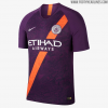
City’s New Kits

Why are they Iconic?

Are they Iconic because we won one thing in it 50 years ago?

Red and Black had nothing to do with City until Big Mal asked for it.

Grumpy has nothing to do with it and nowhere do I say Puma kits are shit or have been shit.

Red is for rags and dippers.
lol.
 
Spot on Alf It was Allison who got the red/black kit, he wanted City to change to it permanently, he believed that it made the players look bigger and was an advantage. Agree about the rose as well it should have been the bee and I said that before the recent hype
Big mal wanted to change the home kit to Royal Blue with the red and white sash, blue shorts and blue socks with red/white turnover.Obviously the club said no. Though we did wear the socks with the home kit for a season, 73/74?
 
That is their right, but it will have nothing to do with David Silva wearing the shirt, I'm shocked an older timer like yourself didn't use the usual red and black monstrosity from the 70's.

We like it because we won something in it mentality.

It is fucking horrible, I have a cheque board one under the bed, not even sure I have ever worn it, somebody bought it for a present. It is, even more, viler than the stripes.
The red n black is iconic and says Manchester City. I love it
 
holstein-kiel-21-22-kits-5.jpg


I want something like this but in our colours obviously.
 
Arguably, our away kits have been better than our home kits under Puma and Nike. Two of my favorite away shirts has been the all black and navy Kits. For some reason they can't quite get the home kit right, I mean how hard can it be ?

Update: deciding which kit to wear today. I know we're home but went for the Nike maroon kit. Forgot how nice it looked.
 
Last edited:
Arguably, our away kits have been better than our home kits under Puma and Nike. Two of my favorite away shirts has been the all black and navy Kits. For some reason they can't quite get the home kit right, I mean how hard can it be ?
they feel they have to fiddle with it to differentiate it. Last year's was perfect if they'd left off the swimming pool floor mosaic. Purple on our first home kit was just bizarre and wrong, this year's is fine but blue shorts is unnecessary.

Nike's were poor quality and the nicer designs were ruined by the shield around the chicken badge. We also some bizarre colour combos that have never been City.
 

Don't have an account? Register now and see fewer ads!

SIGN UP
Back
Top
  AdBlock Detected
Bluemoon relies on advertising to pay our hosting fees. Please support the site by disabling your ad blocking software to help keep the forum sustainable. Thanks.