You are using an out of date browser. It may not display this or other websites correctly.
You should upgrade or use an alternative browser.
You should upgrade or use an alternative browser.
City’s New Kits
- Thread starter PannickAtTheDisco
- Start date
StrutterBlue
Well-Known Member
First thing that comes to mind

That kit was a thing of beauty!
Some of the Umbro kits took the piss. Absolute beauties
better dead than red
Well-Known Member

jamielowndes
Well-Known Member
- Joined
- 15 Jan 2010
- Messages
- 2,783
Had a quick go at some ideas given the information we have.
Pretty sure all the trim on the home will be maroon, but a very "less is more" approach where it doesn't really dominate. Funnily, the purple trim on the 19/20 kit would have been fine as maroon.
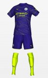
Away is red and black but thought more Flamengo than AC Milan. Flamengo consistently have good shirts and i think thicker stripes look better.
3rd is very much "for shits and giggles". Just went with something abstract. Im sure Puma will claim its a nod to a historic case of acid rain that happened somewhere on the same day City won a preseason tournament.
Pretty sure all the trim on the home will be maroon, but a very "less is more" approach where it doesn't really dominate. Funnily, the purple trim on the 19/20 kit would have been fine as maroon.
Away is red and black but thought more Flamengo than AC Milan. Flamengo consistently have good shirts and i think thicker stripes look better.
3rd is very much "for shits and giggles". Just went with something abstract. Im sure Puma will claim its a nod to a historic case of acid rain that happened somewhere on the same day City won a preseason tournament.
Attachments
Cellarite
Well-Known Member
- Joined
- 12 Jan 2010
- Messages
- 26,770
- Team supported
- Manchester City
I like all three of them.Had a quick go at some ideas given the information we have.
Pretty sure all the trim on the home will be maroon, but a very "less is more" approach where it doesn't really dominate. Funnily, the purple trim on the 19/20 kit would have been fine as maroon.
Away is red and black but thought more Flamengo than AC Milan. Flamengo consistently have good shirts and i think thicker stripes look better.
3rd is very much "for shits and giggles". Just went with something abstract. Im sure Puma will claim its a nod to a historic case of acid rain that happened somewhere on the same day City won a preseason tournament.
urban genie
Well-Known Member
- Joined
- 11 May 2008
- Messages
- 35,036
Had a quick go at some ideas given the information we have.
Pretty sure all the trim on the home will be maroon, but a very "less is more" approach where it doesn't really dominate. Funnily, the purple trim on the 19/20 kit would have been fine as maroon.
Away is red and black but thought more Flamengo than AC Milan. Flamengo consistently have good shirts and i think thicker stripes look better.
3rd is very much "for shits and giggles". Just went with something abstract. Im sure Puma will claim its a nod to a historic case of acid rain that happened somewhere on the same day City won a preseason tournament.
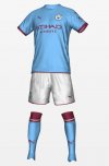
West ham away
QPR away
Better than the shite we wore tonight.
Nice but I would never want to see us wear them personaly as none are city to me
dickie davies
Well-Known Member
Have a look at Crystal Palace 's home kit and change that design to black and redHad a quick go at some ideas given the information we have.
Pretty sure all the trim on the home will be maroon, but a very "less is more" approach where it doesn't really dominate. Funnily, the purple trim on the 19/20 kit would have been fine as maroon.
Away is red and black but thought more Flamengo than AC Milan. Flamengo consistently have good shirts and i think thicker stripes look better.
3rd is very much "for shits and giggles". Just went with something abstract. Im sure Puma will claim its a nod to a historic case of acid rain that happened somewhere on the same day City won a preseason tournament.
I was saying to my daughter, when watching MOTD, that it'd look good in the maroon and white
kun
Well-Known Member


Shaelumstash
Well-Known Member
- Joined
- 30 Apr 2009
- Messages
- 8,305
That red and black is mega, if the badge was full colour it would be a classic to rival the checkerboard one from the 80s.Had a quick go at some ideas given the information we have.
Pretty sure all the trim on the home will be maroon, but a very "less is more" approach where it doesn't really dominate. Funnily, the purple trim on the 19/20 kit would have been fine as maroon.
Away is red and black but thought more Flamengo than AC Milan. Flamengo consistently have good shirts and i think thicker stripes look better.
3rd is very much "for shits and giggles". Just went with something abstract. Im sure Puma will claim its a nod to a historic case of acid rain that happened somewhere on the same day City won a preseason tournament.
Dave Ewing's Back 'eader
Well-Known Member
I think we really need a few posts on City Kit 23-24! Will it still be sky blue, I wonder?Because who doesn't need 9 months of speculation about what next season's kits that we will wear for.. 10 months will look like!
jamielowndes
Well-Known Member
- Joined
- 15 Jan 2010
- Messages
- 2,783
I think we really need a few posts on City Kit 23-24! Will it still be sky blue, I wonder?
Navy blue as a metaphor for the ever darkening state of the world.
Still got sky blue shorts though.
PannickAtTheDisco
Well-Known Member

seems to me to be more the 99 Wembley colours?
Didsbury Dave
Well-Known Member
- Joined
- 1 Feb 2007
- Messages
- 39,162
I’d love to be told how a “Parisian night” is somehow different to a “Mancunian night” or a “Bognor Regis night”
PannickAtTheDisco
Well-Known Member
it's shade is more of a sacre bleu.I’d love to be told how a “Parisian night” is somehow different to a “Mancunian night” or a “Bognor Regis night”
Franny 1234
Well-Known Member
Xmas round the corner !!!!
4 week delivery time SOCCER00.COM.
CTID
4 week delivery time SOCCER00.COM.
CTID
richards30
Well-Known Member
- Joined
- 20 May 2009
- Messages
- 31,779
Xmas round the corner !!!!
4 week delivery time SOCCER00.COM.
CTID
What the stuff like mate? Cheap shit or decent quality?
Franny 1234
Well-Known Member
Definitely the best snide I've come across. Only criticism is the inside of the shirt is a little ruff where the puma cat is embroidered. When i say ruff I mean to feel not in appearances.What the stuff like mate? Cheap shit or decent quality?
hateutd
Well-Known Member
- Joined
- 12 Sep 2009
- Messages
- 3,350
- Location
- Middle Earth
- Team supported
- Manchester City F.C. from Maine Road
Only good memories from 80's are our kits... home and away...That red and black is mega, if the badge was full colour it would be a classic to rival the checkerboard one from the 80s.