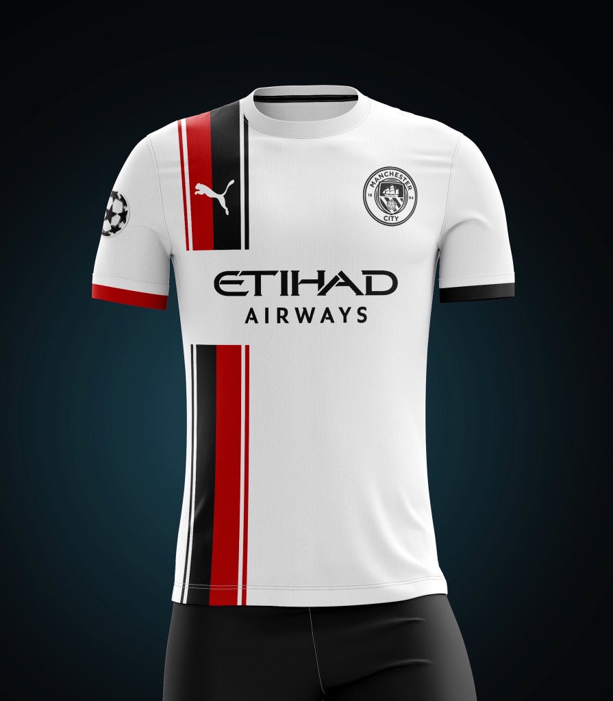
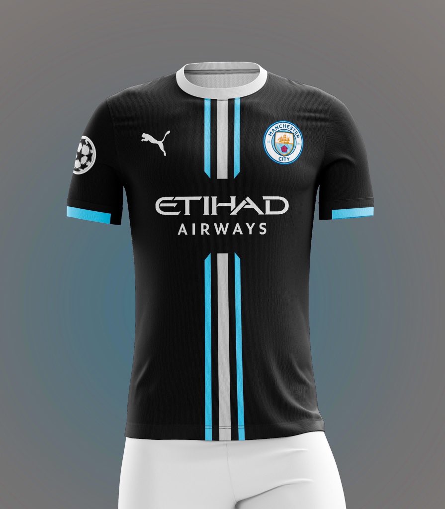
City's New Kits - 2019/20

It isn't that hard Puma.
D8AFGdXXYAUStDg

D8AE7-BWsAEH6uK
They are genuinely stunning those mate. Why can't developers that are paid thousands come up with stuff as good as those. Seen some beauty's on here over the years then we are consistently let down when the kit is released. This is a time where Puma could launch itself in with the big boys monopoly. What we have just achieved, they should be drawing up designs to be as equally stunning as we are on the pitch!!
 
It isn't that hard Puma.
D8AFGdXXYAUStDg

D8AE7-BWsAEH6uK


To be honest niether say Manchester City to me, the top one is ok as it references previous 3rd kit colours, the other one is as city like as the double decker or fruit salad.

Sky blue and white
All maroon white or gold trim
White with black trim (possible red/black sash or pnstripe)

Anything else will never be city in my eyes, but then I am middle agèd and lived thrpugh our most memorable years circa 76-96 when we had the best kits and worst seasons
 

Don't have an account? Register now and see fewer ads!

SIGN UP
Back
Top
  AdBlock Detected
Bluemoon relies on advertising to pay our hosting fees. Please support the site by disabling your ad blocking software to help keep the forum sustainable. Thanks.