mancityvstoke
Well-Known Member
- Joined
- 15 Apr 2009
- Messages
- 23,337
- Location
- Vintage terraced Kippax
- Team supported
- The only football team to come from Manchester
Is it a terrorist organisation?Ip, Dip, Dash?
Is it a terrorist organisation?Ip, Dip, Dash?
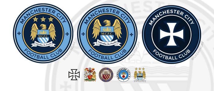
Middle one hear is bearable if we absolutely had to have the eagle..but preferred the reworked Roman banner type eagle one a few pages back
I've got to disagree mate, that's completely unbearable.
Personally I think that looks like the badge of a Mid West American summer camp in the 1980s.
Honest opinion, do you think the eagle looks better with the circle around it?
For me, it's eagle or circle. With the best will in the world, both together just doesn't work on any level.
One of them belongs on a German tank
ok a German plane thenThe one that you say belongs on a German tank, was ? used by st marks as the origonal badge on a black shirt in 1880, there is a photo to support this that predates the use of the Maltesse cross (or iron cross as you would say) by more than 50 years. In the same way that there is evidence that the swastika is an ancient Hindu symbol predating hitler's use of it as a symbol for the national socialist party.
But that's OK because we've been "consulted" about the elements we would like to see, which is fine as long as that exercise comes up with the answer they've almost certainly already decided on.
The one that bombed the Stretford End?ok a German plane then
To be fair, I'd rather not have the eagle at all...but if we were to keep it...I'm just thinking of viable options...like I said...the roman banner looking one is pretty cool if I'm honest, would be happy with that if we had to have a bird in the badge
I said:OK A German plane then
Ireland is Superman said:The one that bombed the Stretford End?
I'm not sure what the roman banner badge is mate?
I'm not a big fan of the eagle either, doesn't feel 'City' to me but I don't hate it. If we were to stick to the current badge it wouldn't be the end of the world.
But all of the redesigned versions of the eagle, especially the ones inside a circle are just an absolute disaster. If we ended up with anything like that it would feel even less 'City' than the current effort.
Dear God, no. That badge is awful.If the club are still keen on the Eagle but want a circular badge a design similar to Valencias badge with the Eagle resting on top could look smart.
ok a German plane then
This one..the overall design has promise...with a little tweaking it could be good
It could be a masonic symbol anyway.....no one really knows and certainly predates anything truly Manchester City Football Club.My point was that st mark's use of the symbol was way before the nazis. Hitler had a thing for image, and used certain very strong images as logos to identify his party and movement. Images that were already in use, so you could say he stole images. Hindu traditions and people still use the swastika today, despite it being tainted by its connection to nazi Germany.
Should we not take back the cross to some small degree on our new badge?
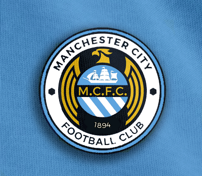
Sky blue bird, sling the MCFC and this starts to look like an attempt
