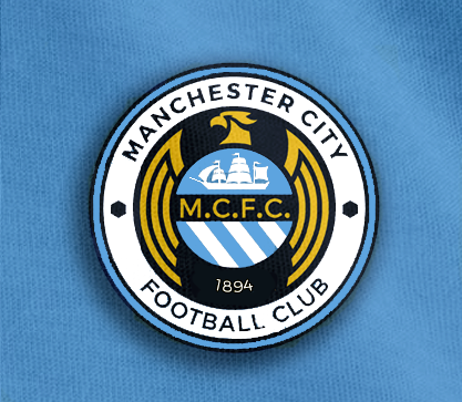
Club Badge (merged)

The Eagle brought the good times don't forget!!!!!!!!!!!!
29w4y0o.jpg
 
Gav, why don't you put a few more of your designs on that glass door so we can visualise them a bit better. Cheers.
 
The Melbourne badge is piss-poor. It's embarrassingly bad tbh. A ten yr old kid must have thought fuck it, let's have a whale on it whilst we're at it. It's complete gash.

Geekingav should be on the panel. His designs are by far the best imho.

That badge could have been made on paint - They have literally copied and pasted the ship of the City badge on to the Melbourne one. The worst bit is the inclusion of both MCFC and Melbourne City Football Club.

The two best City related badges I've seen are one of Gav's (the one on the window) and the NYCFC one - both designed by fans.
 
Just read this on City Voice, which is an official statement from the club:

"Please note that this process is about understanding the views of fans and we are not accepting any unsolicited badge designs. If, as a result of the consultation, the badge does evolve, the Club's in-house designers will undertake this process. ."

The bit in bold is a bit of an area of concern for me. The badge should be designed by a specialist in my view, not just someone from the in house team. The in-house team's previous effort wasn't the best.

Oh no, it's going to be cringe worthy isn't it?

A blue moon with a couple of bananas in the middle with We are Cityzens around the outside is my bet.
 
Yeah, navy shorts and socks for a couple of seasons, it's hardly a traditional part of our kit yet now it seems to be part of the "brand".

60+ years with Navy as part of the kit.....I'd say that's pretty traditional???
 
That badge could have been made on paint - They have literally copied and pasted the ship of the City badge on to the Melbourne one. The worst bit is the inclusion of both MCFC and Melbourne City Football Club.

The two best City related badges I've seen are one of Gav's (the one on the window) and the NYCFC one - both designed by fans.

lets take a moment and breathe ............

1. i havent done anything. i've based mine on the template of the NYCFC and MelCFC badges because i'm 96% certain thats where ours it going. So to help folks visually things better, i just used elements from past City badges , tried different colours to see what works and what doesnt. Trial and Error if you will, not design skill.

2. Melbourne City Badge. Fits in with the brand where ours it going into, the centerpiece is exactly what it should be for Melbourne because of its history of Whaling and Goating and whatever is on there. We might not think its all that, but we arent from ther, it may be perfect for them.

so wait and see what we get and then we'll have another debate for 30 years to change it then lol
 
to be fair .... that's basically me lol
But in our position I think we should be shelling out for the expertise who does this thing day in day out when it's regarding the most important aspect to the identity of the club besides our home colours. It's not just about being able to mock up a design, it's about fitting the criteria into a design in the best way possible to have the best result - that's where Rafael should come in due to his expertise of shapes and colour schemes and what not.
 
But in our position I think we should be shelling out for the expertise who does this thing day in day out when it's regarding the most important aspect to the identity of the club besides our home colours. It's not just about being able to mock up a design, it's about fitting the criteria into a design in the best way possible to have the best result - that's where Rafael should come in due to his expertise of shapes and colour schemes and what not.

without doubt, definitely not me ... but the guys we have at City are top notch media, art and design professionals, of that i have no doubt or worries, and a good bunch of them are City fans so know what is needed..
 

Don't have an account? Register now and see fewer ads!

SIGN UP
Back
Top
  AdBlock Detected
Bluemoon relies on advertising to pay our hosting fees. Please support the site by disabling your ad blocking software to help keep the forum sustainable. Thanks.