You are using an out of date browser. It may not display this or other websites correctly.
You should upgrade or use an alternative browser.
You should upgrade or use an alternative browser.
Club Badge (merged)
- Thread starter MCRJON
- Start date
Blue_Rossy
Well-Known Member
You're the best designer on here Gav, much better than the in house design team at City imo. If anyone could make this work it would be you. But you can't polish a turd.
Why on earth anyone would want a round badge with an eagle inside is just completely beyond me. It doesn't look anything like a City badge, it looks like some kind of US Security Service badge.
I understand the eagle means something to some people and they want to keep it. But I don't believe anyone can say with a straight face that the eagle looks better inside a circle than the existing badge.
No, but you can roll it in diamonds!
IrelandSuperman
Well-Known Member
- Joined
- 1 May 2013
- Messages
- 1,690
The problem with the eagle in a circle I think is this. Above the shield there's the head of the thing. Below there's nothing. So any design like the current one which has no legs, tail or anything will most likely have the shield off center. And that to my OCD eye just will not do.
SWP's back
Well-Known Member
- Joined
- 29 Jun 2009
- Messages
- 89,064
I can.You're the best designer on here Gav, much better than the in house design team at City imo. If anyone could make this work it would be you. But you can't polish a turd.
Why on earth anyone would want a round badge with an eagle inside is just completely beyond me. It doesn't look anything like a City badge, it looks like some kind of US Security Service badge.
I understand the eagle means something to some people and they want to keep it. But I don't believe anyone can say with a straight face that the eagle looks better inside a circle than the existing badge.
mancityvstoke
Well-Known Member
- Joined
- 15 Apr 2009
- Messages
- 22,052
- Location
- Vintage terraced Kippax
- Team supported
- The only football team to come from Manchester
get rid of foghorn leghorn
Shaelumstash
Well-Known Member
- Joined
- 30 Apr 2009
- Messages
- 8,254
I can.
Exactly.
Le Havre Oswald
Well-Known Member
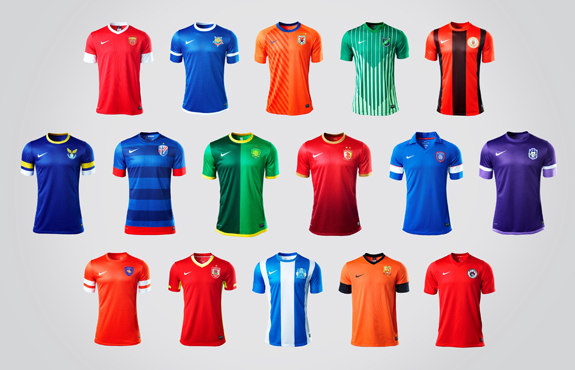
And green, orange and purple. They don't like yellowBlue and red it seems..

CitizenTID
Well-Known Member
- Joined
- 9 Feb 2013
- Messages
- 5,053
Manchester Storm feel to itright .... held off doing this ..... as i dont advocate for an eagle. Done it so i can have closure on the whole thing as its the only one i havent done properly.

Why Purple? Selfish reasons, its my favourite colour and thought it is something different.
Anyhoo. That's me finally finished.
PragueBlue
Well-Known Member
right .... held off doing this ..... as i dont advocate for an eagle. Done it so i can have closure on the whole thing as its the only one i havent done properly.

Why Purple? Selfish reasons, its my favourite colour and thought it is something different.
Anyhoo. That's me finally finished.
Looks good. Would be nice to see it in blue rather than purple though.
PragueBlue
Well-Known Member
me too.I can.
