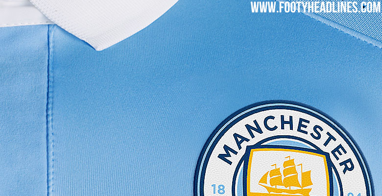
Club Badge (merged)

It does look so much better in monochrome.

From a totally external viewpoint it's interesting we've chosen to represent ourselves with (abandoned) colonialism and a county we're not even in.

But from a fans perspective full colour is just about ok and monochrome is very nice indeed.
 
It does look so much better in monochrome.

From a totally external viewpoint it's interesting we've chosen to represent ourselves with (abandoned) colonialism and a county we're not even in.

But from a fans perspective full colour is just about ok and monochrome is very nice indeed.
Colonialism???
 
I could live with that, but it's quite hard to ignore a big blob of red in the middle of the badge... Like a ketchup stain on a bage couch I once had..

CYErmsHWQAMePPg.jpg
 

Your illustration of the away kit is plum/maroon + black ...i realise that it might not be the stunt double to the variant City have planned but looking at it it trumps ketchup-red & black and the pkum/maroon colour is not without foundation. Could be half reet if the kit manafacturer dont produce the monochromed badge in too big a size.
 

Don't have an account? Register now and see fewer ads!

SIGN UP
Back
Top
  AdBlock Detected
Bluemoon relies on advertising to pay our hosting fees. Please support the site by disabling your ad blocking software to help keep the forum sustainable. Thanks.