kippax_blueboy
Well-Known Member
- Joined
- 17 Sep 2007
- Messages
- 1,612
Keep the current badge. It worksThe Eagle brought the good times don't forget!!!!!!!!!!!!

Last edited:
Keep the current badge. It worksThe Eagle brought the good times don't forget!!!!!!!!!!!!
The Eagle brought the good times don't forget!!!!!!!!!!!!
without doubt, definitely not me ... but the guys we have at City are top notch media, art and design professionals, of that i have no doubt or worries, and a good bunch of them are City fans so know what is needed..
You've got more faith in them than me mate. City's in-house design team were responsible for this!

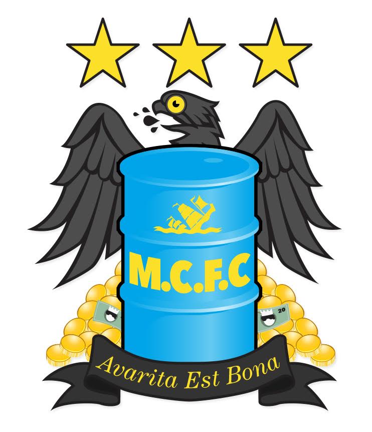
My final offering for today
Keep the current badge. It works
whats wrong with that?
To be fair that's a pretty decent effort. I would be more than happy if that's the new badge.
I promise to stop after this...

Jeez! Monstrosities? Have you no heart? I'm back broken from doing this in powerpoint.All monstrosities. Do you work in house at city?
Obsessed red tw@sjust found this on twitter ... i know its insulting at our expense but it is quite funny and artistically not bad lol
just have to laugh at their jealousy lol
Jeez! Monstrosities? Have you no heart? I'm back broken from doing this in powerpoint.
Actually when you look at them from afar they look a bit like a US Presidential seal. :-)
Maybe the US Federal government will give me a commission?
Seriously....save our bird!
Ah the iconic Manchester Eagle soaring over the horizon... just think about my Peregrine Falcon idea, at least we have those, it could even be tucking into a nice fat pigeon with a Utd kit on?Jeez! Monstrosities? Have you no heart? I'm back broken from doing this in powerpoint.
Actually when you look at them from afar they look a bit like a US Presidential seal. :-)
Maybe the US Federal government will give me a commission?
Seriously....save our bird!
The only thing worse than the word "Cityzens" is the logo they designed for it! Really, really bad. It's First Advice logo bad, even worse than the Melbourne City badge for me.
Jeez! Monstrosities? Have you no heart? I'm back broken from doing this in powerpoint.
Actually when you look at them from afar they look a bit like a US Presidential seal. :-)
Maybe the US Federal government will give me a commission?
Seriously....save our bird!

