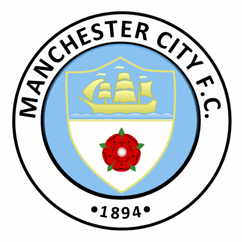
Club Badge (merged)

"A Single Red Rose" doesn't sound like it will be at 9 and 3 o'clock though. My last hope is that it's a blag, if it's genuine we're in Melbourne territory.

Unless it's this one which I quite like

17715003.548cdd4eed711.jpg
 
Unless it's this one which I quite like

17715003.548cdd4eed711.jpg

That looks awful.

I'm hoping if that poster is genuine then these teasers the club are putting out are just things that might feature on the new badge, rather than a comprehensive list of what will be on there.

Otherwise it could end up being a cluttered mess. Guess we'll find out on Saturday anyway.
 
Abomination? Awful? Hahaha..it's not that bad..change out the Maltese Cross for the 1894

Put it this way..if they really are gonna throw everything in the badge this would be the most palatable way to do it unless you want a Melbourne

All we need now is 'The Eagle Has Landed' poster to appear and this place goes nuclear hahaha
 
The list seems to be growing at an alarming rate. If the club decide to add anything else then the only place this new badge is going to fit is on Bony's arse.
 
That looks awful.

I'm hoping if that poster is genuine then these teasers the club are putting out are just things that might feature on the new badge, rather than a comprehensive list of what will be on there.

Otherwise it could end up being a cluttered mess. Guess we'll find out on Saturday anyway.
Exactly what I am worried about.

Hopefully the designer/firm that was tasked with Melbourne City's badge was not allowed within a 3,000 mile radius of our badge.
 
I don't see why they didn't mock up a handful and have fans give their opinion on them in the same manner they asked for our input in the first place.
 
Exactly what I am worried about.

Hopefully the designer/firm that was tasked with Melbourne City's badge was not allowed within a 3,000 mile radius of our badge.

Unfortunately the people who did the Melbourne badge are City's in house design team. The same team who came up with the appalling "Cityzens" logo.

World renowned graphic artist Rafael Esquer did the NYCFC badge. He's interested in City and he was very keen to be involved in this project but the club passed.

My worst fear was that the club were going to look at the results of the questionnaire and squeeze the 4 or 5 most popular symbols in to a badge. That's not good design, that's a fudge.

The final design is far more important than the individual elements. If we end up with a cluttered mess like Melbourne's then I hope blues are going to stand up to the club like Everton fans did.

We shouldn't have our identity trampled on by a cheap second rate designer just because he's employed by the club.
 
NYCFC got two badges as finals and fans got to vote to chose one ... which then became the badge ...

MelbourneCFC got just that ... and no famous artist or designer did it (like NYCFC) but some guy in house ... who apparently has done that City Football Group circles as well, which look just like Cityzens one ... actually the Cityzens logo looks like a subset of what's used as City Football (group) logo ...

Don't think I need to write which of the two ways I'd have liked ours to have gone ... but with no options coming to vote on and no proper designer involved it's looking more and more likely to go down the Melbourne / Cityzens route ...

Right, let's get that protest arranged just in case ;)
 
Actually if we are keeping Ship and Rivers from the original logo and Rose from the second one, why is the Eagle discarded ... might as well keep that and have everything fit in ...

Oh wait, put three stars on top of the circle and that Latin saying at the bottom and we'd have incorporated all three from the past into one :D
 
No point in getting worked up until you actually see what it looks like. I'd be surprised if the club badly fucked this up.
 
Actually if we are keeping Ship and Rivers from the original logo and Rose from the second one, why is the Eagle discarded ... might as well keep that and have everything fit in ...

Oh wait, put three stars on top of the circle and that Latin saying at the bottom and we'd have incorporated all three from the past into one :D
And then whack a gigantic Nike shield around it.
 

Don't have an account? Register now and see fewer ads!

SIGN UP
Back
Top