This is probably the most worrying thing of all.
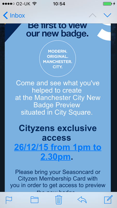
Modern, Original, points towards them not developing our traditional design like Gav's. A design based on the Coat of Arms of our city. A design that has been associated with the club for nearly 100 years.
As for the "Manchester City" bit, the fans will be the judge of that. Because by the sounds of it, the club have done a questionnaire, found out what "symbols" are popular, and have used them to create something completely original. Well I'm sorry, that's not reflective of fan's views. That's not "Manchester City" at all.
If a rose is inside a crest in a round badge with the ship above like on our 72-97 badge, that means something to me, that's Manchester City. If a "single red rose" is just throw in the middle of a round badge with a load of other stuff, it means absolutely nothing.
If the 3 rivers are in a shield with a ship on top like Gav's design and our 1920s badge, that means something. That is on the CoA, it represents Manchester, it was on our badge from 1920-72 and 1997- present day. That is Manchester City. If 3 lines are just thrown in the middle of a badge with a load of other stuff, it means absolutely nothing.
The ship when at the top of a crest with the 3 river shield below, or the rose in the shield below, that means something. It's like that on the Manchester CoA, it's been like that on all of our badges from 1920 until present day. That's Manchester City. If we just have a Blue Peter style ship thrown in the middle of a badge with a load of other stuff, it means absolutely nothing.
I'm becoming more and more concerned the club have completely fucked this up and let the idiot who designed the Melbourne badge have free reign to shit all over our identity based on the results of a bloody questionnaire about popular symbols.