roubaixtuesday
Well-Known Member
- Joined
- 14 Dec 2019
- Messages
- 4,472
- Team supported
- City
Continuing on the "things aren't as bad as reported" theme - lot's of press this morning about the Imperial REACT study showing the lockdown isn't working, and cases are rising rather than falling.
Here's the report:
The study is of randomly sampled people in the population who are tested by PCR. They take a sample over a couple of weeks every so often.
I'd* just like to say that the headlines are absolute and utter cock, and even the study report itself is pretty disappointing from a highly reputable institution.
So, are cases are going up rather than down?
Here's the relevant graph - the red line fitted through the January datapoints is the claimed upward trend.
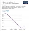
This is bollocks, frankly. The uncertainty on that is such, as you can see from the shaded red area, that the data is also compatible with the falling trend as we see on the daily case data (you'd expect the case data to lag by a few days from the REACT data). Several of the datapoints are outside the confidence interval plotted.
Next up, they also fit the epidemic *between* these sampling intervals into a continuous profile of infected numbers. Relevant graph:
If you believe that fit, you need your head examined, frankly. They have a massive upswing right at the end essentially entirely predicated on the single last day of data. The data is useful and interesting in itself, but the attempts to draw strong conclusions from the trend over the past few days are futile and misleading IMO.
Finally, some views from someone better qualified than me. Those who don't like Twitter can ignore!
I think the most pessimistic possible interpretation of this data is that it's too noisy to draw any clear conclusion on trends since lockdown.
*At this point I should of course acknowledge that they're obviously far more qualified than I am, and you should take my opinions with due scepticism as a result.