Favourite non-city shirt?

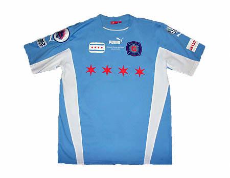
fc messina 2004/2005
Messina-squadra.jpg
 
Even though it's red I always really liked this Denmark shirt from about the time we had Nicklas Jensen.
Jon-Dahl-Tomasson.jpg

I like the chevrons down the arms.
 
<a class="postlink" href="http://bradsfootballshirtcollection.blogspot.co.uk/2012/05/botswana-away-2012.html" onclick="window.open(this.href);return false;">http://bradsfootballshirtcollection.blo ... -2012.html</a>

Botswana away with their Zebra design shirt is pretty cool.
 
YankeeBlue said:

That's an oldie Chicago Fire men's away kit from about 7 years ago. With a name like "Fire" the home kit pretty much has to be red, unfortunately!

The women's team (Chicago Red Stars) wear the sky blue now and it is ser-weet!
chicago-red-stars-home-jersey.png


chicago-red-stars-home-and-away-jerseys.jpg


This one is more current Men's (Chicago Fire) shirt and I think it is a pretty sharp away kit.....
25285.jpg


But, here is the current away shirt, which I prefer without the sponsor, but which costs about $20 more direct from Adidas! I was thinking of getting one, but they are pretty expensive and with City bringing out at least two new kits next season, I need to save my kit dollars!

The four Chicago six-pointed stars from the City of Chicago flag are in the thin sky blue stripes.
01CFIASS1213.jpg
 
green pennies said:
I'd like to second those of you who mentioned Ajax Away this year, as I think those are brilliant.

But as for a kit that hasn't been mentioned yet, I've always been a fan of what Hercules does, especially this season's kits:

201112_HerculesCF_shirt1.jpg


I normally hate the whole blue and white or red and white stripes thing as it can all come off as looking a bit barber pole... but for some reason the Hercules home kit looks cool and not boring and tired like many other kits of similiar design. I think the black shorts with yellow trim help the look of the uniform as a whole, plus the color of blue they use on the shirts is just right.

And as far as the away kit? I mean that's as close to perfect (outside of City kits of course) as you can get. I can't even describe that color.. It isn't red, it isn't pink, it isn't magenta, it isn't orange.. it's just bold and unique. And the way they use the progressively thinning vertical stripes to make it look like the short color is sort of fading up into the black shirt is fantastic.

Plus while we are at it, Hercules is a cool club name. If it's gonna be anyone, you might as well name your team after that fella.

Anyway, kits like this give me hope for the upcoming Nike City kits the season after next...

That away shirt..would have preferred if the shorts were black rather than red..otherwise it looks pretty good..
 

Don't have an account? Register now and see fewer ads!

SIGN UP
Back
Top
  AdBlock Detected
Bluemoon relies on advertising to pay our hosting fees. Please support the site by disabling your ad blocking software to help keep the forum sustainable. Thanks.