1.618034 said:Ship needs to be gold... Stripes need to be white. Like they are now.

butter?
1.618034 said:Ship needs to be gold... Stripes need to be white. Like they are now.

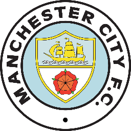
Where've you two got those badges from? On our old retro badge the sea/water under the ship was green (bizarre as it sounds, but it was, check your old kits/programmes!).Sigh said:Ban-jani said:Good effort lads but this will not be negotiated as far as I'm concerned.
Drop the fucking stars & that fucking shit "superbia & proelia"
& give us our fucking badge back... This is MCFC..

This^^^^^
.png)
THIS^^^^^^^^^^^^^^^^^^^
THE CHICKEN MUST DIE!
Amazing!ZabbaStuntDouble said:1.618034 said:Ship needs to be gold... Stripes need to be white. Like they are now.

butter?
KippaxCitizen said:Amazing!
Can you post one with just the badge that I could use as a screen saver, please?!
Thanks mate!Falastur said:KippaxCitizen said:Amazing!
Can you post one with just the badge that I could use as a screen saver, please?!
There's one two pages back.
KippaxCitizen said:Thanks mate!Falastur said:KippaxCitizen said:Amazing!
Can you post one with just the badge that I could use as a screen saver, please?!
There's one two pages back.
EDIT- not in these colours there isn't. Or am I not looking properly?
I'm only being picky :) !Falastur said:KippaxCitizen said:Thanks mate!Falastur said:There's one two pages back.
EDIT- not in these colours there isn't. Or am I not looking properly?
You're right, I didn't notice the subtle changes of colour on some of the bands. My bad.
KippaxCitizen said:Thanks mate!Falastur said:KippaxCitizen said:Amazing!
Can you post one with just the badge that I could use as a screen saver, please?!
There's one two pages back.
EDIT- not in these colours there isn't. Or am I not looking properly?
I wouldn't even know mate, haha! I'm not a technological man at all.ZabbaStuntDouble said:KippaxCitizen said:Thanks mate!Falastur said:There's one two pages back.
EDIT- not in these colours there isn't. Or am I not looking properly?
yeah ... its edited from the first one i did .... any particular size you want ( we all have different resolutions)?
KippaxCitizen said:I wouldn't even know mate, haha! I'm not a technological man at all.ZabbaStuntDouble said:KippaxCitizen said:Thanks mate!
EDIT- not in these colours there isn't. Or am I not looking properly?
yeah ... its edited from the first one i did .... any particular size you want ( we all have different resolutions)?
Thank you ZSD, spot on that!ZabbaStuntDouble said:KippaxCitizen said:I wouldn't even know mate, haha! I'm not a technological man at all.ZabbaStuntDouble said:yeah ... its edited from the first one i did .... any particular size you want ( we all have different resolutions)?
<a class="postlink" href="https://pbs.twimg.com/media/BjbJElFCEAEw6hw.jpg:large" onclick="window.open(this.href);return false;">https://pbs.twimg.com/media/BjbJElFCEAEw6hw.jpg:large</a>
try that, if it doesnt work or isnt the right size let me know.

KippaxCitizen said:Where've you two got those badges from? On our old retro badge the sea/water under the ship was green (bizarre as it sounds, but it was, check your old kits/programmes!).Sigh said:Ban-jani said:Good effort lads but this will not be negotiated as far as I'm concerned.
Drop the fucking stars & that fucking shit "superbia & proelia"
& give us our fucking badge back... This is MCFC..

This^^^^^
.png)
THIS^^^^^^^^^^^^^^^^^^^
THE CHICKEN MUST DIE!
That bottom one, the Blue within the circle is too deep-a blue.
-- Sun Mar 23, 2014 3:38 pm --
Amazing!ZabbaStuntDouble said:1.618034 said:Ship needs to be gold... Stripes need to be white. Like they are now.

butter?
Can you post one with just the badge that I could use as a screen saver, please?!


KippaxCitizen said:In my opinion, our best ever badge is the version of the coat of arms we have used throughout history (1926, 33, 34, 55, 56, 69 and 81 FA Cup finals, 1970 and 76 FL Cup finals, on all of our kits from 1976-81, also used on numbering and other merchandise for the 2011 FA Cup final).

But that is assigned to history. It is an old fashioned thing to have a COA as a club crest.
If this:
[bigimg]https://pbs.twimg.com/media/BjbJElFCEAEw6hw.jpg:large[/bigimg]
was brought in I'd be ecstatic. Really impressive.
Not only does it encompass different good aspects of old badges, it is modern looking and also disc badges look really good on kits and you wouldn't need a silly shield like we have around the current badge. It'd just bang straight on the shirt as it is.
Great stuff!
Wonder what it'd look like on the kit... ;)

JoeMercer'sWay said:I don't like it, but as it's Zabba I can see it being part of a Nike agenda being tested out on here.
I think a badge change is detrimental to our brand in this stage of our development.
ZabbaStuntDouble said:JoeMercer'sWay said:I don't like it, but as it's Zabba I can see it being part of a Nike agenda being tested out on here.
I think a badge change is detrimental to our brand in this stage of our development.
i agree completely ..... comercially it would be suicide to change now when we a developing our brand globally. The current crest is the spearhead for that brand identity.
Still think i work for Nike? lol i'm just trying to make it easier for Nike so we dont need a double crest on our shirts lol
but its still fun ... hoping .... wishing ..... lol
JoeMercer'sWay said:ZabbaStuntDouble said:JoeMercer'sWay said:I don't like it, but as it's Zabba I can see it being part of a Nike agenda being tested out on here.
I think a badge change is detrimental to our brand in this stage of our development.
i agree completely ..... comercially it would be suicide to change now when we a developing our brand globally. The current crest is the spearhead for that brand identity.
Still think i work for Nike? lol i'm just trying to make it easier for Nike so we dont need a double crest on our shirts lol
but its still fun ... hoping .... wishing ..... lol
hmmm...after what Nike did to Everton I wouldn't be surprised if they tried to gauge our fans opinion.
Personally I would make the white circle navy, with white lettering, I'd make the maroon circle gold with the central sky blue circle becoming maroon and the 2 navy ones that sandwich it being sky blue. I then would even try the central navy blue stripe being maroon as well.
-- Mar 23rd, '14, 18:37 --
ZabbaStuntDouble said:JoeMercer'sWay said:I don't like it, but as it's Zabba I can see it being part of a Nike agenda being tested out on here.
I think a badge change is detrimental to our brand in this stage of our development.
i agree completely ..... comercially it would be suicide to change now when we a developing our brand globally. The current crest is the spearhead for that brand identity.
Still think i work for Nike? lol i'm just trying to make it easier for Nike so we dont need a double crest on our shirts lol
but its still fun ... hoping .... wishing ..... lol
yeah, I think you have connections, and besides the easy way not to have 2 badges is to do it properly like they sort of do with England.
With social media the way it is now, I think the world would be used to it within a year.JoeMercer'sWay said:I don't like it, but as it's Zabba I can see it being part of a Nike agenda being tested out on here.
I think a badge change is detrimental to our brand in this stage of our development.


