Centurions
Well-Known Member
Resave them as jpg.Took some photos yesterday but the files are too big to upload from my iPhone using Google as the web browser on it.
Any ideas?
Resave them as jpg.Took some photos yesterday but the files are too big to upload from my iPhone using Google as the web browser on it.
Any ideas?
I reckon the City store will be massive!
Rag!I reckon the City store will be massive!
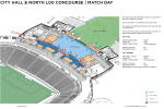
There’s images on the planning application 3000k square is significant bigger than the NYCFC there also town hall square a City square will have numerous F&B offerings on the bottom floor of the hotel building for City square occupants

The museum will make up for it, having no history it can be a small broom cupboard.I reckon the City store will be massive!
A couple A4 posters in that L3 link corridor.The museum will make up for it, having no history it can be a small broom cupboard.
Agree, I actually prefer the shop in Mary Ds at the minuteRegardless of the size of the new City store, I hope City and Puma review the future City merchandise offering. Bar the home and away kits, the vast majority of the merchandise is training gear. There's hardly any casual, urban, street clothing, which City used to do a lot of in the past, before City and Puma decided to go down the training gear route. Visiting the current City store is pretty boring, as it's predominantly stocked with City training gear.
Brilliant spot, looks like it pulled off onto the pavement just a moment or two later.Don’t know if anyone clocked it on Colin’s excellent video last night, but at around 15 minutes in, after viewing the women’s new build, there is a white van. It turns from Asda’s access road directly onto the Metrolink line. Hope they survived!!
The last time I opened my wallet for City merchRegardless of the size of the new City store, I hope City and Puma review the future City merchandise offering. Bar the home and away kits, the vast majority of the merchandise is training gear. There's hardly any casual, urban, street clothing, which City used to do a lot of in the past, before City and Puma decided to go down the training gear route. Visiting the current City store is pretty boring, as it's predominantly stocked with City training gear.

Janice.The last time I opened my wallet for City merch
View attachment 153027
