Our current badge. Why we are where we are today?

blue.behind.enemy.lines said:
Ive opened Pandora's box aha, what have I done!?

No, there may be something very sensible and realistic in it.

Seems to me it might be a bit like buying a house. There might be three or four that tick all the right boxes, but sometimes there is one in particular that you just have a special connection with for the tiniest or most inconsequential of reasons. Maybe the house is on Bell Lane, or Lee Drive, or Lake Street. Maybe the number of the house is 1 6, or 3 2. Maybe you go in the little lad's bedroom and he's got a City duvet and curtains. (Dunno about anyone else but if I found out I was buying a rag's house it would put me right off.) Sometimes, some little omens make you think 'this is the one'.

Course, it might have nothing to do with it at all, but I can just imagine a 'this was meant to be' feeling when the new owners realised the City badge looked like their national emblem.
 
What happens when we win the champions league then? Do they take 2 stars off the badge or add a smaller star above the existing ones?
 
The Kippaxkid said:
I always thought it was a Pheonix (to represent rising from the ashes). Ah well, Golden Eagle it is then.

It is a Phoenix. That's what the club stated when they redesigned the badge anyway.
 
Mugatu said:
The Kippaxkid said:
I always thought it was a Pheonix (to represent rising from the ashes). Ah well, Golden Eagle it is then.

It is a Phoenix. That's what the club stated when they redesigned the badge anyway.

It was redesigned by an Italian designer, they used an Eagle..very ancient symbol for roman legions Eagles.
As for a Phoenix, they rise in flames which there ain´t none on our badge.
 
I think you'll find it's a falcon as falconry is a big hobby in the UAE but they are similar, having said that if you really think HH based his business decisions on the badge your nuts lol.
 
Mugatu said:
The Kippaxkid said:
I always thought it was a Pheonix (to represent rising from the ashes). Ah well, Golden Eagle it is then.
It is a Phoenix. That's what the club stated when they redesigned the badge anyway.
In 1958 the first official crest was issued by the City, this included the often missed Helm and Mantling. It added in the Mantling a Golden Eagle on a Crown. The Eagle was included to represent the importance of the Aero Industry and the crowns represent the enlarging community of Manchester.
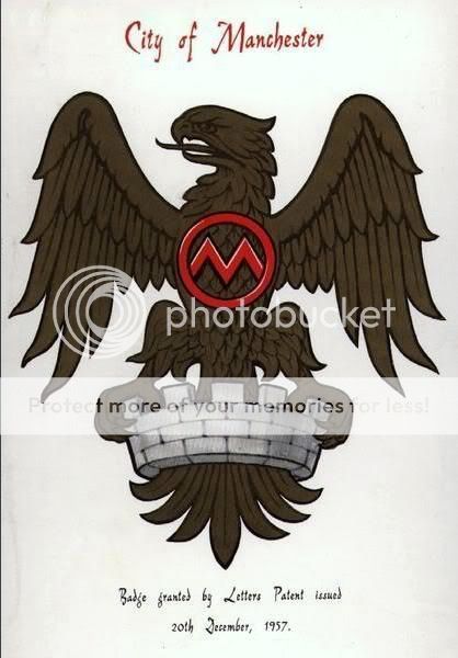
you'd better let the council know mate - I'm sure they could get some cash in to help us poor taxpayers by fining City for a serious heraldic offence

:-)
 
Mugatu said:
The Kippaxkid said:
I always thought it was a Pheonix (to represent rising from the ashes). Ah well, Golden Eagle it is then.

It is a Phoenix. That's what the club stated when they redesigned the badge anyway.


You do wonder where some people get their information from.


The "Eagle" is in reference to a crest the City of Manchester used in the 50's and represented the businesses in the area. The shield in the centre is lifted again from the current official crest of Manchester and features a ship and 3 white stripes.

The stripes represent the three main rivers of Manchester, the Irk, the Irwell and the Medlock.
The ship does NOT represent the Manchester Ship Canal as many believe, but Manchester's shipping trading links.

The phrase "superbia In proelio" translates as "pride in battle". It is a very recent phrase currently used by the club but not wholly accepted by supporters.

The three stars at the top are purely for a continental feel and represent nothing. They were added at a time when adding stars on club crests for recognition of sporting achievements was not officially endorsed by FIFA.
The stars have been roundly criticised by City fans and ridiculed by everyone else. Beleive me when i say 95% of Blues would happily get rid of them, not for the ridicule but because they have no connection to City or Manchester.

It is 'rumoured' rather, ehem, "comically" that the stars represent each decade that City have got without winning a trophy, however there are THREE stars, and at the time the crest was released it had been twenty years, not thirty.

It's also claimed the stars represent the fact City have won the European Cup Winners Cup, the League Title and the FA Cup at least once. Again this isn't correct.

And this:

Manchester City F.C introduced its first logo in 1970. The present club logo was adopted in 1997, as the previous logo could not be registered as a trademark. The logo is based on the arms of the city of Manchester, and has a shield ahead of a golden eagle. The shield depicts a ship in its upper half showing the Manchester Ship Canal, and three diagonal stripes in the lower half, for the city’s three rivers. The bottom of the badge shows the motto Superbia in Proelio, which means Pride in Battle in Latin. On top are three stars, which are only ornamental.
 
never liked the eagle badge, thought it was always just a marketing tool that doesnt really have anyhting to do with us, prefer the old badge
 
Blue Jew said:
You do wonder where some people get their information from.

Well I can see where you get yours from. We can all Google Wikipedia entries mate, me included.

But what I'm going off with the Phoenix reference is something I remember the club saying when the badge was changed... now maybe my memory fails me, I'm quite happy to be corrected. I just don't take everything on Wikipedia as gospel seeing as many football club entries are written by fans, I'd be happier to see something like a press release from the time, that's all.
 
Mugatu said:
Blue Jew said:
You do wonder where some people get their information from.

Well I can see where you get yours from. We can all Google Wikipedia entries mate, me included.

But what I'm going off with the Phoenix reference is something I remember the club saying when the badge was changed... now maybe my memory fails me, I'm quite happy to be corrected. I just don't take everything on Wikipedia as gospel seeing as many football club entries are written by fans, I'd be happier to see something like a press release from the time, that's all.
The Manchester City Council website is not written by blues...(or perhaps it is!)
<a class="postlink" href="http://www.manchester.gov.uk/info/448/archives_and_local_studies/4118/manchester_city_council_crest_in_to_the_future/1" onclick="window.open(this.href);return false;">http://www.manchester.gov.uk/info/448/a ... e_future/1</a>
 
johnny crossan said:
The Manchester City Council website is not written by blues...(or perhaps it is!)

But that's exactly my problem with Wiki, you never actually know who has written an entry.
 
Mugatu said:
Blue Jew said:
You do wonder where some people get their information from.

Well I can see where you get yours from. We can all Google Wikipedia entries mate, me included.

But what I'm going off with the Phoenix reference is something I remember the club saying when the badge was changed... now maybe my memory fails me, I'm quite happy to be corrected. I just don't take everything on Wikipedia as gospel seeing as many football club entries are written by fans, I'd be happier to see something like a press release from the time, that's all.


Wrong!!!! I agree with you re Wikipedia which is exactly why neither of those statements about the redsigned crest came from there. You can do all the research you want and each time the story comes out the same, it's an eagle. If you want to beleive something you vaguely remember from fifteen years ago instead of what is widely held to be the case that's your prerogative. In the abscence of a club statement from 1997, here's some more thoughts on the design from different sources:


The crest we see now was introduced in 1997. The reasons for this seem to vary a little, and it would be good to see if anybody can shed some light on the actual reason? Anyway, back to the badge. It is based on the arms of the city, and consists of the shield in front of a golden eagle. The shield, in detail, features a ship on its upper half representing the Manchester ship canal, and three diagonal stripes in the lower half, for the city’s three rivers. The bottom of the badge holds the motto ‘Superbia in Proelio’ (the ‘correct’ spelling of this seems to be hotly debated) , and if my beginner’s Latin serves me well, it translates to ‘Pride in Battle’.

And this:

My first gripe is that the eagle looks too much like the back of US quarter, or worse, a Nazi symbol. According to the original press release, the eagle was "taken from the Badge of the City of Manchester, dating from 1957". I'm not sure which badge this refers to, as Manchester has been using the same coat of arms since 1842 (pictured lower down) and that certainly doesn't contain an eagle.
 
Blue Jew said:
Mugatu said:
Blue Jew said:
You do wonder where some people get their information from.

Well I can see where you get yours from. We can all Google Wikipedia entries mate, me included.

But what I'm going off with the Phoenix reference is something I remember the club saying when the badge was changed... now maybe my memory fails me, I'm quite happy to be corrected. I just don't take everything on Wikipedia as gospel seeing as many football club entries are written by fans, I'd be happier to see something like a press release from the time, that's all.


Wrong!!!! I agree with you re Wikipedia which is exactly why neither of those statements about the redsigned crest came from there. You can do all the research you want and each time the story comes out the same, it's an eagle. If you want to beleive something you vaguely remember from fifteen years ago instead of what is widely held to be the case that's your prerogative. In the abscence of a club statement from 1997, here's some more thoughts on the design from different sources:


The crest we see now was introduced in 1997. The reasons for this seem to vary a little, and it would be good to see if anybody can shed some light on the actual reason? Anyway, back to the badge. It is based on the arms of the city, and consists of the shield in front of a golden eagle. The shield, in detail, features a ship on its upper half representing the Manchester ship canal, and three diagonal stripes in the lower half, for the city’s three rivers. The bottom of the badge holds the motto ‘Superbia in Proelio’ (the ‘correct’ spelling of this seems to be hotly debated) , and if my beginner’s Latin serves me well, it translates to ‘Pride in Battle’.

And this:

My first gripe is that the eagle looks too much like the back of US quarter, or worse, a Nazi symbol. According to the original press release, the eagle was "taken from the Badge of the City of Manchester, dating from 1957". I'm not sure which badge this refers to, as Manchester has been using the same coat of arms since 1842 (pictured lower down) and that certainly doesn't contain an eagle.
have you tried reading this thread from the start ?
manchestereagle.jpg

- you'll never know what you might find!
 
johnny crossan said:
Blue Jew said:
Mugatu said:
Well I can see where you get yours from. We can all Google Wikipedia entries mate, me included.

But what I'm going off with the Phoenix reference is something I remember the club saying when the badge was changed... now maybe my memory fails me, I'm quite happy to be corrected. I just don't take everything on Wikipedia as gospel seeing as many football club entries are written by fans, I'd be happier to see something like a press release from the time, that's all.


Wrong!!!! I agree with you re Wikipedia which is exactly why neither of those statements about the redsigned crest came from there. You can do all the research you want and each time the story comes out the same, it's an eagle. If you want to beleive something you vaguely remember from fifteen years ago instead of what is widely held to be the case that's your prerogative. In the abscence of a club statement from 1997, here's some more thoughts on the design from different sources:


The crest we see now was introduced in 1997. The reasons for this seem to vary a little, and it would be good to see if anybody can shed some light on the actual reason? Anyway, back to the badge. It is based on the arms of the city, and consists of the shield in front of a golden eagle. The shield, in detail, features a ship on its upper half representing the Manchester ship canal, and three diagonal stripes in the lower half, for the city’s three rivers. The bottom of the badge holds the motto ‘Superbia in Proelio’ (the ‘correct’ spelling of this seems to be hotly debated) , and if my beginner’s Latin serves me well, it translates to ‘Pride in Battle’.

And this:

My first gripe is that the eagle looks too much like the back of US quarter, or worse, a Nazi symbol. According to the original press release, the eagle was "taken from the Badge of the City of Manchester, dating from 1957". I'm not sure which badge this refers to, as Manchester has been using the same coat of arms since 1842 (pictured lower down) and that certainly doesn't contain an eagle.
have you tried reading this thread from the start ?
manchestereagle.jpg

- you'll never know what you might find!


That was a quote from the purelymancity blog, not my words. Have you tried reading my posts in full? Touché
 
Seek and ye shall find.


Manchester City Football Club would like to announce that they have commissioned a new crest to replace the round badge that has only existed since 1974.
The new club crest is based on elements from the original "Arms of the City of Manchester", the crest which is still used by Manchester City PLC today and worn on the team shirt for all Wembley occasions. It retains the original shield set against an eagle taken from the Badge of the City of Manchester, dating from 1957, also originally found on the City of Manchester Crest, on the ribbon flowing from the knight's helmet. Below the shield is the new club motto "Superbia In Proelio", a latin phrase translating to "Pride in Battle". The three stars above the eagle constitute a design element that relate a more continental feel to the design.
Manchester City see this as a progressive, forward looking move, to take the club into the next millennium. In previous years an unsatisfactory situation had developed at Manchester City regarding the licensing out of the round badge on an ad hoc basis which has lead to a number of problems with counterfeit goods. This we felt was leading to a devaluing of the Manchester City brand, and consequently its badge in both the modern market and in football.
Re-alignment of the Club's branding with the new crest, which still has much in common with the original ethos of the traditional crest, was the only way of safeguarding the Club brand on the modern market and bringing the Club up to date with its own image in an increasingly modern world.
We have already made massive strides in only a very short time in addressing the commercial problems of the past. The Kippax Stand, Merchandise Department and excellent Corporate Entertainment facilities are all symptomatic of a fresh outlook at Manchester City. The launch of a new crest is seen as a continuation of our forward looking regime.
Moving on and forward is also how this club see the new deal that we have struck with the UK Division of Italian sportswear giants, Kappa, to manufacture and produce the team kit and replica leisurewear for the next three years, the terms of which are to remain confidential.
In tandem with the launch of the new crest, Manchester City see the new deal with Kappa as a positive and exciting step forward. After some 60 years with our previous sponsor, the club felt that a new brand and new relationships were needed to take Manchester City into the next century and beyond. The time was right to lead the club into the new millennium, with a fresh outlook matched only by new and real aspirations for success both on and off the pitch.
Kappa represent not only the highest quality technical performance wear available for the modern athlete, but they are also one of the most fashion aware brands in the modern market. In the area of soccer, Kappa are well established as a sportswear manufacturer with a tradition grounded in sporting excellence. They currently are manufacturing sponsors of European soccer giants, Juventus, Barcelona and Red Star Belgrade. The fact that Kappa are at the forefront of the high quality sports fashion market was also an important consideration for Manchester City, as one of the first football clubs to pioneer a fashion conscious merchandise division.
Manchester City, a football club now firmly on the move themselves, believe that this new deal represents a major coup for both the City and the game. We fully expect to forge a dynamic and forward looking partnership to take both parties into the new millennium.
The dynamic new ethos at the club is no more in evidence than in the striking new kit design featuring the new club crest. The new colour of the home shirt, laser blue, has more in common with the City strips of the Bell, Lee and Summerbee era than the more recent pale blue. More modern and up to date but still reflecting past glory, the club see this as another major step forward, while retaining the utmost respect for the past.


Mugatu, you have been owned!
 

Don't have an account? Register now and see fewer ads!

SIGN UP
Back
Top