You are using an out of date browser. It may not display this or other websites correctly.
You should upgrade or use an alternative browser.
You should upgrade or use an alternative browser.
City’s New Kits
- Thread starter PannickAtTheDisco
- Start date
kun
Well-Known Member
A57 the snake
Well-Known Member
- Joined
- 5 Aug 2020
- Messages
- 2,557
- Team supported
- Mcfc
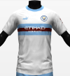
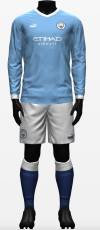
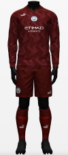
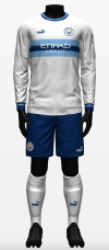
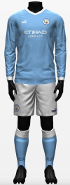
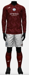
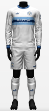
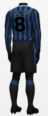
Absolutely Great work kun .View attachment 65907View attachment 65916View attachment 65915
This would pretty much be my choice of colours for each kit
The third kit's shorts and socks are home alternates and vice versa. Away would have white alternative shorts and socks with maroon puma logo.
Well done to you, Hope puma have peep on from time and sign you up !!!
HelloCity
Well-Known Member
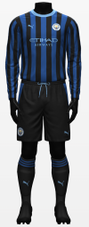
The sponsor isn’t visible enough. Design won’t work with text there.
kun
Well-Known Member
It looks perfectly visible on the navy/sky blue bands. Absolutely no reason that design won’t work.The sponsor isn’t visible enough. Design won’t work with text there.
It looks bad with the maroon imo but I was replying to someone who asked for that.
citymad
Well-Known Member
Now Puma, how hard is that ? 3 nice kits. I would change the home kit to sky blue socks and the away to white shorts. Almost 3 perfect kits.View attachment 65907View attachment 65916View attachment 65915
This would pretty much be my choice of colours for each kit
The third kit's shorts and socks are home alternates and vice versa. Away would have white alternative shorts and socks with maroon puma logo.
kun
Well-Known Member
HelloCity
Well-Known Member
Home is the a plain blue shirt design which I actually like, but you can’t have that every year like some seem to think.
Away one looks near identical to this seasons goalkeeper kit.
White one looks a bit tin pot. Like an Oldham away kit or something.
Away one looks near identical to this seasons goalkeeper kit.
White one looks a bit tin pot. Like an Oldham away kit or something.
citymad
Well-Known Member
love themHere you go
View attachment 65924View attachment 65925
All 3 look good with white shorts but logistically I think they need to be different.
hilts
Well-Known Member
The home and 3rd are mintView attachment 65907View attachment 65916View attachment 65915
This would pretty much be my choice of colours for each kit
The third kit's shorts and socks are home alternates and vice versa. Away would have white alternative shorts and socks with maroon puma logo.
RiversideBlue
Well-Known Member
- Joined
- 19 Feb 2020
- Messages
- 2,887
- Team supported
- Man city
Any chance you couls stick maroom shorts on the home kit. Lets see how it would look as the women's kit.
citymad
Well-Known Member
Are are you asking for more room in the shorts ? I would get yourself on a diet.Any chance you couls stick maroom shorts on the home kit. Lets see how it would look as the women's kit.
RiversideBlue
Well-Known Member
- Joined
- 19 Feb 2020
- Messages
- 2,887
- Team supported
- Man city
Nah, the women won't be wearing white shorts so wondered what it would look like with marron shorts instead. Thats allAre are you asking for more room in the shorts ? I would get yourself on a diet.
gouldybob
Well-Known Member
kun
Well-Known Member
100% agree, the home kit is the hardest to design with changes needed every season (I mean, we could go back to not changing every year but I doubt it - it seems to be going in the other direction if anything). I think this one is different enough from this years to sell well - it's not too dissimilar from the rumoured home.Home is the a plain blue shirt design which I actually like, but you can’t have that every year like some seem to think.
I dunno I thought it was more like the 1990 away kit but fair.Away one looks near identical to this seasons goalkeeper kit.
Again that's fair I can kind of see that now you say it but it still looks more like a city version of Inter or Sampdoria to me.White one looks a bit tin pot. Like an Oldham away kit or something.
kun
Well-Known Member
If you're talking about the kit I posted, that would have navy shorts (the one's from the third kit) for the women.Any chance you couls stick maroom shorts on the home kit. Lets see how it would look as the women's kit.
Here they are, with maroon (away shorts) as comparison.
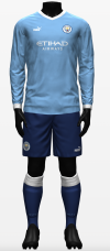
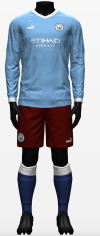
This would essentially be the home and alternative for the women's team.
Last edited:
threespires
Well-Known Member
- Joined
- 7 Aug 2019
- Messages
- 8,540
- Team supported
- City
Indeed.
One of the all-time greatest footy kits, Inter’s 1965 European Cup final kit
View attachment 65882
Yet Allison tried to be a copy of the team with red in their kit, when our biggest rivals wear red. Never understood that and never will, and I’ll never like our red kits.
That Inter kit is a thing of beauty. I used to be a fan of the red and black stripes out of fondness for some of our great players who wore it in the late 60s early 70s but these days I'm in agreement with you. The white, sky and dark navy blue combination is so stylish, striking and true to our core colours that aside from the occasional maroon kit it should be all we ever need.
Sadly, 10 year olds who want kits that look like they've just puked up on them will disagree and that's who puma listen to I suspect.
citymad
Well-Known Member
That is a superb looking shirt. Would look mint with jeans and some nice trainers.
Puma get it done.
FantasyIreland
Well-Known Member
- Joined
- 29 Oct 2008
- Messages
- 64,698
The only time a football shirt looks mint is when its paired with associated shorts and socks and worn on a football pitch.That is a superb looking shirt. Would look mint with jeans and some nice trainers.
Puma get it done.
I agree,it would look very well under those circumstances.

