City’s New Kits

The Nike 2017-2018 home kit. For the likes of FOCs like me this clean minimalistic combination of the sacred sky blue and white with a splash of maroon is kit perfection. To drive seasonal sales the manufacturers would argue more variation is needed, but maybe 1 in 3 years could be a minimal design with a twist... just sayin ...

View attachment 173411

Tbf, this season's home shirt is basically that one but with a sash.
 
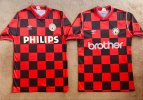
1986/87 First Division and 1987/88 Second Division chess board style away shirts which featured over two campaigns.

The 86/87 style continued into the 87/88 campaign featuring the new BROTHER sponsor and the addition of the single white strip to the shoulders & arms.

View attachment 174256
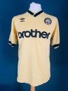
I liked that kit.
 
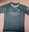
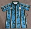
Well thank god for AI. How else would we have come up with such an innovative design...


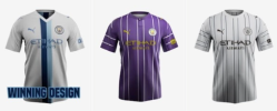
Any of these 3 I would've been happy with so no complaints from here. (my vote was for the purple but it is what it is)
1762780981987.png
 
Any of these 3 I would've been happy with so no complaints from here. (my vote was for the purple but it is what it is)
View attachment 174550
I think I too voted for the winning design, but I doubt this is what Puma had in mind when asking the public to create AI-Generated kits. The possibilities may be endless, but that doesn't mean anyone likes them, or even wants them...
 

Don't have an account? Register now and see fewer ads!

SIGN UP
Back
Top