Umedaman
Active Member
Manchester1894 said:

Have the eagle take a dump and something resembling old trafford, and we have ourself a new crest boys!
Manchester1894 said:

GeekinGav said:dobobobo said:GeekinGav said:yes i did.... i could dig out all the ones i did for your wonderment (amusement)?
Very nice.
On page four, but you removed it from your post.
think i did one with the stars on the ribbon ... i'll check my hard drives
they were on imageshack but lost the password ... whoops. use Photobucket now for random guff
edit* ..... collection of the ones i've done and pllayed about with over the last 2 years or so ....

This!dobobobo said:GeekinGav said:dobobobo said:Very nice.
On page four, but you removed it from your post.
think i did one with the stars on the ribbon ... i'll check my hard drives
they were on imageshack but lost the password ... whoops. use Photobucket now for random guff
edit* ..... collection of the ones i've done and pllayed about with over the last 2 years or so ....
The bottom three badges for me. Those three would be brilliant for display in all of the hospitality areas. Bit of a tweak and I think they would work great as an icon for each of the supporters club (club name on an individual bage).
Great work!
Possible tattoo idea I think...spanishblue said:
dobobobo said:GeekinGav said:dobobobo said:Very nice.
On page four, but you removed it from your post.
think i did one with the stars on the ribbon ... i'll check my hard drives
they were on imageshack but lost the password ... whoops. use Photobucket now for random guff
edit* ..... collection of the ones i've done and pllayed about with over the last 2 years or so ....
The bottom three badges for me. Those three would be brilliant for display in all of the hospitality areas. Bit of a tweak and I think they would work great as an icon for each of the supporters club (club name on an individual bage).
Great work!

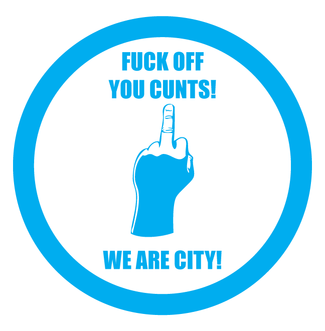
Rascal said:Can someone do a badge that says
"Fuck off you cunts, were City"
Ta
GeekinGav said:dobobobo said:GeekinGav said:think i did one with the stars on the ribbon ... i'll check my hard drives
they were on imageshack but lost the password ... whoops. use Photobucket now for random guff
edit* ..... collection of the ones i've done and pllayed about with over the last 2 years or so ....
The bottom three badges for me. Those three would be brilliant for display in all of the hospitality areas. Bit of a tweak and I think they would work great as an icon for each of the supporters club (club name on an individual bage).
Great work!
blue banks said:Blootoof said:Manchester1894 said:
Hold on a minute. Has that been Photoshop'd?
Hmm, I thought so too at first but if you zoom right in, it's profesh.
dobobobo said:GeekinGav said:dobobobo said:
Exactly that! I've not been a member for years but I still have my supporters keyring (and still use) with the current crest on it. If your crest was on it, it would make it a lot more treasurable because it is individual and a timeless design.

GeekinGav said:dobobobo said:
Exactly that! I've not been a member for years but I still have my supporters keyring (and still use) with the current crest on it. If your crest was on it, it would make it a lot more treasurable because it is individual and a timeless design.
City already own it technically, its modified from the NYCFC crest, fused with elements of City past and present.
warpig said:I used to be pro-return to the old badge, but as we have won everything in my life time with the new one, I'm happy for it to stay as it is. I don't know about other people, but personally it has really grown on me the last couple of seasons. the same as the ethihad, is really starting to feel like 'home' now.
shaiomarali said:GeekinGav said:dobobobo said:Exactly that! I've not been a member for years but I still have my supporters keyring (and still use) with the current crest on it. If your crest was on it, it would make it a lot more treasurable because it is individual and a timeless design.
City already own it technically, its modified from the NYCFC crest, fused with elements of City past and present.
would be great if MHFC gets a blue makeover.