A club crest we can all agree on..

If I had the time I'd jump in to the design mix, I would, as GeekGav has done a great job and really inspired everyone to contribute.

I wonder, though, if it would look better without the shield framing inside the ring. I know it harkens back to one of the traditional badges but to me it always looked a bit awkward. It could be interesting to just have a simple half and half, ship above, rivers below. Very simple and distinctive.

I do think the dark blue ring with white text and sky blue top half, maroon bottom half is the best colour scheme, both for fidelity, and for the way in which it could be integrated with all kit and apparel. The gold is nice but looks a bit out of place.

Probably alone there, though.
 
SebastianBlue said:
If I had the time I'd jump in to the design mix, I would, as GeekGav has done a great job and really inspired everyone to contribute.

I wonder, though, if it would look better without the shield framing inside the ring. I know it harkens back to one of the traditional badges but to me it always looked a bit awkward. It could be interesting to just have a simple half and half, ship above, rivers below. Very simple and distinctive.

I do think the dark blue ring with white text and sky blue top half, maroon bottom half is the best colour scheme, but for fidelity, and for the way in which it could integrated with all kit and apparel. The good is nice but looks a bit out of place.

Probably alone there, though.
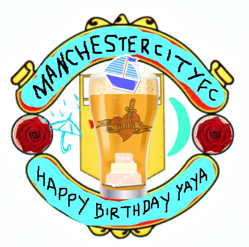
Not alone mate, totally agree.

Take the shield design on the current badge, lose the black band across it with MCFC as this is around the edge, and just fill in the circle with this design.
 
citynewbad.jpg
 
SebastianBlue said:
If I had the time I'd jump in to the design mix, I would, as GeekGav has done a great job and really inspired everyone to contribute.

I wonder, though, if it would look better without the shield framing inside the ring. I know it harkens back to one of the traditional badges but to me it always looked a bit awkward. It could be interesting to just have a simple half and half, ship above, rivers below. Very simple and distinctive.

I do think the dark blue ring with white text and sky blue top half, maroon bottom half is the best colour scheme, but for fidelity, and for the way in which it could integrated with all kit and apparel. The good is nice but looks a bit out of place.

Probably alone there, though.

Someone has done the half and half without the shield earlier on in the thread, think it was Zabbasstuntdouble? He's a great designer, but personally I prefer the shield included in GeekGavs design. The only problem is it is similar to FCUM's badge.

I think with NYCFC's and Melbourne's badges being so similar with the round shape, if we were ever going to go back to having a roundel which the majority of people seem to be in favour of, now is the time to do it.
 
yeah I'm ZabbaStuntDouble ... had a username change stop having different username's everywhere.
 
GeekinGav said:
yeah I'm ZabbaStuntDouble ... had a username change stop having different username's everywhere.

Haha! Well I guess I liked your design better than your design! :-)

Great work though mate
 
GeekinGav said:
yeah I'm ZabbaStuntDouble ... had a username change stop having different username's everywhere.

Do you still have the half/half effort saved? Or point me to the thread/page where it resides?

Thanks mate!
 
Shaelumstash said:
GeekinGav said:
yeah I'm ZabbaStuntDouble ... had a username change stop having different username's everywhere.

Haha! Well I guess I liked your design better than your design! :-)

Great work though mate

Would love to see your version of the roundel with the shield inside using the same colours as the NYCFC badge, if you have time.
 
Shaelumstash said:
SebastianBlue said:
If I had the time I'd jump in to the design mix, I would, as GeekGav has done a great job and really inspired everyone to contribute.

I wonder, though, if it would look better without the shield framing inside the ring. I know it harkens back to one of the traditional badges but to me it always looked a bit awkward. It could be interesting to just have a simple half and half, ship above, rivers below. Very simple and distinctive.

I do think the dark blue ring with white text and sky blue top half, maroon bottom half is the best colour scheme, but for fidelity, and for the way in which it could integrated with all kit and apparel. The good is nice but looks a bit out of place.

Probably alone there, though.

Someone has done the half and half without the shield earlier on in the thread, think it was Zabbasstuntdouble? He's a great designer, but personally I prefer the shield included in GeekGavs design. The only problem is it is similar to FCUM's badge.

I think with NYCFC's and Melbourne's badges being so similar with the round shape, if we were ever going to go back to having a roundel which the majority of people seem to be in favour of, now is the time to do it.

Sorry mate but City had that badge 30+ years before FCUM did.

image.jpg


Also completely disagree with sebastianblue and his comment about losing the inner shield. The boat and 3 rivers look like they've been squished into a circle shape without it and it reminds me of watching an old 4:3 TV show stretched out on a 16:9 widescreen display.
 

Don't have an account? Register now and see fewer ads!

SIGN UP
Back
Top
  AdBlock Detected
Bluemoon relies on advertising to pay our hosting fees. Please support the site by disabling your ad blocking software to help keep the forum sustainable. Thanks.