sergiosboot
Well-Known Member
- Joined
- 4 Feb 2014
- Messages
- 66
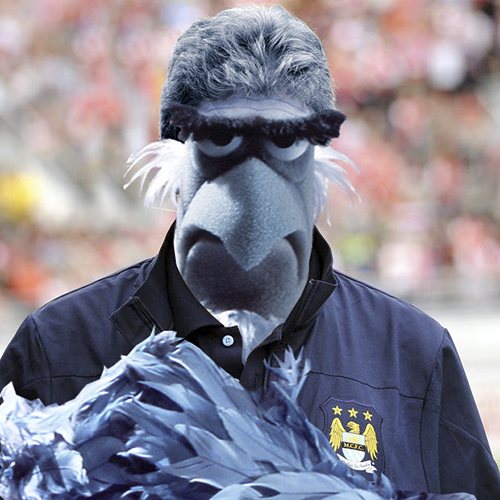
And possibly wearing a Burberry capBert Trautmann's Parachute said:How about a pigeon stood in the pouring rain, with a slight cough?
And possibly wearing a Burberry capBert Trautmann's Parachute said:How about a pigeon stood in the pouring rain, with a slight cough?
djimaldblue said:It's amazing how some people who think they are clever with photoshop can make such a cock up of our badge.
I sometimes think half of them on here don't have a clue about our history with the sh1t they come out with!


I thought exactly the same thing when I saw the Melbourne badge. Our owners do seem to like the idea of a consistent 'brand', so I wouldn't be at all surprised to see a round badge with "Manchester City FC" around the outside, this time next year.SteWadda said:New York have a round one, now Melbourne have a round one. As we are part of one group does it not make sense to give us a round in a similar style to theirs.
Hopefully, I really don't like the current one.Falastur said:When City put out the survey a year ago about the "Cityzen" scheme, one of the things they asked people to say whether they wanted to have the right to vote on was things like changing the club badge. They actually used that as a specific example. I reckon a change to the club badge is more likely to happen than not right now.
flinty1975 said:Doesn't Eddie Phillips own the rights to the round badge and we will have to pay rights to him to use it? Another shady Swales deal(Apologies if this has already been mentioned)
Mëtal Bikër said:
I have to say, i do like this crest.
Has the rose, has the date, is in the circular style, retains the shield, no crappy latin motto. Just remove the stars on the black stripe.
Me likey!

CelesteItis said:Mëtal Bikër said:
I have to say, i do like this crest.
Has the rose, has the date, is in the circular style, retains the shield, no crappy latin motto. Just remove the stars on the black stripe.
Me likey!
Is this the badge for a new Adidas kit?
ManCityX said:I dare anyone to disagree with this. An absolute thing of beauty.