blueparrot
Well-Known Member
- Joined
- 7 Jun 2012
- Messages
- 33,411
As I‘ve saying once seen on a player it’s all good.
Me too.Is this the only time we've had three blue kits?
I quite like them all, btw.
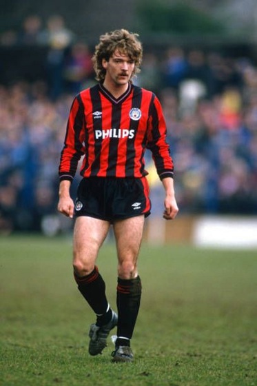
our best ever away kit.....!!!!!!!!!!!And this should be the away kit..
Yep. Unique, smart and relevant. The bastards!Me too.
At least Puma are trying to make more of us being MANCHESTER City rather than Umbro and Nike who spent the mid part of last decade thinking we were called FC Moon City. Umbro were even from Manchester and didn’t make anything of the link after 2009-10’s bee kit.
I hated all that Blue Moon sound waves and print of the surface of the Moon on the kits. Hated it!
For too long we didn’t push the Mancunian element of the club. One of the greatest cities in the world and it was like the club were ashamed of coming from here.
Still need to get rid of the daft aliens as mascots and a few other things; but finally the club are showing they are proud to come from Manchester!
So far Puma have done a Madchester kit, and these look to Manchester again with a mosaic kit, a kit with the MOSI structure on and something with a nod to textiles.
Plus they’re not giving us a template that 30 other teams all have like Nike. There was no individuality about our Nike kits.
Not forgetting Puma made the nicest shirt in our entire history with the 125 YEARS shirt last year too.
I’d have a spice head as mascot.Yep. Unique, smart and relevant. The bastards!
I agree about the mascots too. What would you have? Bees? Navvies? Atoms? Rough sleepers...? How about Bertie & Betty Magoo?
-)
Can anyone name a worse set of kits in the history of any club?
Been asked to provide feedback on all 3 shirts.
Only skimmed the comments here but looks to be mostly positive so will pass that on.


Get the Gallagher's to stroll round the pitch, Liam at the away end and Noel at the other they don’t even have to speak to each just get the crowd riled upYep. Unique, smart and relevant. The bastards!
I agree about the mascots too. What would you have? Bees? Navvies? Atoms? Rough sleepers...? How about Bertie & Betty Magoo?
-)
our best ever away kit.....!!!!!!!!!!!
Yep and this one, would have been neck and neck for best everhttps://www.ebay.co.uk/i/3334734369...mM05NGTVSkBQUpUEcqBP8sgTRrIJPs3BoCl3wQAvD_BwEThis won’t be beaten imo

Me too.
At least Puma are trying to make more of us being MANCHESTER City rather than Umbro and Nike who spent the mid part of last decade thinking we were called FC Moon City. Umbro were even from Manchester and didn’t make anything of the link after 2009-10’s bee kit.
I hated all that Blue Moon sound waves and print of the surface of the Moon on the kits. Hated it!
For too long we didn’t push the Mancunian element of the club. One of the greatest cities in the world and it was like the club were ashamed of coming from here.
Still need to get rid of the daft aliens as mascots and a few other things; but finally the club are showing they are proud to come from Manchester!
So far Puma have done a Madchester kit, and these look to Manchester again with a mosaic kit, a kit with the MOSI structure on and something with a nod to textiles.
Plus they’re not giving us a template that 30 other teams all have like Nike. There was no individuality about our Nike kits.
Not forgetting Puma made the nicest shirt in our entire history with the 125 YEARS shirt last year too.