City’s New Kits - 2021/22

Ha ha ha... brings to mind when I went to see Fleetwood Mac on their last UK tour. I've never seen so many old men dressed up as Mick Fleetwood, complete with ponytails. Hundreds of them. I was waiting for Matthew Kelly to introduce them individually... "tonight Matthew, I'm going to be.... an absolute bell end"

I was quite happy that I opted to go in my Stevie Nicks outfit.
That would be the equivalent of wearing a full kit, with a name on the back, dyed hair like Foden, shin pads and football boots.

Wearing a city top to a City match is no different than wearing a rumours t-shirt to a Fleetwood Mac gig.
 
OK, think I've figured it out - why the downward trajectory each year.
Not just the designer's fault. Typically a designer will rustle up a few very different options. If the client doesn't like them (highly likely given what we've seen as the final output in recent years), a re-brief batch are often produced taking into account the feedback.

If time is critical, then not uncommon for a shortlist of two - one of which based on the most liked one, will have the designer's best efforts and attentions put into it, and which will probably be pretty damn cool. The other will be a quick and dirty aberration. As little time spent on it as possible, as the designer is just looking to 'help' a quick decision by forcing an obvious choice.
Problem is, the numpty deciding at our end keeps choosing the deliberate dud.

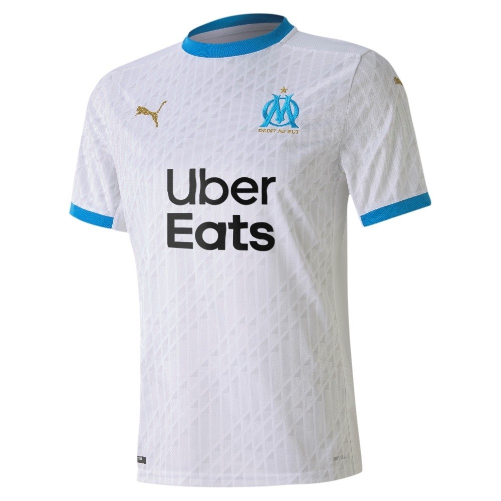
If only they could take notice of existing elegance they have floating around them elsewhere, we might get something as simple and beautiful as this (reverse the colours and you're there) for minimal extra effort.
om-h-jsy-2020.jpg

But no, we go all in for 'unique' and get this:
1*Y3ZibsBlrVfWspy9HLANPQ.jpeg
 
Having got a bit more used to it the H Top it isn’t bad but is, well —Meh. We’ve definitely had worse than this. The colour is fine and I prefer the white Etihad bit and I’m all in with the 00:00 pattern (if it covered the whole shirt) but the different collar situation on the player’s and Fans version is abysmal -and they both look totally shit.
 
I agree with this 100%
Not been a huge fan of their home kits (I think the new one is the best of the three, excluding the 125 years which is a stunner). I think the reason for that is their use of experimentation, which works better on away kits than home. Hacienda kit was gorgeous. The Paisley pattern top last year and this years leaked white number are also top drawer.
I think the problem is we sometimes fall for the bollocks they spout as though they've been pouring over mood boards and researching the shit out of us... puts me in mind of the Rags kit about ten years back... it was like a check/plaid pattern and Nike came out with some bullshit about it representing the cotton industry... great, only Trafford only had about 2-3 cotton mills!!!
To me (Umbro aside) it seems they put the bare minimum of effort in tbh... I'd love the club to put one of their videos out (website) showing/explaining the process of picking the kit... seeing the other options that were on the table etc.
 

Don't have an account? Register now and see fewer ads!

SIGN UP
Back
Top
  AdBlock Detected
Bluemoon relies on advertising to pay our hosting fees. Please support the site by disabling your ad blocking software to help keep the forum sustainable. Thanks.