Uncle Wally One Ball
Well-Known Member
Even the Mona Lisa is getting it nowSomething needs adding to that staggeringly boring overrated painting.
Even the Mona Lisa is getting it nowSomething needs adding to that staggeringly boring overrated painting.
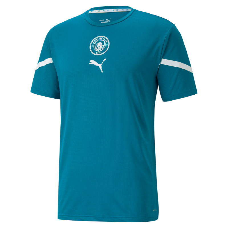
Training tops are always better than the kits because they don’t have a sponsor on them and they can have a pattern on them all the way round (whereas kits aren’t allowed patterns on the back because of shirt numbers).Some of the helpers were wearing the ‘turquoise’ (it’s teal) coloured pre match shirt yesterday, thought it looked quite smart and better than both away shirts.

Manchester City Pre-Match Shirt
The official Pre-match Collection consists of technical and stylish products worn by your favorite players while warming up before kick-off on match days.shop.mancity.com
WTF is Street Soccer Kit now? We're moving to 4-5 kits a season, isn't it? With that eSports gamers shirt last year and that BALR fashion brand one ... we already had 5 last season I think ...
for our European Super League team?
Make the badge coloured and that’s a classic.
My problem with this third shirt is that a lot of people (me included) don't really recognise us as Man City. It's one of those irrational irks of mine. It has always been City or Manchester City if talking to people from afar. The powers that be rebranded the website to www.mancity.com and now this. As said before, though still poor, just City on the front would be much better.
