The Crypt Kickers said tell them Boris sent youCity have got a goth kit
We'll run out to the Sisters of Mercy
You are using an out of date browser. It may not display this or other websites correctly.
You should upgrade or use an alternative browser.
You should upgrade or use an alternative browser.
City’s New Kits
- Thread starter PannickAtTheDisco
- Start date
I've liked 4 out of Puma's 24 kits for us.
I've quite disliked 8m the rest were neither here nor there.
Spot on.Puma homes, my rankings:
'23 (treble centre badge)
'24 (v neck stripes)
'22 (title winning kit v Villa at home)
'26 (this year's sash)
'21 (mosaic)
'25 (area code farce)
'20 (purple monstrosity)
Most of the aways have been good too.
Maroon and Paisley third shirts very good too.
citymad
Well-Known Member
That’s lovely! Love a black kit, I might shell out for the new one.Always thought this shirt deserved more love. Really smart I think.


Last edited:
BlueMonkey79
Well-Known Member
The Nike 13/14 black and gold was a belter IMOFucking lovely that! Love a black kit, I might shell out for the new one.
Wore it that much the sponsor started peeling off
Attachments

hallsteve62
Well-Known Member
- Joined
- 18 Oct 2012
- Messages
- 938
Perhaps we can start calling the Etihad the 'Temple of Love' ; )City have got a goth kit
We'll run out to the Sisters of Mercy
BlueMonkey79
Well-Known Member
Had mine 2 months lol
Obviously not genuine Puma, but for less than 20 notes i cant moan..
Attachments
plattlanebenches
Well-Known Member
- Joined
- 10 Jun 2018
- Messages
- 1,509
Wonder if we’ll do the haka before kick off.
Kippax Street 1880
Well-Known Member
- Joined
- 22 Mar 2010
- Messages
- 7,949
The Nike 13/14 black and gold was a belter IMO
Wore it that much the sponsor started peeling off
Remember that goal Sergio is celebrating left foot rocket past Cech before he could raise an arm
City Hobgoblin
Well-Known Member
- Joined
- 22 Feb 2014
- Messages
- 5,200
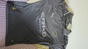
But nobody will be able to see the players due to the excessive use of dry iceCity have got a goth kit
We'll run out to the Sisters of Mercy
So the club are selling the normal away kit and the authentic away kit.
Rather than just being a more sporty material this time, it actually has a slightly different design.
So the normal kit for £85 won't even look exactly like the kit the players are playing in.
So the club are essentially selling a fake £85 shirt.
How on Earth is that allowed?
Rather than just being a more sporty material this time, it actually has a slightly different design.
So the normal kit for £85 won't even look exactly like the kit the players are playing in.
So the club are essentially selling a fake £85 shirt.
How on Earth is that allowed?
Blueknows
Well-Known Member
Thats a good replica especially for less than £20Had mine 2 months lol
Obviously not genuine Puma, but for less than 20 notes i cant moan..
Cellarite
Well-Known Member
- Joined
- 12 Jan 2010
- Messages
- 26,833
- Team supported
- Manchester City
I can't resist stuff like this when kits are lined up, so here we go...
2019/20
Home - Controversial use of purple that pissed off many a bluemooner but I honestly didn't mind it. It could've been done better than what was basically a puma template at that time. 6/10.
Hacienda away - I loved this and it was fresh and interesting with a nod to Manchester culture. 9/10.
Third - I absolutely despised this along with loads of blues. My youngest two liked it and people say time and time again that the kids are who these are aimed at. Still, it just didn't look like a City kit, more like a Barcelona kit your kids get when you go on holiday. 4/10.
2020/21
Home - not really rated too much on here but I didn't mind it. Based in the 1987-89 kit which was my first City home kit so gave me a bit of nostalgia. 7/10.
Away - a decent kit but didn't expect another black kit immediately after the Hacienda effort. 7/10.
Third - Another interesting idea and looked decent as a kit with the navy shorts. 6/10.
2021/22
Home - a pretty uninspiring effort and to add to my dislike, an all sky blue affair which I simply don't like. 5/10.
Away - a good effort. I'd prefer the sponsors and badges to be City colours like sky and navy blue but this was a good looking shirt. 7/10.
Third - fucking horrendous. At the time, I thought this template shite was the worst City kit I'd ever see but we'll get to that. An all navy third can and has been done well, I'm thinking 2010/11 but this isn't it. Put the fucking badge in the shirt instead of the name of the team and for fuck's sake, don't call us Man City. 3/10.
2022/23
Home - Amazing. The only small change I would make would be to remove the puma logo from under the badge to make it look less busy but an inspiring kit that became an instant classic. 10/10.
Away - Not bad at all. I'm one of those who doesn't freak out at the thought of red on an away kit and like the tradition of having red and black aways from time to time. Could've been better had the backs and sleeves carried on the stripes but leagues and kit manufacturers love to find new and inventive ways of fucking up shirts. 6/10.
Third - I don't mind this because we know a neon kit is always just around the corner. 6/10.
2023/24
Home - pretty uninspiring and standard fayre again for the home kit. I get that it's a throw back to the first year of the Etihad but it's just a bit weak looking to me. 5/10.
Away - a really good effort but once again, I'd just like the details to be colours more City related. Maroon logos and sponsors and sky blue collar and cuffs and this could've been one of the greats. 7/10.
Third - Another one for the whipper-snappers. It didn't upset me like it did some, but nor did it excite me. 6/10.
2024/25
Home - Not a bad effort for a home kit and had the bonus of navy socks. I just didn't really see the need for the 0161 shite. 7/10.
Away - some people like the 1999 kit, some don't. I do and it was due a remake. Could've been better but if you accept that the kit was always going to come back, this isn't a bad effort. 7/10.
Third - A smart maroon effort, just a bit bland. I'd love a maroon away based on the 1990 version where the details are sky blue and white. 7/10.
Oasis kit - I have mixed feelings on this. The sky blue and pink details are quite eye catching but the yellow staining spoils what is an otherwise decent effort. I feel like it's reputation suffered because we wore it at home against Inter but that didn't bother me. 6/10.
2025/26
Home - a sash on the home kit! They have to find ways to shake it up and we have history with sashes on aways so I'm not against this. 7/10.
Away - one of the smartest aways we've had and I can't wait to see the team line up in it. 8/10.
Third - has taken the biscuit when it comes to shite kits. It's only redeeming feature is that it has a City badge on it. 1/10.
If you want a genuine Replica your only option is a snide one basicallySo the club are selling the normal away kit and the authentic away kit.
Rather than just being a more sporty material this time, it actually has different a slightly different design.
So the normal kit for £85 won't even look exactly like the kit the players are playing in.
So the club are essentially selling a fake £85 shirt.
How on Earth is that allowed?
But nobody will be able to see the players due to the excessive use of dry ice
Smelling of patchouli oil rather than cigarette smoke when you come out of the bogs
jimharri
Moderator
You think our third kit is bad?
Our third kit IS bad, by the way. There's just different levels of badness!
Our third kit IS bad, by the way. There's just different levels of badness!
You think our third kit is bad?
Our third kit IS bad, by the way. There's just different levels of badness!
Fucking hell. Is this a fundraising effort for 'Lambrini Makes Your Period Runny' awareness?
The grey and green looks like some daft Thailand fake kit that never makes it as a real kit because of how ridiculous it is and the black one looks like a referee kit from some cheapo independent sportswear stall on Longsight Market.
We pretty much never have nice kits. Doesn’t matter who we have: Umbro, Le Coq, Reebok, Umbro, Nike, Puma… they’ve all been awful at making City kits, just with the odd anomaly.I've liked 4 out of Puma's 24 kits for us.
I've quite disliked 8m the rest were neither here nor there.
I love sky blue as a colour for our home kit (and Lazio get it right most of the time so there’s no excuse for us not to), but I’ve only liked around 6 City home kits in my 43 years.
Away kits are probably worse considering there are so many of them, I’ve only ever really liked maybe 8 or 9 City away kits in my lifetime out of the (what seems like-)hundreds we’ve had.
As a rule, City have fucking appalling football kits.