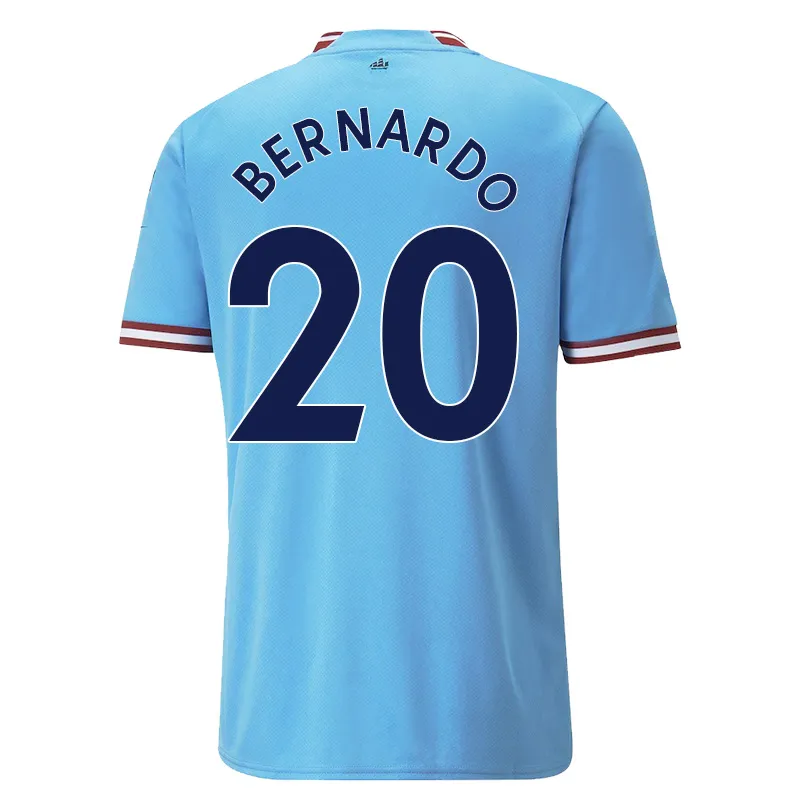
no, because it was an early copy, the same as the other guy a few pages back, I believe if you order now they have the crown mark.
EDIT
Seen your other post now, the red/maroon goes all the way around, it doesn't have the blue separator.
no, because it was an early copy, the same as the other guy a few pages back, I believe if you order now they have the crown mark.
Yup, £20 for two shirts, you take your chances, there would be no way in this world I would have paid £90 for the Aguero shirt or whatever the 'real' price was.And that is why you don't purchase off some
no-mark company.
I'd say you are bang on, you have to factor in the longer wait for postage but I am sure the shirts on the site now are differentI feel like with DHGate it's worth waiting a couple of months because the people making them are going off concepts and rumours round the time of announcement and thats now their stock.
Once you get a few months in, they're working off the real thing.

Mines from club shop and has the blue separator at backno, because it was an early copy, the same as the other guy a few pages back, I believe if you order now they have the crown mark.
EDIT
Seen your other post now, the red/maroon goes all the way around, it doesn't have the blue separator.
yes, ordering the snides later seems to be the way to go, you live and learn.Mines from club shop and has the blue separator at back
DH GATE snides turned up today, despite me going even bigger size than last year they are still the same as last years fucking shirts, starting to piss me off a bit tbh, I also ordered an NFL jersey in XXL and that is like a tent on me, you can't win lol
View attachment 46303View attachment 46304
I asked for Kun Aguero on the back, I seem to have got a creative guy who decided I really wanted Agueroooo with the funny dots over the U for some reason.
View attachment 46305
A funny shade of maroon on the home shirt, still what do expect for £10 a shirt?
Shirt material feels good quality though.
Ah well, back to the running machine to lose another fucking stone to get a shirt on :(
As we have established, cheers :)Better waiting for the better copies to come out online mate. Order in a few months and you'll have maroon instead of red ha ha
Alright mate, no need to be a dick. Just saying it's a nice shirt is all.Cannot wait to find out if you buy one mate...go on...you can do it. Make sure you let us know if you take the plunge haha!!!...the suspense is killing me.
I'd say you are bang on, you have to factor in the longer wait for postage but I am sure the shirts on the site now are different

and yes they are, that image is lifted from a sale advert
I agree it's a nice shirt and liked your post. I was, in no way, trying to criticise you and it's a shame you took it that way. I actually thought you might find it funny but clearly you are lacking in the sense of humour department.Alright mate, no need to be a dick. Just saying it's a nice shirt is all.
Must be me as well, I thought your post was sarcastic as fuck tbhI agree it's a nice shirt and liked your post. I was, in no way, trying to criticise you and it's a shame you took it that way. I actually thought you might find it funny but clearly you are lacking in the sense of humour department.
Same as dhgateNo but great copies and sizes are spot on.
Nah sizes are better brother got a xlarge of d h gate was way under size.Same as dhgate
Weight watchersI need a Cheap 22/23 3xl shirt. Any ideas of where I could get them?
Lol collectors item then!:))Mine that are en-route from DHgate have the ship on the back (seller sent me a picture on WhatsApp before posting)
