dasein
Well-Known Member
You are right, the 'rivers' are different widths.
It grows on you if you ignore the 18 and 94 and the red rose.
I second that at first i hated it, then indifferent, now its quite nice, especially in monochome
You are right, the 'rivers' are different widths.
It grows on you if you ignore the 18 and 94 and the red rose.
There, fixed.do you not think it looks too busy with the red rose??
Cheers!
Wallpaper if anyone wants it.
Im a spurs fan.
You do realise that wumming is against the CoC?Iv been trying to steer clear of the new badge in the hope that my initial view was one of shock and just not wanting the change with the hope that the new badge will grow on me..
Unfortunately it has not, and the more I look at it the more I see wrong with it.
I have looked without bias trying to take the good things from it but I'm struggling , It just doesn't sit right .
It has probably all been said here before but what stands out to me is - Initially
the CITY being straight and not curved like the rest of the wording
The shield being outside the rounding - and maybe if it protruded out the same at the bottom as it dose on the sides wouldn't look as bad.
The rivers don't seem to be the same size ( could be my eyes ) and maybe could be better positioned
The ship seems to be out of place a little , not quite central - again could by my eyes
That god dam splash of red there for no reason what so ever, may have well used a star or 3
I seriously can't believe that somebody has been paid for putting this together, and that somebody has said "yes that's the one "
Thear have been some really great mock ups done on here by posters that may not have been my first choice but I would have took over this peace of garbage any-day.
The only thing I acutely like about it is it's round and the ship is quite nice.
This is what you get when you try to please everyone I guess.
I personally don't think it will grow on me as the eagle did after a while on the last change, as it looks quite amateurish , even childish , I just hope I'm around to see this fixed when the young guys who have grew up with the eagle get old enough to have there voices herd and want a change away from two old relics haphazardly thrown together in a attempt to please the old farts who wanted the change back to the old badge but couldn't decide which one to change to.
And if there clever enough it won't be long - marketing wise 3 new kits every change -(just dawn on me we get 3 new kits per year now anyway don't we - fkme when did that become the acceptable norm)
I'd love for anybody to point out the good things about it to give me something to acutely like about it. Just a little thing or two to give me some hope that it may be a good badge and that I'm missing the whole point ... Maybe it's like a Picasso the shiter it looked the better it acutely is..
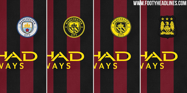
Told you...black red away...with yellow socks
Mate have you heard anything on the ghastly rumours of navy blue sleeves, sky blue shorts and white socks?
Surely the first time in history that City haven't work a City shirt, shorts or socks?
I made these and have added a couple more to this. 22 wallpapers in total!
These are some that are portrait for mobiles
Colonialism???It does look so much better in monochrome.
From a totally external viewpoint it's interesting we've chosen to represent ourselves with (abandoned) colonialism and a county we're not even in.
But from a fans perspective full colour is just about ok and monochrome is very nice indeed.
By choosing to include the ship I imagine it will carry those connotations for some people. Obviously it's on the Manchester coat of arms but that's down to trade, empire and colonialism to a certain extent.Colonialism???
You are right, the 'rivers' are different widths.
It grows on you if you ignore the 18 and 94 and the red rose.
You do realise that wumming is against the CoC?
I could live with that, but it's quite hard to ignore a big blob of red in the middle of the badge... Like a ketchup stain on a bage couch I once had..

Thanks mate!The one with the fans is fabulous. Great work pal!