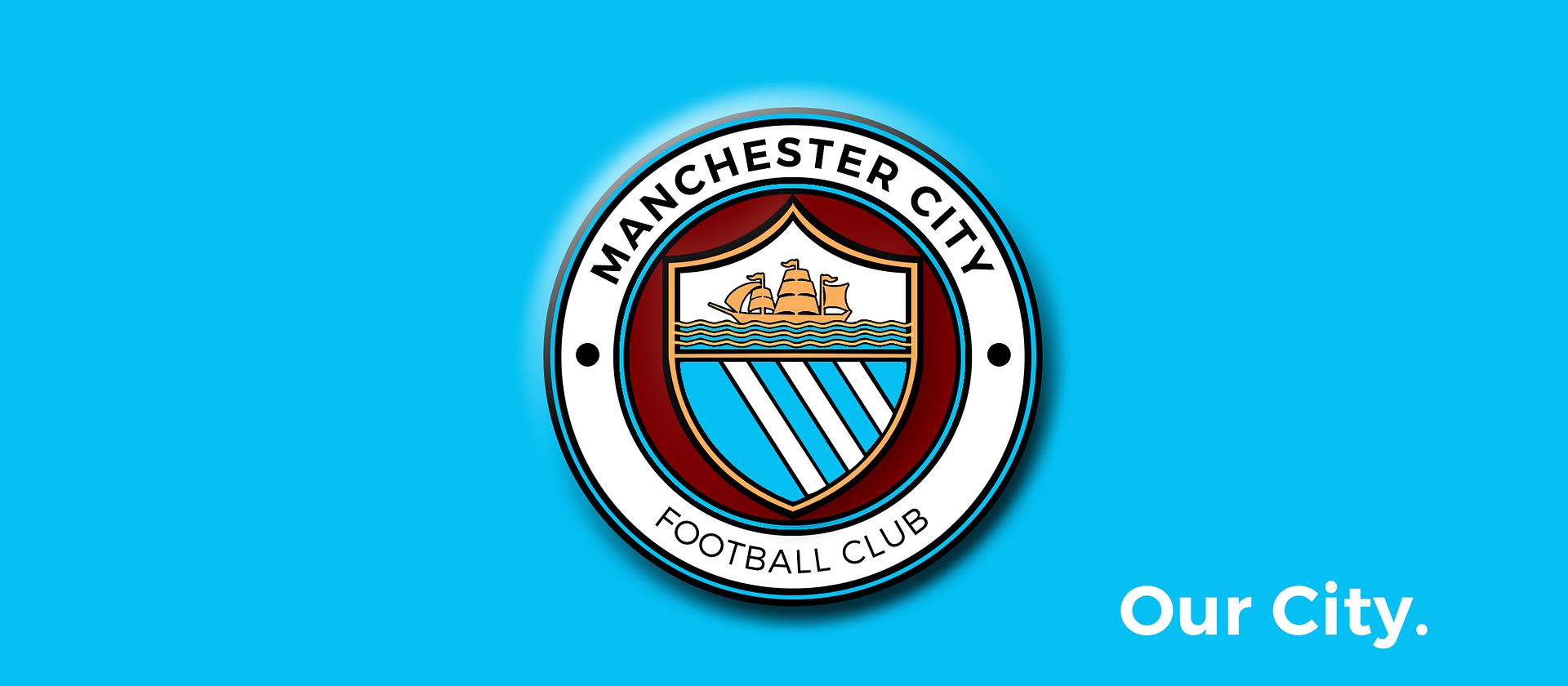
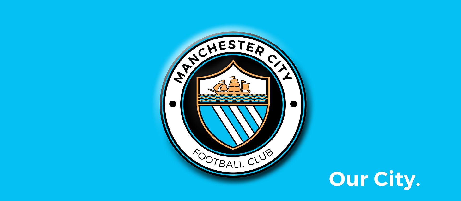
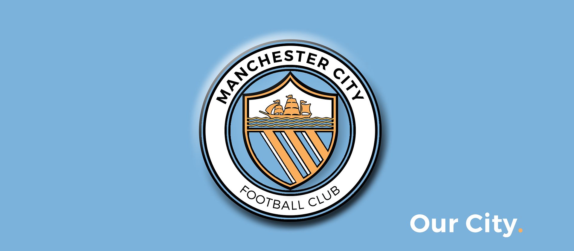
Club Badge (merged)

Done my best for you mate. I'm not a graphic designer so apologies that they look amateurish.

9ShkfSi.png


QP1dWVz.png
Great combination....Football - Working Class - Manchester
 
Otherwise excellent as usual, Gav, but face it those moon things are minging. What's wrong with plain dots? Or you can leave them out altogether.
 
Otherwise excellent as usual, Gav, but face it those moon things are minging. What's wrong with plain dots? Or you can leave them out altogether.

i agree ... i'm fucking useless at doing moons .... done bees. dont like. done roses, dont like. done dark 'cross pattee' (st marks) that are nazi iron crosses it seems, did circles/dots, fine with them. but thought fuck it, try moons ...... fucked it.
 
I know it's not overly popular but Maroon looks good as a fill between the Script Ring and the Shield. And I accidentally tried black after not switching my colours and it actually looks alright, think some might like it.


EDIT: Give grey a go as well Gav, see what you think, With metalic silver thread it could look interesting? It certainly doesn't detract when I try it.
Like this
 
Instead of reposting the same general idea, as a nod to St. Marks; do either or both of the 2 flag positions below work?


The front one is more of a subtle nod, which i quite like on its own.

That is a brilliant idea to incorporate it into the sail.
 
Not having a go at your design as its clearly best any of us has come up with but for me that just shows it looks like a cheap copy of the NYCFC one, like we're a pub team thats pinched the idea. If we're gonna have a circle we need something more interesting in the inner circle - dare I say it, something a bit busier (i.e to fill out that gap or make the badge look a bit more 3D).

I think it's the order of the rims - that outer template. If we're having a circle we need a unique approach to it rather than conforming to the sister clubs.
 
Took that colour off the website :/

Here's the design with blue moon blue ;)


Don't like the badge before the current one reminds me of Swales and his newsagent mate who owns it Was modifying one of Gav's to make the main circle City blue like the one above this is getting there for me simple clean and modern with lots of blue and white. Wanted the bees but having seen them they don't work. Think the, club should get a City font copyrighted and declare once and for all what City blue is
 
Instead of reposting the same general idea, as a nod to St. Marks; do either or both of the 2 flag positions below work?


The front one is more of a subtle nod, which i quite like on its own.
If they don't want St.Marks cross at risk of alienating foreign fans of other religions, the front sail could be a nice subtle option to get around it. I think this is the best way to incorporate St.Marks, it's a classy way of doing it but the ship has to be black.
 

Don't have an account? Register now and see fewer ads!

SIGN UP
Back
Top