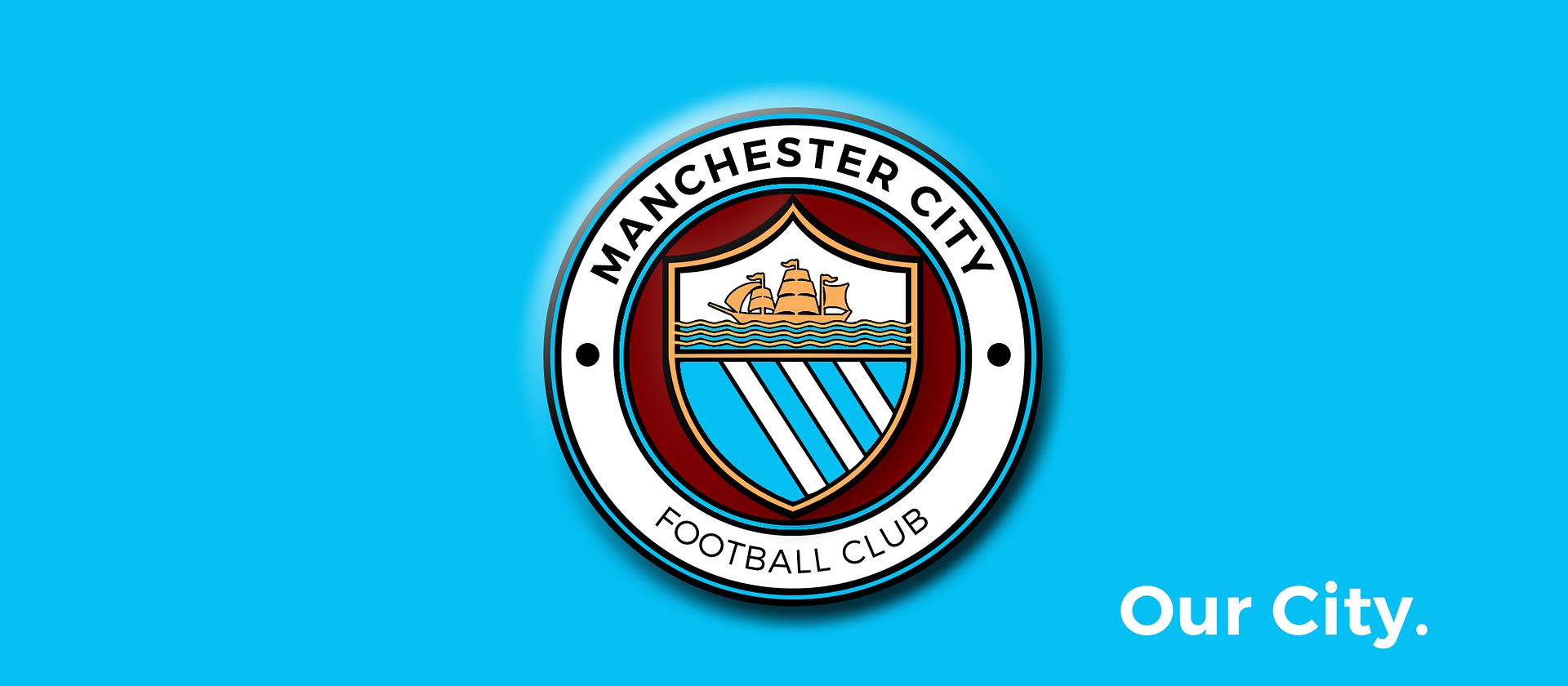
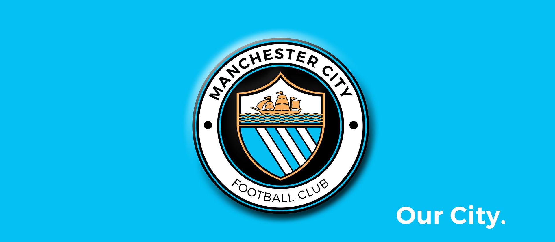
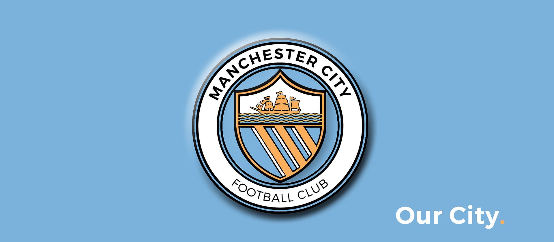
Why are the top flags going in different directions? The wind should blow them in the same directionI know it's not overly popular but Maroon looks good as a fill between the Script Ring and the Shield. And I accidentally tried black after not switching my colours and it actually looks alright, think some might like it.
EDIT: Give grey a go as well Gav, see what you think, With metalic silver thread it could look interesting? It certainly doesn't detract when I try it.
You are using an out of date browser. It may not display this or other websites correctly.
You should upgrade or use an alternative browser.
You should upgrade or use an alternative browser.
Club Badge (merged)
- Thread starter MCRJON
- Start date
D
D
Deleted member 58678
Guest
Oh I love the non-glass door version of that.does everyone just like because i put it on a glass door? they look at the actual non-glass-doorversion and pretty much dont like it. lol
i assume i'me done it right .... i am a bit simple now but my understanding that a ship with sails, has to go with a side of tail wind right? head wind, not good? so if its a tail wind to go foward, the sails and flags should point tio the front of the ship ... is that right?ah didn't see that - good job!
Another point to consider is we don't want a badge too similar to Fake Club United.
Yes all of themi assume i'me done it right .... i am a bit simple now but my understanding that a ship with sails, has to go with a side of tail wind right? head wind, not good? so if its a tail wind to go foward, the sails and flags should point tio the front of the ship ... is that right?
CitizenTID
Well-Known Member
- Joined
- 9 Feb 2013
- Messages
- 5,053
Having lived in Manchester all my life I've never actually seen a ship here, but that sounds logical to me.i assume i'me done it right .... i am a bit simple now but my understanding that a ship with sails, has to go with a side of tail wind right? head wind, not good? so if its a tail wind to go foward, the sails and flags should point tio the front of the ship ... is that right?
No idea, having lived in Manchester all my life I've never actually seen a ship here!
only in the bath tub myself. so if yousee a design with the flags in one direction, good chance its mine lol
CitizenTID
Well-Known Member
- Joined
- 9 Feb 2013
- Messages
- 5,053
Apparently cottongrass is the county flower of Manchester, which seems a nice idea - suppose we've got too many symbols already though. It's not on the CoA either.
MadchesterCity
Well-Known Member
- Joined
- 12 Sep 2009
- Messages
- 18,265
Black ship would look perfect
urban genie
Well-Known Member
- Joined
- 11 May 2008
- Messages
- 35,239
Yes all of them
the rear flag has always been shown as flown the opposite to the other 2, but don't know anyone who knows why it just does
D
D
Deleted member 58678
Guest
On the CoA the back flag that goes the other way has the St Georges Cross cross on it and the pole sticks out backwards.the rear flag has always been shown as flown the opposite to the other 2, but don't know anyone who knows why it just does
Shaelumstash
Well-Known Member
- Joined
- 30 Apr 2009
- Messages
- 8,305
does everyone just like because i put it on a glass door? they look at the actual non-glass-doorversion and pretty much dont like it. lol
You know I love your designs Gav, and I totally agree with you on this! The colour scheme on your 'glass door' one with the black (or is it navy?) circle with white lettering, if people saw that not on a glass door, but perhaps on a blue football shirt, they wouldn't like it half as much. Conversely, if some of the other colourways you've done i.e white circle with navy lettering, was on the glass door, people would rave about that one the most.
Because the glass door one looks so realistic, it's easy for people to visualise it being a real badge as opposed to a graphic on a computer. But if there was 5 different colour schemes offered to fans, I don't think the black / navy circle would end up being the most popular one.
does everyone just like because i put it on a glass door? they look at the actual non-glass-doorversion and pretty much dont like it. lol
BlueMoonRisingTV is on Facebook. To connect with BlueMoonRisingTV, join Facebook today.
Join Log In

BlueMoonRisingTV
City fans already sending in designs for the new badge. We imagine it'll be a mix of the old and new.
What do you want to see on our new badge?
They like it here also;-)
urban genie
Well-Known Member
- Joined
- 11 May 2008
- Messages
- 35,239
On the CoA the back flag that goes the other way has the St Georges Cross cross on it and the pole sticks out backwards.
yeah I know I was on about our badges, to be fair I think there are a few diffierent styles to the boat on many versions of the CoA sheild as long as it's 3 sails and on thw waves not still water (like a canal) then it can be classed as a sufficent depiction.
Londonblue79
New Member
- Joined
- 19 Oct 2015
- Messages
- 1

Carver
Well-Known Member
the rear flag has always been shown as flown the opposite to the other 2, but don't know anyone who knows why it just does
I used to think the 2 flags pointing forward and one back represented city, we could never take 2 steps forward without going one back....
However, it's depicted like this due to superstition and is artistic licence, it is considered bad luck to have them all pointing in the right (forward) direction.
CitizenTID
Well-Known Member
- Joined
- 9 Feb 2013
- Messages
- 5,053
I've gone to complete the survey twice now and both times it finished with 'Something went wrong' but still thanks me for my participation in it, talking about seeing the results of the consultation process at a later date and had the option to go back to MCFC home page.
Anyone else had this? I don't know if it's gone through.
Anyone else had this? I don't know if it's gone through.
DAGW
Well-Known Member
Shaelumstash
Well-Known Member
- Joined
- 30 Apr 2009
- Messages
- 8,305
Just read this on City Voice, which is an official statement from the club:
"Please note that this process is about understanding the views of fans and we are not accepting any unsolicited badge designs. If, as a result of the consultation, the badge does evolve, the Club's in-house designers will undertake this process. ."
The bit in bold is a bit of an area of concern for me. The badge should be designed by a specialist in my view, not just someone from the in house team. The in-house team's previous effort wasn't the best.
GeekInGav:

Rafael Esquer:

City's "In-house" design team:
Not really of the same standard.
"Please note that this process is about understanding the views of fans and we are not accepting any unsolicited badge designs. If, as a result of the consultation, the badge does evolve, the Club's in-house designers will undertake this process. ."
The bit in bold is a bit of an area of concern for me. The badge should be designed by a specialist in my view, not just someone from the in house team. The in-house team's previous effort wasn't the best.
GeekInGav:

Rafael Esquer:

City's "In-house" design team:

Not really of the same standard.
citizen_maine
Well-Known Member
- Joined
- 29 May 2011
- Messages
- 18,437
You obviously gave the "wrong" answers :-)I've gone to complete the survey twice now and both times it finished with 'Something went wrong' but still thanks me for my participation in it, talking about seeing the results of the consultation process at a later date and had the option to go back to MCFC home page.
Anyone else had this? I don't know if it's gone through.

