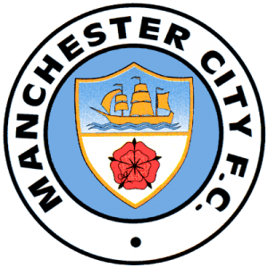
Club Badge (merged)

I agree the outer circle.should be white with black piping inner should be the manchester shield in it's proper colours (red and gold all this no red bollocks is a bit silly it's he colour of the shield) the background should be sky blue roses or bees optional. Forget the eagle n stars and the navy blue needs to be toned down

11ky4j4.jpg
 
I'm really glad there seems to be a concensus for this as it is one of my favourites from @GeekinGav. (By the way I think you protest too much, you know you want your place in City's history :) ). This is absolutely stunning. I love it. If it was a choice between this and Messi I would take this all day long.

As @jimharri says I'd be happy to lose the names as it will date the badge quickly as we get new heroes and, indeed, less is more, as is not perfectly demonstrated by the shite badge we have at present.

Please let it happen City.

the premise with the names was .... like a roll of honour of legends .... that would only be on like a main stadium type version ... with players added to it over the years ... decades ... as an inspiration to become legends on the heart of the club .... not on all the kits etc ... that would be inpossible from a manufacturing point of view.
 
Yeah, that's what I'm particularly hating though mate.

Fuck the CFG. Not interested. Our heritage shouldn't be dictated to in order to fit into some generic template for some tin pot clubs on the other side of the globe.

We have our club colours, and Navy blue shouldn't be in there, IMO.

yep ... maybe you are right .... but then i think navy, maroon and gold are part of City's colours over the years in kits etc .... sol they are just a perspective ..... voice it on the questionnaires if it comes up .... think thats the whole idea.
 
yep ... maybe you are right .... but then i think navy, maroon and gold are part of City's colours over the years in kits etc .... sol they are just a perspective ..... voice it on the questionnaires if it comes up .... think thats the whole idea.

Will do mate. Thanks again for the mock ups, they're quality. Just disagree ever so slightly on the colour schemes a little.

Like you said, Navy blue has been part of our kits in the past, and some blues have a hard on for the Navy blue socks for some reason, but when I think of Manchester City, Navy blue doesn't come into it.

It shouldn't, IMO.

The club badge is central to our indentity and part of me worries that if we get a badge accented with Navy blue for example, or containing Navy blue, we'd end up seeing more Coventry City type monstrosities for kits.

Sky blue and White is MCFC for me. Intrinsically so. We should be very careful about what else we include in the crest IMO.
 
yep ... maybe you are right .... but then i think navy, maroon and gold are part of City's colours over the years in kits etc .... sol they are just a perspective ..... voice it on the questionnaires if it comes up .... think thats the whole idea.

I think the colour of the badge does not necessarily have to include our traditional colours. The silver and gold version you did were perfect as was the one I quoted above. As long as the kit retains traditional colours the badge just has to be as good as it possibly can and you have pretty much perfected it with some of your designs. BRAVO!!
 
Will do mate. Thanks again for the mock ups, they're quality. Just disagree ever so slightly on the colour schemes a little.

Like you said, Navy blue has been part of our kits in the past, and some blues have a hard on for the Navy blue socks for some reason, but when I think of Manchester City, Navy blue doesn't come into it.

It shouldn't, IMO.

The club badge is central to our indentity and part of me worries that if we get a badge accented with Navy blue for example, or containing Navy blue, we'd end up seeing more Coventry City type monstrosities for kits.

Sky blue and White is MCFC for me. Intrinsically so. We should be very careful about what else we include in the crest IMO.

that I agree with 2bh, seems either Nike or ADUG, probably both, are being insistent on us having dark/navy away kits, and mixing in Navy to the exclusion of white on too many home kits.

Sky blue and white, leave it as, and be more imaginative on the away kits.
 
thats why i dont want the "job" ... in the end if a new one is done, a large proportion of the City faitful will be disappointed, because the different generations and era's want different things. the fusion crest as just a visual clue of something that could be .... hopefully this consoltation process will please everyone .... not i'm not optimistic .... lol
 
that I agree with 2bh, seems either Nike or ADUG, probably both, are being insistent on us having dark/navy away kits, and mixing in Navy to the exclusion of white on too many home kits.

Sky blue and white, leave it as, and be more imaginative on the away kits.

to be honest i dont see the reason of a new crest if its not going to be inline with the CFG branding ... but thats me being cynical lol
 
post: 8931495 said:
yeah sorry was only a metal version


Navy/DarkNavy is CFG's colour through out .... was just going with the trend ... turn your brightness down and its black .... sorted lol
Hi Gav. Great work. How do I upload an image please? Been trying for 3 hours. :'(
 
to be honest i dont see the reason of a new crest if its not going to be inline with the CFG branding ... but thats me being cynical lol

No I agree, it's definitely a motive for the club.

Let's say in theory if our most popular old crest was a hexagon with a scroll around the bottom, I doubt the club would endorse it.

One of the primary reasons this has come up is because our old crests are circular and very popular, and the club knows its goal for having similar crests for all the 'CFG' is more or less inline with what the fans want.

That's why we have to make sure that our crest stays true to Manchester City, and isnt some generic piece of crap intended to fit nicely next to a tinpot club that's only just been formed for example.
 
Hi Gav. Great work. How do I upload an image please? Been trying for 3 hours. :'(

to here .... could be wrong, but think you can only link to n offsite image ....

if you have twitter or facebook or instagram etc, upload it there,

right click on it when its on and should say something like copy image address that will copy the link to the clipboard

then come on here in the post box look for a symbol with a picture frame, then pless Ctrl and V or Cmd and V to paste the link into the pop up box, please enter and the image should be dispayed in the post ...

then submit yuour post ...

thats bascically what i do lol
 
No I agree, it's definitely a motive for the club.

Let's say in theory if our most popular old crest was a hexagon with a scroll around the bottom, I doubt the club would endorse it.

One of the primary reasons this has come up is because our old crests are circular and very popular, and the club knows its goal for having similar crests for all the 'CFG' is more or less inline with what the fans want.

That's why we have to make sure that our crest stays true to Manchester City, and isnt some generic piece of crap intended to fit nicely next to a tinpot club that's only just been formed for example.

i agree .. i think it was just a coincidence or maybe a future plan to have all the CFG badges circular. ... i dont understand why they didnt do this when they rebranded Melbourne Heart and i think its no cocidence its been announced after the recent "good news" profit announcemrnt that the club is successfully growing globally ....

cynical .... told ya lol
 
Yeah, that's what I'm particularly hating though mate.

Fuck the CFG. Not interested. Our heritage shouldn't be dictated to in order to fit into some generic template for some tin pot clubs on the other side of the globe.

We have our club colours, and Navy blue shouldn't be in there, IMO.

No I agree, it's definitely a motive for the club.

Let's say in theory if our most popular old crest was a hexagon with a scroll around the bottom, I doubt the club would endorse it.

One of the primary reasons this has come up is because our old crests are circular and very popular, and the club knows its goal for having similar crests for all the 'CFG' is more or less inline with what the fans want.

That's why we have to make sure that our crest stays true to Manchester City, and isnt some generic piece of crap intended to fit nicely next to a tinpot club that's only just been formed for example.


Agree with you - i worry it's going to be too similar to the others in "city group".. and loads of fans mock ups already use pretty much the navy blue circle style like the other clubs. I don't want us to look almost the same as the rest, as much as to the bosses we are a part of 4... surely even they know we're the big part, the unique part, the part with history and a fan base and trophies to win that actually mean something. You can't just make a badge neatly look like the rest of the "brand". Which is why if we change, should be pretty much like the old (ie 70s to 90s) badge - black edging, white inside the cicrles, black writing etc etc with yellow and red. Pretty much the old badge with either the rose or red and yellow lines. Don't make us look like we're just a part of "city group"... however i worry that's exactly where we're heading - and all these fan mock ups don't help, can't they see they look like nyc or melbourne??!
 
thats why i did the 'tale of four cities' image when i heard about Yokohama as a what i invisioned was the plan...(if/when we increase the yokohama stake or nissan agree to merge it with CFG)

BwnlFOsIEAAhoxS.jpg


but i'll go one step further an bet they will all have the sky blue band on the outer. did our white as some hope of uniqueness and kept Yokohama blue as we dont own them really.
 
Last edited:
I agree the outer circle.should be white with black piping inner should be the manchester shield in it's proper colours (red and gold all this no red bollocks is a bit silly it's he colour of the shield) the background should be sky blue roses or bees optional. Forget the eagle n stars and the navy blue needs to be toned down

11ky4j4.jpg


Yep this or this...

mcfc-badge-1972-76-300x300.png
 
Sorry! Only just seen this about the new badge.
Can someone please tell me what CFG is?

Would love the old circular, 3 stripes(rivers).
Ship.
Nod to St.Marks would be good. Maltese cross?
No Lancs rose.
Manchester City Football Club.
Sky Blue, white & maroon.
 
Agree with you - i worry it's going to be too similar to the others in "city group".. and loads of fans mock ups already use pretty much the navy blue circle style like the other clubs. I don't want us to look almost the same as the rest, as much as to the bosses we are a part of 4... surely even they know we're the big part, the unique part, the part with history and a fan base and trophies to win that actually mean something. You can't just make a badge neatly look like the rest of the "brand". Which is why if we change, should be pretty much like the old (ie 70s to 90s) badge - black edging, white inside the cicrles, black writing etc etc with yellow and red. Pretty much the old badge with either the rose or red and yellow lines. Don't make us look like we're just a part of "city group"... however i worry that's exactly where we're heading - and all these fan mock ups don't help, can't they see they look like nyc or melbourne??!

Agree, completely.

No Navy blue is a must as far as I'm concerned.
 
Sorry! Only just seen this about the new badge.
Can someone please tell me what CFG is?

Would love the old circular, 3 stripes(rivers).
Ship.
Nod to St.Marks would be good. Maltese cross?
No Lancs rose.
Manchester City Football Club.
Sky Blue, white & maroon.

CFG is City Football Group .. which is basically the parent company/umbrella that all the clubs are under. City, NYCFC, Melbourne City and Yokohama (dont own them completely yet)
 

Don't have an account? Register now and see fewer ads!

SIGN UP
Back
Top