Love it. Thanks SS! :-)
Part of me won't like getting rid of the Eagle. It makes the badge look less 'soft'
You are using an out of date browser. It may not display this or other websites correctly.
You should upgrade or use an alternative browser.
You should upgrade or use an alternative browser.
Club Badge (merged)
- Thread starter MCRJON
- Start date
Uncle Wally One Ball
Well-Known Member
Then its about time we changed that by putting the word Manchester back prominently on the badgeThe ship and water and rivers don't really work in monochrome at all, looked really odd on the umbro black trim kit.
I'd be surprised if we see something more complicated than
Outer circle
Central element
(Potentially a background pattern)
MCFC
In global terms I think 'Manchester' is potentially too associated with United, that 'City' is our differentiated global brand but it would be odd to highlight City above all else so we'll settle for MCFC.
tbh I wouldn't be shocked to see an eagle in the circle.
While the maltese cross carries some dodgy connotations, I'm not convinced we'd believe people all over the world will get behind a ship icon (and lesser negative connotations such as imperialism and colonialism).
Keepingthefaithsince1976
Well-Known Member
600K? Why would he spend that much on it?(also where does a shop owner get that amount of cash back then, over half a mill?) If it's no longer current then he wouldn't make as much off it anyway... seems like he bought it in the hopes the club would have to stump up the cash to buy it off him but they weren't having none of it. Kind of like people do with internet domains these days and patents for "ideas" that they haven't the funds or know-how to implement.
I don't really like the rose if I'm honest, it makes it look dated rather than "retro cool"... plus its red. Eagle>Rose!
It was something I read. He was the club shop owner/merchandiser. Do the maths. Shirts were say 20 pounds a pop. He would only have to sell 30,000 shirts a year to make his money back. Scarfes, caps, badges, tracksuits, mugs, pyjamas, quilt covers etc etc. Or maybe he paid 600 grand for the legnth of the deal. Who knows? It didn't work out well for City or the fans because we got that daft eagle. We'll probably never find out the details. Swales has passed away & Franny Lee is probably glad he's away from City & the problems past. How about a genetically modified blue rose?
DAGW
Well-Known Member

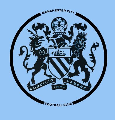
I love the Mono coat of arms but I don't see us using it - too intricate :/

IanBishopsHaircut
Well-Known Member
I love the Mono coat of arms but I don't see us using it - too intricate :/
That would be nice if it had a Gav style circle around it...as in a thick one...making the 'Manchester City Football Club' more prominant
Last edited:
It was something I read. He was the club shop owner/merchandiser. Do the maths. Shirts were say 20 pounds a pop. He would only have to sell 30,000 shirts a year to make his money back. Scarfes, caps, badges, tracksuits, mugs, pyjamas, quilt covers etc etc. Or maybe he paid 600 grand for the legnth of the deal. Who knows? It didn't work out well for City or the fans because we got that daft eagle. We'll probably never find out the details. Swales has passed away & Franny Lee is probably glad he's away from City & the problems past. How about a genetically modified blue rose?
I heard it was 100k a year for the rights sell city merchandise.
quiet_riot
Well-Known Member
I love the Mono coat of arms but I don't see us using it - too intricate :/
That is mint.
Shaelumstash
Well-Known Member
- Joined
- 30 Apr 2009
- Messages
- 8,305

That's close to perfect. Think it needs something to break up the gaps on the side of the circle though.
tailspin747
Well-Known Member
I'd love that but can't see it happening.I love the Mono coat of arms but I don't see us using it - too intricate :/
I get that but I'd love to see your creations without.
stand back a bit :P
That's close to perfect. Think it needs something to break up the gaps on the side of the circle though.
not a fan of using the CoA, we already get called the Council Team.
The ship and water and rivers don't really work in monochrome at all, looked really odd on the umbro black trim kit.
thats why the new badge will, because the designers, like what i did on mine, will test what works and what doesnt through the design process so it works in every scenario. Somethings may have to be comprised, but anything can get be solved given time.
Shaelumstash
Well-Known Member
- Joined
- 30 Apr 2009
- Messages
- 8,305
not a fan of using the CoA, we already get called the Council Team.
?? Most of your designs use the central crest from the CoA just the same as this one?
I quite like these as an alternative.
Needs to be very simple imho. Reference to original three rivers and origins with WG St Marks. Who we are, where we are, where we came from and what we do.
dickie davies
Well-Known Member
100% guarantee there will be no nod to the original cross anywhere in the badge. It brings up too many connotations to past historical symbols. Also no fucking Eagles and no red elements in the badge what so ever.
100% it will be round to fit in with the rest of the sister clubs branding.
100% we won't get a vote of a choice of 3. It will be the clubs decision.
Re the "red elements"
You are aware that the Manchester coat of arms contains the three rivers on a red background! and that this element was on our badge for 70 years!!
Via the link on the club website, I asked, in the comments section, that the badge should be an updated version of the 1930 - 70
http://www.bbc.co.uk/manchester/con.../110209_manchester_coat_of_arms_feature.shtml
The red shield with gold stripes is taken from the lords of Manchester, who ruled the city prior to 1301
?? Most of your designs use the central crest from the CoA just the same as this one?
but i dont use any of the Heraldry ....only use the shield as its the only constant in previous badges.
We are part of Manchester. a club in Manchester ... we have own own idenity within our great City. Have part of our City in our badge, but dont just rip the whole thing from the council from is and call it ours.
Last edited:
Shaelumstash
Well-Known Member
- Joined
- 30 Apr 2009
- Messages
- 8,305
but i dont use any of the Heraldry ....only use the shield as its the only constant in previous badges.
We are part of Manchester. a club in Manchester ... we have own own idenity within our great City. Have part of our City in our badge, but dont just rip the whole thing from the council from is and call it ours.

Yeh I think you might have quoted the wrong poat before. The badge I said was close to perfect wasn't the council CoA, it was just another version of your design.
Yeh I think you might have quoted the wrong poat before. The badge I said was close to perfect wasn't the council CoA, it was just another version of your design.
yeah ... sorry mate lol .... just looked back .... it was the quiet riot one before your's i was replying to ... thats the colnfusion lol my fault.
sorry i thought we talking about the blatant Council Logo rip off lol
Shaelumstash
Well-Known Member
- Joined
- 30 Apr 2009
- Messages
- 8,305
yeah ... sorry mate lol .... just looked back .... it was the quiet riot one before your's i was replying to ... thats the colnfusion lol my fault.
sorry i thought we talking about the blatant Council Logo rip off lol
Ah no worries mate. I think 90% are in agreement on the core design. Everyone has their own preference for little tweaks and colour schemes etc, but I think the overwhelming majority will be happy with it.