You are using an out of date browser. It may not display this or other websites correctly.
You should upgrade or use an alternative browser.
You should upgrade or use an alternative browser.
Club Badge (merged)
- Thread starter MCRJON
- Start date
Blue Mooner
Well-Known Member
- Joined
- 25 Jun 2005
- Messages
- 3,139
The 'current' badge is probably one of the more recognizable badges in football and it just had MCFC on it. Hence why they've spelt it out in this new one because it won't be as instantly recognizable without displaying the club's name on it. Again though, the addition of "FC" or "football club" doesn't hurt a club's brand it doesn't sway how people pronounce and associate the club's name. It's another aspect of the badge, like the rose etc that some feel should be kept.
Chelsea spell out the whole name, 'football club' and all; doesn't do them any harm. Even the CL draw, they make a point to place "FC" after, or before, every club it relates to. It's a football competition, we all know that but they still do it as it's the official name of each club.
But Chelsea are only Chelsea so the addition of football club didn't look cluttered or necessarily a mouthful, plus before that change they were only cfc I would argue that 'the football club' in their case was done for design purposes, otherwise you have nothing to fill the circle with. However that example - amongst big clubs - is very much the exception who either use a very abbreviated version of their name with fc or simply use their name as we have done. Not only that, for me, aesthetically it looks so much better. The key point is we are Manchester City, we shouldn't feel the need to add 'football club or FC, it's stating the bleeding obvious, unless you're worried we're going to start investing in shopping centres or something equally non football related!?
Keepingthefaithsince1976
Well-Known Member
I am looking at other club badges .. Ac Milan, Barcelona, Real Madrid, Inter Milan, Liverpool, Bayern Munich and the list goes on and on.
All their badges include FC or AC (Associazione Calcio).. The only c***s that I know removed Football Club from their badge are the rags, "for branding reason" ..
I'm wondering if that's the reason fans aren't happy with it removed. I for one had no idea they had done that. (Probably get called a rag now like on the Guardiola thread because i didn't know facts about Man Yoo...as if I'd be interested in what they do or don't do). Anyway we should do what's best for Manchester City...irrespective of what anyone else does or thinks. I was an advocate of FC. Now i saw the new badge I'm happier without.
https://www.ipo.gov.uk/tmownerid/search?domain=1&id=38653&app=0&mark=UK00003141842
What is the difference between a mark being examined and applicaton published
What is the difference between a mark being examined and applicaton published
I'm not worried or upset about the loss of "FC", however, personally I would have "Manchester City" all along the top. I get though why some would like "FC" or football club included both from a visual persepctive and/or a professional type stand point, for lack of a better term. It's not a worry of people forgetting we're a football club, that's silly, but it does give a more business type impression. Which of course we ultimately are but it does add instant recognition to the sport when included.But Chelsea are only Chelsea so the addition of football club didn't look cluttered or necessarily a mouthful, plus before that change they were only cfc I would argue that 'the football club' in their case was done for design purposes, otherwise you have nothing to fill the circle with. However that example - amongst big clubs - is very much the exception who either use a very abbreviated version of their name with fc or simply use their name as we have done. Not only that, for me, aesthetically it looks so much better. The key point is we are Manchester City, we shouldn't feel the need to add 'football club or FC, it's stating the bleeding obvious, unless you're worried we're going to start investing in shopping centres or something equally non football related!?
Some want the rose, ship etc for historical purposes and others wanted them for visual purposes. Same for the "football club". I must admit it does look better to me with "football club at the bottom but I don't need it there for identity purposes. I understand the idea of 'branding', like how the Premier League won't be the Barclay's Premier League for much longer; they want an NFL/MLB type branding.
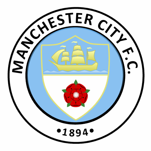
I could take or leave the FC on this badge, centre the name then of course, add 2 more "lines" under the ship and it's sorted imo. Though I'd like a less comic sans type ship.

Last edited:
IanBishopsHaircut
Well-Known Member
I'm not worried or upset about the loss of "FC", however, personally I would have "Manchester City" all along the top. I get though why some would like "FC" or football club included both from a visual persepctive and/or a professional type stand point, for lack of a better term. It's not a worry of people forgetting we're a football club, that's silly, but it does give a more business type impression. Which of course we ultimately are but it does add instant recognition to the sport when included.
Some want the rose, ship etc for historical purposes and others wanted them for visual purposes. Same for the "football club". I must admit it does look better to me with "football club at the bottom but I don't need it there for identity purposes. I understand the idea of 'branding', like how the Premier League won't be the Barclay's Premier League for much longer; they want an NFL/MLB type branding.
I could take or leave the FC on this badge, centre the name then of course, add 2 more "lines" under the ship and it's sorted imo. Though I'd like a less comic sans type ship.

I'm sorry but that looks shite..waaay too top heavy..I like the fact we only have Manchester on top now
Cheadle_hulmeBlue
Well-Known Member
- Joined
- 27 Oct 2012
- Messages
- 16,890
I'm not worried or upset about the loss of "FC", however, personally I would have "Manchester City" all along the top. I get though why some would like "FC" or football club included both from a visual persepctive and/or a professional type stand point, for lack of a better term. It's not a worry of people forgetting we're a football club, that's silly, but it does give a more business type impression. Which of course we ultimately are but it does add instant recognition to the sport when included.
Some want the rose, ship etc for historical purposes and others wanted them for visual purposes. Same for the "football club". I must admit it does look better to me with "football club at the bottom but I don't need it there for identity purposes. I understand the idea of 'branding', like how the Premier League won't be the Barclay's Premier League for much longer; they want an NFL/MLB type branding.
I could take or leave the FC on this badge, centre the name then of course, add 2 more "lines" under the ship and it's sorted imo. Though I'd like a less comic sans type ship.

that doesn't look right too much at the top and not very balanced. i agree though it should have fc it on somewhere. i really like that the word manchester stands out though
That's why I would like to see it without the "FC"I'm sorry but that looks shite..waaay too top heavy..I like the fact we only have Manchester on top now
But that simple design, even with a shield but within the circle. Would have all the elements of the new one minus the shading and paint by numbers. Plus the ship like the one now, not like the above and new design.
Last edited:
This one is "Application published" in September 15th 2015
https://www.ipo.gov.uk/tmcase/Results/1/UK00003128350
If you click the link below and go to page 3 you will see this and the alledged new badge
https://www.ipo.gov.uk/tmownerid/search?domain=1&id=38653&app=0&mark=UK00003141842
https://www.ipo.gov.uk/tmcase/Results/1/UK00003128350
If you click the link below and go to page 3 you will see this and the alledged new badge
https://www.ipo.gov.uk/tmownerid/search?domain=1&id=38653&app=0&mark=UK00003141842
Last edited:
Please please please be this
Im trying to find out what application published means, I want this one too. Although I'd take the new one happily.
