Coronavirus (2022) thread

  • Thread starter Thread starter Ric
  • Start date Start date
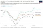
Interesting comparison of alpha, delta and omicron waves.

It's a log plot, so equal distance between lines means equal ratio between those measurements.

The graph is normalised to the January '21 alpha peak, so everything else (cases, hospitalisation, ICUs, deaths) is relative to the peak then.

Timeliness are shifted to give the same peak in '21, ie hospitalizations are lagged by 1-2 weeks, deaths are by 3-4 weeks etc, according to how the peaks of each lagged in '21.

Preamble over, what do we see:

Hospitalizations and deaths fell from alpha to delta by a lot relative to cases. This is due to the vaccination programme.

From delta to omicron there's little difference in hospitalisation or death; omicron seems near equally likely to hospitalise or kill you as delta.

What there is a big change in is severe disease needing ICU - the gap between cases to icu admissions widens a lot.
FJSu9AYXIAIyXKf.jpeg


ourworldindata allows you to make your own plots of this sort now, but I've not tried myself. Perhaps the "South Africa Data was ignored" crowd should try it.

From Paul Mainwood on twitter who explains a bit about why it's useful better than I have, I think.

 
Both that and the movie Contagion eleven years ago show very well how we have seen this kind of thing coming for ages and in effect still just sleepwalked into the consequences. Though thankfully science - especially in vaccines - had progressed just enough in that decade since 2011 and was fast tracked through 2020 - to mean we could save possibly hundreds of thousands of lives globally that we might not have otherwise done with Covid.
When I watched Contagion last year I assumed it was made-for-TV movie released in 2020. The fact it was 11 years old and contained all the same references ("r" rates, social distancing etc) was eerie..
 
Interesting comparison of alpha, delta and omicron waves.

It's a log plot, so equal distance between lines means equal ratio between those measurements.

The graph is normalised to the January '21 alpha peak, so everything else (cases, hospitalisation, ICUs, deaths) is relative to the peak then.

Timeliness are shifted to give the same peak in '21, ie hospitalizations are lagged by 1-2 weeks, deaths are by 3-4 weeks etc, according to how the peaks of each lagged in '21.

Preamble over, what do we see:

Hospitalizations and deaths fell from alpha to delta by a lot relative to cases. This is due to the vaccination programme.

From delta to omicron there's little difference in hospitalisation or death; omicron seems near equally likely to hospitalise or kill you as delta.

What there is a big change in is severe disease needing ICU - the gap between cases to icu admissions widens a lot.

View attachment 34724


ourworldindata allows you to make your own plots of this sort now, but I've not tried myself. Perhaps the "South Africa Data was ignored" crowd should try it.

From Paul Mainwood on twitter who explains a bit about why it's useful better than I have, I think.

Nice try but no cigar:
-> 45%+ are admitted to hospital for reasons other than Covid and most of those that die, do so because they tested +ve within 28 days of their death date.
-> 90%+ are on ventilators for Covid because they didn't get vaccinated.
THE PUBLISHED STATS ARE BROKEN. So your diagrams are totally incorrect.
 
Last edited:
Nice try but no cigar:
-> 45%+ are admitted to hospital for reasons other than Covid and most of those that die, do so because they tested +ve within 28 days of their death date.
-> 90%+ are on ventilators for Covid because they didn't get vaccinated.
THE PUBLISHED STATS ARE BROKEN. So you diagrams are totally incorrect.


There have always been incidental admissions and deaths. You'd expect them to be proportional to prevalence.

Which part of what I posted specifically do you disagree with, or do you purely wish to express inchoate rage - shouting doesn't make make you correct.
 
Interesting comparison of alpha, delta and omicron waves.

It's a log plot, so equal distance between lines means equal ratio between those measurements.

The graph is normalised to the January '21 alpha peak, so everything else (cases, hospitalisation, ICUs, deaths) is relative to the peak then.

Timeliness are shifted to give the same peak in '21, ie hospitalizations are lagged by 1-2 weeks, deaths are by 3-4 weeks etc, according to how the peaks of each lagged in '21.

Preamble over, what do we see:

Hospitalizations and deaths fell from alpha to delta by a lot relative to cases. This is due to the vaccination programme.

From delta to omicron there's little difference in hospitalisation or death; omicron seems near equally likely to hospitalise or kill you as delta.

What there is a big change in is severe disease needing ICU - the gap between cases to icu admissions widens a lot.

View attachment 34724


ourworldindata allows you to make your own plots of this sort now, but I've not tried myself. Perhaps the "South Africa Data was ignored" crowd should try it.

From Paul Mainwood on twitter who explains a bit about why it's useful better than I have, I think.


Youre dragging the arse out of this now mate. It’s over, we’ve got through what will hopefully be there final wave and we should all move on.
 
Interesting comparison of alpha, delta and omicron waves.

It's a log plot, so equal distance between lines means equal ratio between those measurements.

The graph is normalised to the January '21 alpha peak, so everything else (cases, hospitalisation, ICUs, deaths) is relative to the peak then.

Timeliness are shifted to give the same peak in '21, ie hospitalizations are lagged by 1-2 weeks, deaths are by 3-4 weeks etc, according to how the peaks of each lagged in '21.

Preamble over, what do we see:

Hospitalizations and deaths fell from alpha to delta by a lot relative to cases. This is due to the vaccination programme.

From delta to omicron there's little difference in hospitalisation or death; omicron seems near equally likely to hospitalise or kill you as delta.

What there is a big change in is severe disease needing ICU - the gap between cases to icu admissions widens a lot.

View attachment 34724


ourworldindata allows you to make your own plots of this sort now, but I've not tried myself. Perhaps the "South Africa Data was ignored" crowd should try it.

From Paul Mainwood on twitter who explains a bit about why it's useful better than I have, I think.

Are you sure that’s what it says?

CFB7FCB7-B4CB-4E66-838D-B94EE1B96E85.jpeg
 
Are you sure that’s what it says?

View attachment 34735

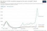
The reason for using the log plot is that the ratios are clearer. Impossible to judge the linear one by eye. I pointed at Mainwood's that which exclaims better than I did, as I said.

But to answer the question, no, I'm not sure that's what it shows, it's just the impression it gives to me. Do you take something different from it?
 
When I watched Contagion last year I assumed it was made-for-TV movie released in 2020. The fact it was 11 years old and contained all the same references ("r" rates, social distancing etc) was eerie..

Yeah I only watched it for the first time sometime last year.
Pre-Covid I'd never even heard the term 'social distancing' in any context that I can remember.
It's almost a little too close to a documentary for comfort.

Maybe Hollywood knew something we all didn't?
Maybe it's all one massive conspiracy that has been brewing since 2011?
Maybe the conspiracy theory nutjobs are on the money about all their other batshit crazy ideas?!

Nahhhhhhh.

Wouldn't be surprised to see a Contagion 2 in the pipeline before long.
 
The reason for using the log plot is that the ratios are clearer. Impossible to judge the linear one by eye. I pointed at Mainwood's that which exclaims better than I did, as I said.

But to answer the question, no, I'm not sure that's what it shows, it's just the impression it gives to me. Do you take something different from it?
The linear scale visually demonstrates a powerful how measures the vaccines have severely weakened the link between the measures, is my take.
 
Plan B taken forward for several weeks.Cases
Peak:
600,000 to 2 million per day. Timing: Late December 2021 to January 2022.
Hospitalisations
Peak:
3,000 to 10,000 admissions per day. Timing: January to February 2022. Shape: increase over December and January to peak, declining over March to April 2022.
Deaths
Peak:
600 to 6,000 deaths per day. Timing: Mid-January to mid-March 2022.
This is SAGEs best case scenario for the continuation of Plan B, Published on the 15th Dec. People can draw their own conclusions. But its very difficult to argue that this is anything but way off the mark so far. Unless you like to argue that is?! :-)
 
Optimism is all very well, but the calls of “it’s over” are wishful thinking. It isn’t over just because you’re fed up of it, we’re all fed up of it. But to just become complacent and pretend it’s not an issue anymore isn’t the answer, and no I don’t have the answer, I just hope that this relentless disaster movie plot has a happy ending sooner rather than later.
 
Optimism is all very well, but the calls of “it’s over” are wishful thinking. It isn’t over just because you’re fed up of it, we’re all fed up of it. But to just become complacent and pretend it’s not an issue anymore isn’t the answer, and no I don’t have the answer, I just hope that this relentless disaster movie plot has a happy ending sooner rather than later.

Definitely not for other parts of the World but over here in the UK it certainly feels like it’s coming to an end - all restrictions soon to be lifted , unless a new Variant appears then we are at the finishing line
 
Plan B taken forward for several weeks.Cases
Peak:
600,000 to 2 million per day. Timing: Late December 2021 to January 2022.
Hospitalisations
Peak:
3,000 to 10,000 admissions per day. Timing: January to February 2022. Shape: increase over December and January to peak, declining over March to April 2022.
Deaths
Peak:
600 to 6,000 deaths per day. Timing: Mid-January to mid-March 2022.
This is SAGEs best case scenario for the continuation of Plan B, Published on the 15th Dec. People can draw their own conclusions. But its very difficult to argue that this is anything but way off the mark so far. Unless you like to argue that is?! :-)
To be fair, their infection model is a lot better this time round. Sadly, yet again, the virulence model is totally to cock.
It really wasn't that difficult to compare Delta and Omicron in SA and use that is the basis of the model. But no, they didn't.
Sadly, continually crying wolf has consequences.
 
The linear scale visually demonstrates a powerful how measures the vaccines have severely weakened the link between the measures, is my take.

I wholeheartedly agree with that conclusion - though I think the log plot shows it more clearly, as you can see it consistently across the waves regardless of their magnitude.
 
Plan B taken forward for several weeks.Cases
Peak:
600,000 to 2 million per day. Timing: Late December 2021 to January 2022.
Hospitalisations
Peak:
3,000 to 10,000 admissions per day. Timing: January to February 2022. Shape: increase over December and January to peak, declining over March to April 2022.
Deaths
Peak:
600 to 6,000 deaths per day. Timing: Mid-January to mid-March 2022.
This is SAGEs best case scenario for the continuation of Plan B, Published on the 15th Dec. People can draw their own conclusions. But its very difficult to argue that this is anything but way off the mark so far. Unless you like to argue that is?! :-)

Read the document that comes with it, which sets out the assumptions and uncertainties. Most notably, on severity.
 
It really wasn't that difficult to compare Delta and Omicron in SA and use that is the basis of the model

Funny to read this, despite the fact

(1) nobody actually did that at the time and
(2) the SA health agency published a report just last week, posted on here, saying it was still not possible now!
 
There have always been incidental admissions and deaths. You'd expect them to be proportional to prevalence.

Which part of what I posted specifically do you disagree with, or do you purely wish to express inchoate rage - shouting doesn't make make you correct.
My daughter (CofE Consultant) says incidental admissions were around 10% in Jan 2021 and a lot of the elderly admitted this way subsequently became very ill. Nothing like that this time
 

Don't have an account? Register now and see fewer ads!

SIGN UP
Back
Top