johnny on the spot
Well-Known Member
- Joined
- 19 Jul 2006
- Messages
- 24,748
Three rivers and a bee would be nice. Either that or Frank Sidebottom's head.
Caveman said:Tottenham went from this overly busy badge
[bigimg]http://www.tottenhamhotspur.com/media/images/non-decorative/the-club/non-crunch/web/old-badge-1.jpg[/bigimg]
back to something like their original, but a modern version
[bigimg]http://www.footballchatter.com/photopost/data/502/TOTTENHAM-badge.jpg[/bigimg]
Liverpool went from this overly busy badge
[bigimg]http://newsimg.bbc.co.uk/media/images/45783000/gif/_45783210_liverpool_226.gif[/bigimg]
back to something like their original, but a modern version
[bigimg]http://korakasgroup.gr/eco/wp-admin/network/liverpool-badge-2012-13-800.jpg[/bigimg]
Chelsea went from this shit
[bigimg]http://www.starstore.com/acatalog/CHELSEA_club_badge.jpg[/bigimg]
back to something like their original, but a modern version
[bigimg]http://lh6.ggpht.com/-OW0hOKHMiW4/Ryoc39FQ5tI/AAAAAAAAASA/Ielflzj3OuY/Chelsea_crest.JPG[/bigimg]
Arsenal went from this overly busy badge
[bigimg]http://www.whoateallthepies.tv/wp-content/uploads/2012/06/ArsenalBadge_Original.gif[/bigimg]
to this modern looking badge
[bigimg]http://www.binbin.net/photos/reydon-sports/ars/arsenal-crest-pin-badge.jpg[/bigimg]
The NRL have recently changed from this
[bigimg]http://1.bp.blogspot.com/_73Ll0Gh1I0M/SebOaasHPQI/AAAAAAAAAt0/Jvq7D8XVzDA/s1600/nrl-logo-for-forum.png[/bigimg]
to this
[bigimg]http://themortreport.blogs.deseretnews.com/files/2012/11/nrl_logo_detail.gif[/bigimg]
Indiana Pacers, from this
[bigimg]http://www.emptythebench.com/wp-content/uploads/2009/08/Pacers-Classic.gif[/bigimg]
to this
[bigimg]http://content.sportslogos.net/logos/6/224/full/3084.gif[/bigimg]
Houston Astros, from this
[bigimg]http://www.nationalsportsbeat.com/images/logos/mlb/Houston_Astros.jpg[/bigimg]
to this
[bigimg]http://www.bloggerstobenamedlater.com/wp-content/uploads/2013/02/Houston-Astros-Logo.png[/bigimg]
Toronto BlueJays, from this
[bigimg]http://www.spineonline.ca/storage/winter2011/blogs/section_020/hemo0004/061215_toronto_blue_jays_logo.jpg?__SQUARESPACE_CACHEVERSION=1297455112923[/bigimg]
to this
[bigimg]http://www.blogto.com/upload/2011/11/20111119-blue-jays-better.jpg[/bigimg]


I only copy+pasted a few URLs.Kun Aguero said:Someone has too much time on their hands.
ban-mcfc said:
either of these two, bring back one of the older badges...
badman said:ban-mcfc said:
either of these two, bring back one of the older badges...
i dont like a badge within a badge.
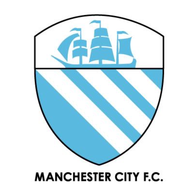
just a shield with a ship and stripes inside would be enough.