BlueTangerine
Well-Known Member
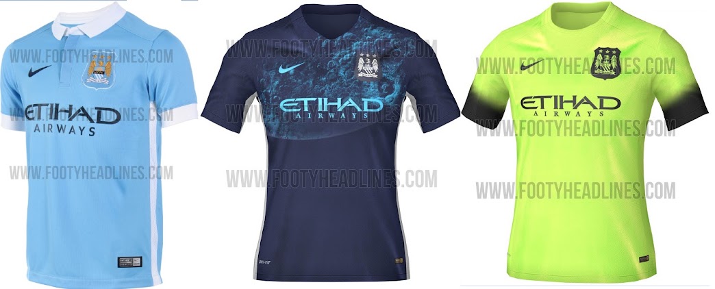
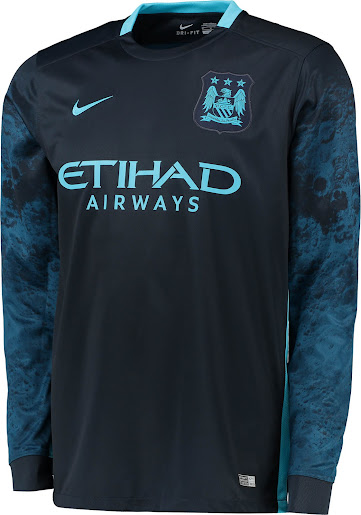
It's only a shirt so I can't really get upset about it myself, but it's fucking shite.
Actually I don't really mind it honestly, but we've had better.
Actually I don't really mind it honestly, but we've had better.