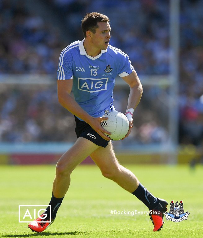
Worse, in my opinion, Karen. The font looks childish and the kit, after seeing it on the young lads for their match, looks even worse.
The shirt itself looks like a training top, when the fabric gets saturated with sweat (which only happens with the shirt) it looks laser blue and clashes quite a bit with the shorts, the white socks look like we left the navy or light blue socks at home (as, aside from the badge, there's no white anywhere else on the kit), we got the exact same template as every other Nike outfitted club this season, and they are charging an arm, leg, testicle, ovary, and favourite dog for it, most of which likely goes to Nike (one of the reasons they went with a single template for contracted clubs, no doubt, so they could maximise profit and minimise manufacturing scaling costs).
They have given us a travesty, history ignoring kit in a year where we've changed the crest (supposedly to harken to our history), brought in one of the best (if not the best) managers in the world, and are center stage in the world's gaze. The whole things just seems very strange—why go with such a huge departure from what has been established as our "colours" (brand, if you will, which is fairly differentiated in the top echelons of football) this year? And make it so cheap looking, as well.
I'm not angry—all of this is to express how perplexed I am with the club's decision making. I suppose my perspective stems quite a lot from my professional life, as I analyse these sorts of actions in my work. In most industries these sorts of changes can have significant effects on revenues and brand perception. People, whatever they say, are very sensitive to the way they perceive brands and support via their wallet accordingly. Perhaps this will not have much effect so I am being a bit over the top—I am sure a few will say that.
I do hope, though, we return to our modern scheme next season.


