Wheelsy
Well-Known Member
Dunno. As long as we never drop references to FC or Football Club like the Rags.
Wheelsy OSC Sydney said:The only thing that irks me is the MCFC part. I'd prefer Manchester City Football Club.
I'd prefer a redesigned old badge, a la Wigan.
Brucie Bonus said:masterwig said:Does anyone know if we will be keeping any of the shirts for more than one season?
I know the price is down to quality but they have a timeless look and if we had them for longer it would justify people splashing out a bit more. They look class so we should keep them.
If I understood Cookie, the badge / crest is likely to change next season; either to the old roundel (if they can sort the rights issue out), or to a new roundel very similar to the old one, or to some sort of hybrid. I don't remember hordes of Blues demanding the old badge be changed, LOTS of us do not like the new one and the old one fits into the branding project better than the new (as I said on the thread about naming COMS "Etihad").
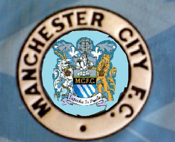
Have a look at this:
<a class="postlink" href="http://t-shirts.cafepress.com/item/manchester-city-fc-ringer-t/127780424" onclick="window.open(this.href);return false;">http://t-shirts.cafepress.com/item/manc ... /127780424</a>
Any doubt who we are? I was in a shopping mall (ugh) in Raleigh last weekend and I wore an old Brother shirt. Lots of young lads would walk really close (I pretended not to notice) and eye the badge, and I know they read MANCHESTER CITY. It's the same when I go anwhere with an old top on, the yank I'm talking to looks right at the badge, and what they read is MANCHESTER CITY, not some initials and a bunch of Latin all compressed into too small a space.
It's been causing me to think twice tbh about these new kits, because if they put the old crest on next season, but leave everything else unchanged, I'll never wear this season's offering, so why bother? Wait until next season and see. Of course, I'm not going to wait...so I suppose if they change the badge I'll be back in again. I'll make a prediction though: if the sales rankings (retro gear vs not) that City had on-line at the shop the last couple of seasons were accurate, then IF City put the old badge on next season, the kit will be the biggest seller EVER.
Brucie Bonus said:masterwig said:Does anyone know if we will be keeping any of the shirts for more than one season?
I know the price is down to quality but they have a timeless look and if we had them for longer it would justify people splashing out a bit more. They look class so we should keep them.
If I understood Cookie, the badge / crest is likely to change next season; either to the old roundel (if they can sort the rights issue out), or to a new roundel very similar to the old one, or to some sort of hybrid. I don't remember hordes of Blues demanding the old badge be changed, LOTS of us do not like the new one and the old one fits into the branding project better than the new (as I said on the thread about naming COMS "Etihad").
Have a look at this:
<a class="postlink" href="http://t-shirts.cafepress.com/item/manchester-city-fc-ringer-t/127780424" onclick="window.open(this.href);return false;">http://t-shirts.cafepress.com/item/manc ... /127780424</a>
Any doubt who we are? I was in a shopping mall (ugh) in Raleigh last weekend and I wore an old Brother shirt. Lots of young lads would walk really close (I pretended not to notice) and eye the badge, and I know they read MANCHESTER CITY. It's the same when I go anwhere with an old top on, the yank I'm talking to looks right at the badge, and what they read is MANCHESTER CITY, not some initials and a bunch of Latin all compressed into too small a space.
It's been causing me to think twice tbh about these new kits, because if they put the old crest on next season, but leave everything else unchanged, I'll never wear this season's offering, so why bother? Wait until next season and see. Of course, I'm not going to wait...so I suppose if they change the badge I'll be back in again. I'll make a prediction though: if the sales rankings (retro gear vs not) that City had on-line at the shop the last couple of seasons were accurate, then IF City put the old badge on next season, the kit will be the biggest seller EVER.


Only for cup games as Gary Cook said last week.masterwig said:I think with the badge it is a case of balancing history with style and relevance
I quite like the new badge to be honest, the old one, especially with the sort of faded blue sky like on the t-shirts posted above looks very cheap and outdated to me. Also I don't think the ship should be so prominent.
This is a very poor knockup someone did on here but I think if it was done properly it would look class: