New Nike Kit 13/14? (Merged)

Status
Not open for further replies.
ChicagoBlue said:
ZabbaStuntDouble said:
ChicagoBlue said:
And, Zabba, I think you should be sending your ideas to Nike, along with a CV!

Nah mate, they'd do me for infringing on tha' land. They'd butcher me up into a Lasagne. lol

i havent done anything, only added stuff on top of their original designs, anyone with the time can do it.

Think the idea of the Fan designing ... or at least choosing a away kit is a great idea. Remember the Brum did it one year and it works a treat.

1 vote per City number, put in a really dodgy one so the Rags can try and sabotage it knowing that one will never be chosen regardless, then Nike/City know who wanted what, and those that didn't choose the popular design, they send a discount to sway them to buying the winning one.

Its odd that no one does it already, espcially nowadays with people linked together through the social sites etc .... rather than gambling on blind faith that we are sheep that will buy anything just its related to our club.

Sounds like we've got it sorted! Shall I tell them, or will you?!

Keep up the good work....love the kits!

Getting them to listen is the trick ;)

gonna experiment with one later, people will hate it i think ... along the lines that Nike use the elements of the crests/badges in the kit design ..... but just want to see if it works or not.
 
citykev28 said:
ChicagoBlue said:
Looks good, but might look better in the traditional sky blue and maroon. More subtle color distinction for me as blue and black ALWAYS reminder me of Inter or Coventry.

Just as well that Zabba used dark blue and not black then.

All that effort to be a pedantic smart arse? You must be very successful when you apply that effort for good!

BLACK OR DARK BLUE?

Gnat's whisker, mate. You are a better man than me. :-)
 
ManCitizens. said:
JoeMercer'sWay said:
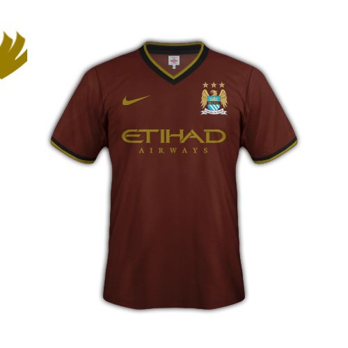
"according to Footy Headlines exclusive infomation the Manchester City 2013/14 Away Kit comes in Black/Dark Brown/Gold"

end of traditional City kits, bleurgh.

I could be wrong but it wouldn't surprise me if the idiots reporting have misplaced dark brown for burgundy.

Remember our black and gold kit under Hughes?
browngoldblack_zpsb87b2be6.jpg


or based on the home kit design:
browngoldblack2_zps0f7f9cb0.jpg
 
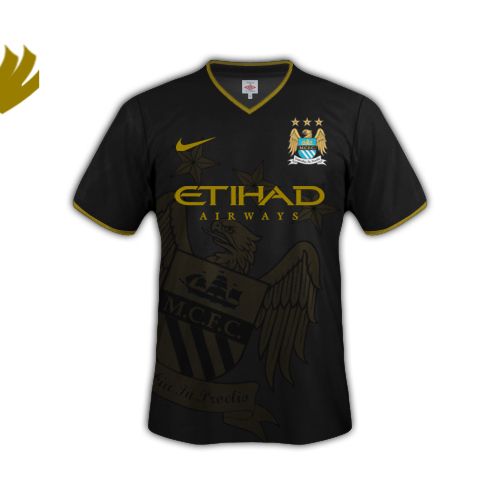
was trying to a black and gold today with a crest design involved in the shirt, but it wasn't working so gave up on it.
 
kun said:
ZabbaStuntDouble said:
was trying to a black and gold today with a crest design involved in the shirt, but it wasn't working so gave up on it.
black2_zps15c7395b.jpg

kind of ... was just using the shield part with the sponsor replace the MCFC on the crest and the the shield all in a shimmiring silivery black, on a black shirt/ i just couldn't get it to like up properly and didnt have time to spends hours doing it right.
 
ChicagoBlue said:
citykev28 said:
ChicagoBlue said:
Looks good, but might look better in the traditional sky blue and maroon. More subtle color distinction for me as blue and black ALWAYS reminder me of Inter or Coventry.

Just as well that Zabba used dark blue and not black then.

All that effort to be a pedantic smart arse? You must be very successful when you apply that effort for good!

BLACK OR DARK BLUE?

Gnat's whisker, mate. You are a better man than me. :-)

It didn't take too much effort to type 12 words out in all honesty.
 
The training gear in that picture doesn't look too bad although its not great.

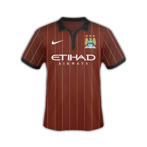
Just a thought, I wonder if the striped one is hinting at the colours that the 3 kits will be?
 
Status
Not open for further replies.

Don't have an account? Register now and see fewer ads!

SIGN UP
Back
Top
  AdBlock Detected
Bluemoon relies on advertising to pay our hosting fees. Please support the site by disabling your ad blocking software to help keep the forum sustainable. Thanks.