You are using an out of date browser. It may not display this or other websites correctly.
You should upgrade or use an alternative browser.
You should upgrade or use an alternative browser.
New Nike Kit 13/14? (Merged)
- Thread starter Shaelumstash
- Start date
- Status
- Not open for further replies.
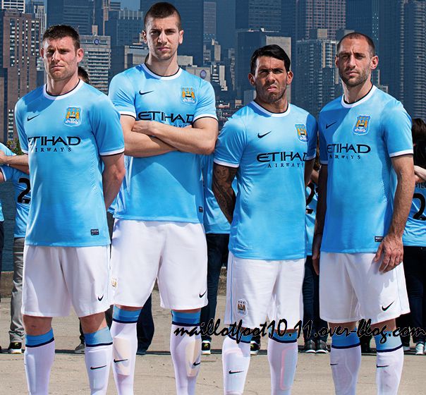
Worst Case Ontario said:When I saw pictures of shirt, shorts, socks I kind of didnt like, but when I saw whole kit together from a distance, I actually think I'm in love, together looks really nice

i thought New York would be taller somehow
markbmcfc
Well-Known Member
bobette said:
Have to say, last night I was underwhelmed. Mainly because of the shield.
After looking at this pic, I fucking love it.
Still don't like the shield, but never mid.
I fucking love the socks!!
SheeshKebab
Well-Known Member
- Joined
- 3 Jul 2011
- Messages
- 441
Think the shield makes it abit better to imo
Blueboy Danny
Well-Known Member
- Joined
- 28 Jan 2009
- Messages
- 855
Worst Case Ontario said:When I saw pictures of shirt, shorts, socks I kind of didnt like, but when I saw whole kit together from a distance, I actually think I'm in love, together looks really nice

When you look at most of the kits Nike churn out, I think we got the best they could have offered, still miss Umbro though.
another generation
Well-Known Member

Semi-Poznan with New York skyline in background. Nice.
Oh, and any City kit always looks good on our lads. Can't wait to see it on RSC!
bluemathlady
Well-Known Member
- Joined
- 9 Dec 2012
- Messages
- 954
SheeshKebab said:Think the shield makes it abit better to imo
That's the spirit
D
D
Deleted member 52846
Guest
I didn't like the shield at first but I believe it is a look back at the kits from our back-to-back FA Cup final team from the mid 1950s. Both the Sky and Maroon kits had this shaped shield:markbmcfc said:bobette said:
Have to say, last night I was underwhelmed. Mainly because of the shield.
After looking at this pic, I fucking love it.
Still don't like the shield, but never mid.
I fucking love the socks!!
[bigimg]http://www.binbin.net/photos/toffs/man/manchester-city-1954-1955-retro-football-shirts.jpg[/bigimg]
[bigimg]http://footballcollect.ucoz.ru/_bl/1/40567804.jpg[/bigimg]
D
D
Deleted member 52846
Guest
Great pic. Only Clichy missing in that pic from our five best players this season too. Love what those five have done this season, a real positive to take from it. Nastasić has been immense and I hope he can kick on next season.another generation said:
Semi-Poznan with New York skyline in background. Nice.
Oh, and any City kit always looks good on our lads. Can't wait to see it on RSC!
Isn't it funny how the players love the Poznań, the media love the Poznań, and now it seems New York loves the Poznań but we seem to have sacked it off. We've become such an apathetic
group of fans, in just one season.
The kit looks great, the more I look at it the more I like it. The colour of the Blue is spot on; beautiful. Not sure about white socks as part of a City kit, though, but that's because I have a navy sock bias. Navy has been our sock colour for 74 years of our history (more than any other colour) and was the colour of our socks when I first started watching City. But these white ones are nice I suppose.
another generation said:
Semi-Poznan with New York skyline in background. Nice.
Oh, and any City kit always looks good on our lads. Can't wait to see it on RSC!
New York Skyline? ... was thinking then ... "gee ... Manchester has changed a bit" lol<br /><br />-- Wed May 22, 2013 11:04 pm --<br /><br />
Caveman said:I didn't like the shield at first but I believe it is a look back at the kits from our back-to-back FA Cup final team from the mid 1950s. Both the Sky and Maroon kits had this shaped shield:
[bigimg]http://www.binbin.net/photos/toffs/man/manchester-city-1954-1955-retro-football-shirts.jpg[/bigimg]
[bigimg]http://footballcollect.ucoz.ru/_bl/1/40567804.jpg[/bigimg]
we know where the shield is from ... but its the 21sr Century, not 60 years ago. Somethings should stay where they belong.
- Status
- Not open for further replies.

