You are using an out of date browser. It may not display this or other websites correctly.
You should upgrade or use an alternative browser.
You should upgrade or use an alternative browser.
New Nike Kit 13/14? (Merged)
- Thread starter Shaelumstash
- Start date
- Status
- Not open for further replies.
bluemathlady
Well-Known Member
- Joined
- 9 Dec 2012
- Messages
- 954
invisableman said:Or some designer at Nike saw ur design thought that'll do and spent six months with his feet up eating donutsbluemathlady said:ZabbaStuntDouble said:it is scary how accurate my designs could actually be:

Home has a mainly white collar and cuffs but everything looks back on.
Away we think is gonna be black/navy with gold trim and gold sponsor
3rd could actually be a white/black/red number ..... might have to change my name to Mystic Zabba if it turns out to be true.
Or Psychic Zabba ;)
Thats the boring explanation :/
kun
Well-Known Member
Looks fake to me. The sponsor is far to big and there is no nike tickSoCalBlue said:MCFCmadman said:what about this for the away kit??

This is probably the Euro away kit....
bluemathlady
Well-Known Member
- Joined
- 9 Dec 2012
- Messages
- 954
bobette said:
Not bad at all really.
lunebleu
Well-Known Member
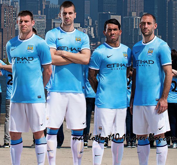
Worst Case Ontario said:When I saw pictures of shirt, shorts, socks I kind of didnt like, but when I saw whole kit together from a distance, I actually think I'm in love, together looks really nice

They'll do for me ,especially after last seasons black badge bodged up bollocks.
However those footie boots would be great in Panto on the north pier.
Abz rover
Member
bobette said:
Is Tevez squeezing one out?
Worst Case Ontario said:When I saw pictures of shirt, shorts, socks I kind of didnt like, but when I saw whole kit together from a distance, I actually think I'm in love, together looks really nice

Agreed. Looks fantastic as a whole kit. I actually love the colour of blue they used too, looks good with that shiny material.
Chev Chelios
Well-Known Member
Nastys gonna be a unit in couple of yrs!bluemathlady said:bobette said:
Not bad at all really.
- Status
- Not open for further replies.

