New York City FC Kit and Badge Thread

BlueMoonoverUS said:
Pigeonho said:
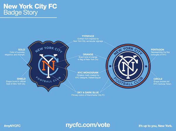
No interest in NYCFC, however the badge comp just came up on Facebook and I have to say the circle one instantly reminds me of our badge before the monstrosity we have now. Looks classy as fuck.
behasuvu.jpg


Yes, gets my vote.

The one on the right, definitely.

The left looks like a police badge with Mets colors.
 
Blue Haze said:
BlueMoonoverUS said:
Pigeonho said:
No interest in NYCFC, however the badge comp just came up on Facebook and I have to say the circle one instantly reminds me of our badge before the monstrosity we have now. Looks classy as fuck.
behasuvu.jpg


Yes, gets my vote.

The one on the right, definitely.

The left looks like a police badge with Mets colors.

Mets colours (Inherited from NY Giants), Knicks colours... New York's colours.


[bigimg]http://upload.wikimedia.org/wikipedia/commons/thumb/b/ba/Flag_of_New_York_City.svg/500px-Flag_of_New_York_City.svg.png[/bigimg]

The modern flag of New York City takes its colours from the Dutch flag of the 17th century, and has an orange stripe in honour of the House of Orange-Nassau.
 
The second one has already won. It has been decided.

a. We are getting ready to re-launch our old crest instead of the Campbell's chicken and stars we suffer with now
0000341840502.jpg
"A superior product" (Superbia in Proelia)
b. The Italian feel is not a coincidence.
64371577-01163433.jpg
 
the right hand logo with the coloured lettering of the left badge would look best.
 
Shaelumstash said:
M24 Citizen said:
Shaelumstash said:
I really like the circle one though. I'm really surprised how neither badge seems to have anything at all in common with MCFC though. I assumed the whole point of expanding in to other leagues was to expand our "brand". Other than the name "City" I can't see any way in which this increases our brand recognition whatsoever.

Both badges look more closely affiliated to Rangers or Inter Milan than Manchester City. I think it would be impossible to say either of these badges use anything whatsoever of our "Intellectual property" of our branding / badge. No eagle, no latin motif, no Manchester COA ship / shield. In fact, nothing whatsoever that is in any way similar to MCFC.

Think if the Chicago Bulls launched a basketball franchise in Manchester called the Manchester Bulls. They used the same iconic bull logo, the team played in the same iconic red kit, only the word 'Chicago' was replaced with the word 'Manchester'. Everyone would know the teams were affiliated, it would expand the Bulls brand, the Manchester team would benefit from being associated with the parent brand, and would likely have to pay the Chicago company royalties for the privilege.

Looking at this NYCFC badge though, no one would be able to tell there was any affiliation whatsoever to Manchester City, unless they were explicitly told about it.

There is nothing stopping any other team in the world being called "City" and nothing preventing them from playing in sky blue. If they wanted to use elements of our badge though, they'd have to pay us millions in fees to licence the intellectual property. I assumed this was one of the main reasons for the expansion teams of the "City Group". They pay MCFC millions to be able to use elements of our branding / badge, and it's another revenue stream for the club.

The fact the NYCFC badge uses zero of our intellectual property is just a strange decision for me, I kind of thought that was the major purpose of launching the team.
The less it feels to New Yorkers like they are a "mini Manchester City" the more will follow NYCFC meaning it will be more successful. Plus I'm happier having affiliated clubs that have their own identity, if we made a load of "mini Manchester City" clubs we'd be losing part of our uniqueness as well

I can appreciate everything you are saying mate, and it all makes sense from a New York supporters point of view, even from a MCFC supporters point of view.

But the point I'm making is that from a commercial point of view, what is the purpose of this for Manchester City as a business?

I assumed it was to spread awareness of our brand, but these badges don't do that in any way whatsoever. I assumed we would be licensing our Intellectual property to NYCFC, and they would be paying us a fee for it. But these badges don't use anything at all of our IP, so we couldn't charge them a licensing fee.

Think of a brewery..that manufactures different brands of beer, the brands hardly look identical eh?
 
S04 said:
Shaelumstash said:
M24 Citizen said:
The less it feels to New Yorkers like they are a "mini Manchester City" the more will follow NYCFC meaning it will be more successful. Plus I'm happier having affiliated clubs that have their own identity, if we made a load of "mini Manchester City" clubs we'd be losing part of our uniqueness as well

I can appreciate everything you are saying mate, and it all makes sense from a New York supporters point of view, even from a MCFC supporters point of view.

But the point I'm making is that from a commercial point of view, what is the purpose of this for Manchester City as a business?

I assumed it was to spread awareness of our brand, but these badges don't do that in any way whatsoever. I assumed we would be licensing our Intellectual property to NYCFC, and they would be paying us a fee for it. But these badges don't use anything at all of our IP, so we couldn't charge them a licensing fee.

Think of a brewery..that manufactures different brands of beer, the brands hardly look identical eh?

No, you're missing the point. We're not the brewery, we're the brand. Diageo brews Guiness. When they launched a new colder version of the product, they called it 'Guiness Extra Cold'. It used the same name, same brandng, same colour scheme, same typeface, same logo as regular Guiness.

Everyone who sees a Guiness Extra Cold product, or a Guiness Extra Cold advert instantly knows that the product is intrinsically linked to regular Guiness which has been around for centuries. Extra Cold benefits from all of the brand association built up over many years for Guiness.

Guiness Extra Cold is a brand extension of Guiness. It's a similar but unique product. That is reflected in it's branding. The branding is similar enough so consumers understand it's benefits, while also different enough to know it is a unique product.

NYCFC is a brand extension of MCFC. It should have sought to benefit from the brand recognition of Manchester City, while remaining unique and slightly different. Instead they've gone for a completely branding, and I don't see how MCFC can benefit from it at all from a brand recognition point of view.

You see Manchester City is not Diageo, it's Guiness, eh?
 
1.618034 said:
Blue Haze said:
BlueMoonoverUS said:
behasuvu.jpg


Yes, gets my vote.

The one on the right, definitely.

The left looks like a police badge with Mets colors.

Mets colours (Inherited from NY Giants), Knicks colours... New York's colours.


[bigimg]http://upload.wikimedia.org/wikipedia/commons/thumb/b/ba/Flag_of_New_York_City.svg/500px-Flag_of_New_York_City.svg.png[/bigimg]

The modern flag of New York City takes its colours from the Dutch flag of the 17th century, and has an orange stripe in honour of the House of Orange-Nassau.


OK. I still don't like Mets colors. They don't look good and the Mets suck.

I voted for the other one.
 
Shaelumstash said:
S04 said:
Shaelumstash said:
I can appreciate everything you are saying mate, and it all makes sense from a New York supporters point of view, even from a MCFC supporters point of view.

But the point I'm making is that from a commercial point of view, what is the purpose of this for Manchester City as a business?

I assumed it was to spread awareness of our brand, but these badges don't do that in any way whatsoever. I assumed we would be licensing our Intellectual property to NYCFC, and they would be paying us a fee for it. But these badges don't use anything at all of our IP, so we couldn't charge them a licensing fee.

Think of a brewery..that manufactures different brands of beer, the brands hardly look identical eh?

No, you're missing the point. We're not the brewery, we're the brand. Diageo brews Guiness. When they launched a new colder version of the product, they called it 'Guiness Extra Cold'. It used the same name, same brandng, same colour scheme, same typeface, same logo as regular Guiness.

Everyone who sees a Guiness Extra Cold product, or a Guiness Extra Cold advert instantly knows that the product is intrinsically linked to regular Guiness which has been around for centuries. Extra Cold benefits from all of the brand association built up over many years for Guiness.

Guiness Extra Cold is a brand extension of Guiness. It's a similar but unique product. That is reflected in it's branding. The branding is similar enough so consumers understand it's benefits, while also different enough to know it is a unique product.

NYCFC is a brand extension of MCFC. It should have sought to benefit from the brand recognition of Manchester City, while remaining unique and slightly different. Instead they've gone for a completely branding, and I don't see how MCFC can benefit from it at all from a brand recognition point of view.

You see Manchester City is not Diageo, it's Guiness, eh?
I like Guinness.
 
Especially for JMW & 6one

ix9w5l.png
67nxnn.jpg


I only did it with paint. I'm sure a photoshop expert will be along shortly.

Soz, too much extra pissing about to get them the same size.
The orange N brings out the colour of the border a bit better but I'm looking at just the NYC on a baseball cap without the rest of the badge and I think that the original white would stand out better.

Errm undecided, Go on then, I agree with JMW & 6one, the coloured letters.
 
Not being linked to the branding of MCFC is something I actually welcome more than if they copied us completely.

I can't see the club attracting many supporters if they had gone down the route of copying us either.

The badge looks more like that of a Serie A club than it does of us.

We'll still have the benefits being linked with the club, such as the base for our EDS players to play in a fully competitive league and maybe? have first choice on any future stars that arise from NYCFC.

I can see ideas that aren't allowed over here such as Rail Standing being introduced over in the States.

How embarrassing it will be when the Yanks will have better atmosphere in their stadium than we do.
 
Shaelumstash said:
S04 said:
Shaelumstash said:
I can appreciate everything you are saying mate, and it all makes sense from a New York supporters point of view, even from a MCFC supporters point of view.

But the point I'm making is that from a commercial point of view, what is the purpose of this for Manchester City as a business?

I assumed it was to spread awareness of our brand, but these badges don't do that in any way whatsoever. I assumed we would be licensing our Intellectual property to NYCFC, and they would be paying us a fee for it. But these badges don't use anything at all of our IP, so we couldn't charge them a licensing fee.

Think of a brewery..that manufactures different brands of beer, the brands hardly look identical eh?

No, you're missing the point. We're not the brewery, we're the brand. Diageo brews Guiness. When they launched a new colder version of the product, they called it 'Guiness Extra Cold'. It used the same name, same brandng, same colour scheme, same typeface, same logo as regular Guiness.

Everyone who sees a Guiness Extra Cold product, or a Guiness Extra Cold advert instantly knows that the product is intrinsically linked to regular Guiness which has been around for centuries. Extra Cold benefits from all of the brand association built up over many years for Guiness.

Guiness Extra Cold is a brand extension of Guiness. It's a similar but unique product. That is reflected in it's branding. The branding is similar enough so consumers understand it's benefits, while also different enough to know it is a unique product.

NYCFC is a brand extension of MCFC. It should have sought to benefit from the brand recognition of Manchester City, while remaining unique and slightly different. Instead they've gone for a completely branding, and I don't see how MCFC can benefit from it at all from a brand recognition point of view.

You see Manchester City is not Diageo, it's Guiness, eh?
No, you're missing the point. It might not be the same in Melbourne but in NY it's a brand new club. The intellectual rights don't consist of copying our badge, it's things like training and how to run a club. I'm not an expert on these things but millions to use a badge is a bit ridiculous don't you think? Our colours are going to become identifiable world wide. Just look at Yas Marina;
Yas-Marina-Circuit-FormulaDrift.png
The track didn't have to be that colour. NYCFC need their own identity, but they will have things in common with us. Firstly, playing in sky blue.

I hope they chose the circle one.
 
Shaelumstash said:
S04 said:
Shaelumstash said:
I can appreciate everything you are saying mate, and it all makes sense from a New York supporters point of view, even from a MCFC supporters point of view.

But the point I'm making is that from a commercial point of view, what is the purpose of this for Manchester City as a business?

I assumed it was to spread awareness of our brand, but these badges don't do that in any way whatsoever. I assumed we would be licensing our Intellectual property to NYCFC, and they would be paying us a fee for it. But these badges don't use anything at all of our IP, so we couldn't charge them a licensing fee.

Think of a brewery..that manufactures different brands of beer, the brands hardly look identical eh?

No, you're missing the point. We're not the brewery, we're the brand. Diageo brews Guiness. When they launched a new colder version of the product, they called it 'Guiness Extra Cold'. It used the same name, same brandng, same colour scheme, same typeface, same logo as regular Guiness.

Everyone who sees a Guiness Extra Cold product, or a Guiness Extra Cold advert instantly knows that the product is intrinsically linked to regular Guiness which has been around for centuries. Extra Cold benefits from all of the brand association built up over many years for Guiness.

Guiness Extra Cold is a brand extension of Guiness. It's a similar but unique product. That is reflected in it's branding. The branding is similar enough so consumers understand it's benefits, while also different enough to know it is a unique product.

NYCFC is a brand extension of MCFC. It should have sought to benefit from the brand recognition of Manchester City, while remaining unique and slightly different. Instead they've gone for a completely branding, and I don't see how MCFC can benefit from it at all from a brand recognition point of view.

You see Manchester City is not Diageo, it's Guiness, eh?

Yes, but two pints of Guinness sat on a table cannot interact with each other by themselves. Football teams can, and they don't have to be wearing the same crest to do so. The point of having several teams is that they will operate in conjunction with each other - summer friendly tournaments, cross-advertising and sponsorship deals, each website providing materials about the other. In this way, everyone will know that the teams are linked.

There are more ways of promoting the brand than making NYCFC literally have to look like an indenti-kit clone of MCFC, and this is a very good thing, because the MLS has already had Chivas USA, which was nothing more than a foreign team deliberately and unashamedly declaring that their MLS side was nothing more than the cheap plastic action figure toy version of the real Chivas - same kits, same badge, same commitment to playing Latino players over other ethnicities - and the result was that its fanbase bombed and it became nothing more than a joke club, a name invoked when you want to provide an example of everything that can be wrong with a club. NYCFC are having to take very careful steps to show that they explicitly are not going down the Chivas USA route of simply existing to deflect glory back to Manchester, because if we were to have copied the badge and so on, the club would have become a hundred-million-dollar failure and it would have cost us all the good will we are trying instead to build.
 
Personally that sounders kit is arguably the worst kit ever. The colours are a horrible combination.
 
SuperYaya said:
This is the best one imo.

1465318_249856025187861_383825908_n.png

That one is pretty smart:

<a class="postlink-local" href="http://forums.bluemoon-mcfc.co.uk/posting.php?mode=quote&f=1&p=7536673" onclick="window.open(this.href);return false;">posting.php?mode=quote&f=1&p=7536673</a>

Looks a tad like Oldham's colours on their owl crest.

NYCFC have given fans the chance to design, vote and be part of their club in many shapes and forms. I'm sure after the crest, the kit will follow. Will Etihad sponsor them?! Or CITC?<br /><br />-- Tue Mar 11, 2014 6:09 am --<br /><br />
M24 Citizen said:

Reminds me of when Umbro came in and paid attention to our kits.
 
Blue Haze said:
1.618034 said:
Blue Haze said:
The one on the right, definitely.

The left looks like a police badge with Mets colors.

Mets colours (Inherited from NY Giants), Knicks colours... New York's colours.


[bigimg]http://upload.wikimedia.org/wikipedia/commons/thumb/b/ba/Flag_of_New_York_City.svg/500px-Flag_of_New_York_City.svg.png[/bigimg]

The modern flag of New York City takes its colours from the Dutch flag of the 17th century, and has an orange stripe in honour of the House of Orange-Nassau.


OK. I still don't like Mets colors. They don't look good and the Mets suck.

I voted for the other one.

Hey! Less of The Mets bashing. That's my team!
 
Is anyone else slightly confused by the way the image above which explains the various aspects of the badge claims that the colours of MCFC are sky and navy blue, not sky blue and white? Perhaps it explains why all the white is disappearing from our shirts?
 
Falastur said:
Is anyone else slightly confused by the way the image above which explains the various aspects of the badge claims that the colours of MCFC are sky and navy blue, not sky blue and white? Perhaps it explains why all the white is disappearing from our shirts?
<a class="postlink" href="http://www.historicalkits.co.uk/Manchester_City/Manchester_City.htm" onclick="window.open(this.href);return false;">http://www.historicalkits.co.uk/Manches ... r_City.htm</a>

Navy blue has been part of our kits since the 1800's. I'd say in recent years it's the navy blue that has disappeared in favour of white. We've had navy blue socks for over 80 years of our existence, and yet we've now adopted white. Strange decision for me as there are many teams with sky blue shirts, white shorts and white socks Napoli, Celta Vigo, Coventry, Lazio.

Yet sky blue shirts, white shorts and navy blue socks I have only ever seen worn by Manchester City. I don't know why the powers that be have decided to make us like all of those other teams instead of keeping our own unique identity.
 
ped said:
disappearing white / ? where did you get that from?

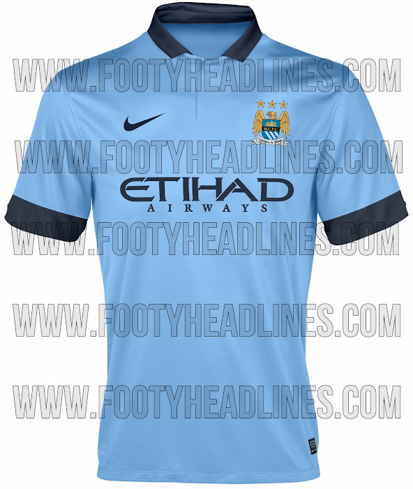
From our supposed shirt for next season, in the "2013/14 kit" thread, and for that matter our current shirt. All the white trim on the colours and sponsor logo has gone, replaced by dark blue:

Manchester+City+14-15+Home+Kit.jpg


Shaelumstash said:
Falastur said:
Is anyone else slightly confused by the way the image above which explains the various aspects of the badge claims that the colours of MCFC are sky and navy blue, not sky blue and white? Perhaps it explains why all the white is disappearing from our shirts?
<a class="postlink" href="http://www.historicalkits.co.uk/Manchester_City/Manchester_City.htm" onclick="window.open(this.href);return false;">http://www.historicalkits.co.uk/Manches ... r_City.htm</a>

Navy blue has been part of our kits since the 1800's. I'd say in recent years it's the navy blue that has disappeared in favour of white. We've had navy blue socks for over 80 years of our existence, and yet we've now adopted white. Strange decision for me as there are many teams with sky blue shirts, white shorts and white socks Napoli, Celta Vigo, Coventry, Lazio.

Yet sky blue shirts, white shorts and navy blue socks I have only ever seen worn by Manchester City. I don't know why the powers that be have decided to make us like all of those other teams instead of keeping our own unique identity.

I'm aware of that. I've contributed images to that website before. But the fact of the matter is that if you asked any City fan "what are City's colours" they would reply "Sky blue and white". I googled "Sky blue and white" and a City link was the third response but we weren't anywhere at all if you replace "white" with "navy blue". We have never worn the two shades of blue without white featuring prominently, but we have used white with both colours on their own. If they were going to say that navy blue was one of City's colours, they should have labelled up white and said that all three are our colours, because white features on that badge, and it features prominently.
 

Don't have an account? Register now and see fewer ads!

SIGN UP
Back
Top