City's New Kits - 2019/20

I love this! The 125 kit is wonderful

puma-manchester-city-125th-anniversary-shirt-1.jpg


https://www.footyheadlines.com/2019...ma-manchester-city-125th-anniversary-kit.html

puma-manchester-city-125th-anniversary-shirt-2.jpg


Jacket looks good too

puma-manchester-city-125th-anniversary-shirt-5.jpg
Great shirt- but not impressed with Puma if this is all they come up with for a commemorative shirt.
You can buy this design from the shop or get a Score Draw replica- so Puma haven’t exactly put their back out just reproducing this classic design.

I’d be much more impressed if this was our actual shirt next season and the 125th one actually alluded to our beginnings -more than just the neck label certificate on a 1960’s shirt.
Lazy and unimaginative.
 
The training jackets look decent. They'll sell a few of them.
 
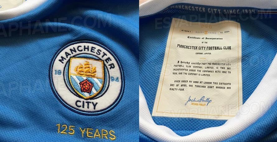
The clearer photo has solidified my dislike of the shirt. It turns out all the purple backlighting for official promo shots, purple collateral for club events, and purple smoke at the parade was in fact likely meant to ease us in.

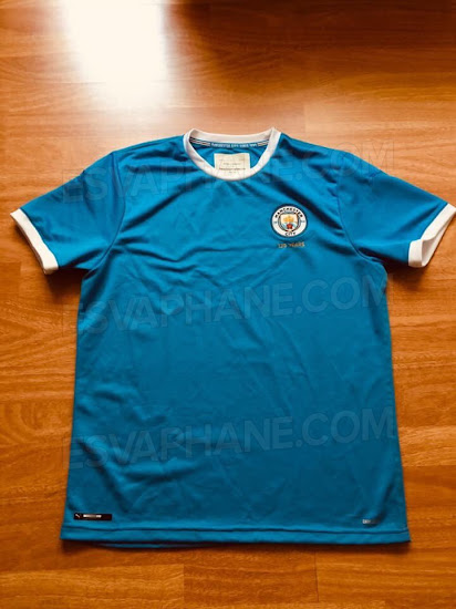
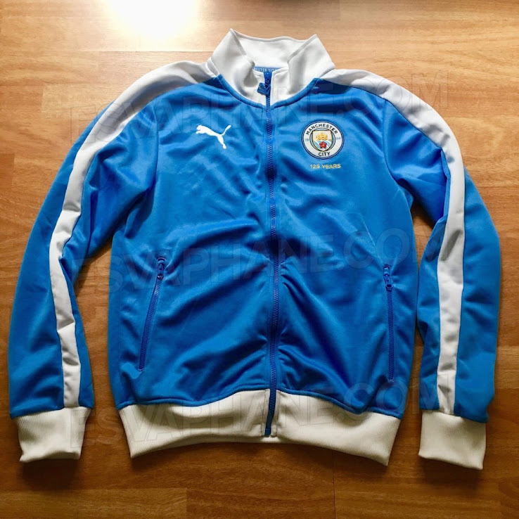
I personally just hope this is not a play to establish sky blue, purple, and white as our official colours using the goodwill created by our historic treble/quadruple season (as it is a very strange colour combination from both a design and kit history perspective). It’s probably not, of course, but that’s also what Cardiff supporters said when the rumours of their colour change started (I knew one that swore that the ownership would never be so stupid and out of touch as to do that).
You are a deep thinker, I can tell
 
The rivers on the badge look white on that photo. So either they’ve altered the badge again, or shirt’s a bad snide.
Or the sunlight shining on it is reflecting to make them look lighter and the shirt hasn’t actually got areas of navy blue, they’re just creases and shadows.

Come on Shael, I expect more from a navy socks unionist.
 
Or the sunlight shining on it is reflecting to make them look lighter and the shirt hasn’t actually got areas of navy blue, they’re just creases and shadows.

Come on Shael, I expect more from a navy socks unionist.
Haha! I’ll always be a staunch NSU!

I’m just not sure that retro shirt is legit. It’s probably pretty close to the real one, but looks like the snide Thailand version.
 
The home shirt is growing on me. Yeah the purple is weird but it's the perfect shade of sky blue, without any stupid patterns, buttons, collars or necklines.
 

Don't have an account? Register now and see fewer ads!

SIGN UP
Back
Top