City’s New Kits

If it was a full round collar maybe

But why piss about with patterns just keep it plain

Without patterns the home kits would be practically repeating themselves after about 5 years. Unless they did shit like give the home shirt a purple trim. I'd prefer an odd pattern than see that again.
 
Hoping they've just cobbled that together quickly based on the description and that it's pretty far off.
 
That has to be AI, we'll be a fucking laughing stock with that on. Imagine buying it and wearing it out in public hahaha!
 
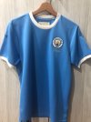
Why cant we just keep it simple like the below. Add the current badge then puma logo and eithad sponsor in white. and they're perfect and everyone would love them. No frills no two tone nonsense and tribute to this and that. Just plain and beautiful 1000143768.jpg1000143769.jpg
 
Why cant we just keep it simple like the below. Add the current badge then puma logo and eithad sponsor in white. and they're perfect and everyone would love them. No frills no two tone nonsense and tribute to this and that. Just plain and beautiful View attachment 158210View attachment 158211
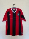
That Reebok away one had FAR too much red in it for my liking. The LCS/Eidos one from the Ali Bernabia years was the right way to do red & black stripes.
 
Why cant we just keep it simple like the below. Add the current badge then puma logo and eithad sponsor in white. and they're perfect and everyone would love them. No frills no two tone nonsense and tribute to this and that. Just plain and beautiful View attachment 158210View attachment 158211

Come on, this is a daft question that you clearly know the answer to.

Regardless of how much this kind of thing is liked, the kits are changed each year to maximise Puma's return for their outlay. Simple as that. And because that means basically a minimum of 30 different outfield shirts over a ten year period, that's a lot of different designs and marketing bullshit required.
 

Don't have an account? Register now and see fewer ads!

SIGN UP
Back
Top