Club Badge (merged)

Hi Jon,
If your man at the club has put you up to this, please send him this design that Geek in Gav did, I think it's pretty much the perfect City badge! He did one with the Manchester bee instead of the Maltese cross, but I can't find it online. (Oh and while you're at it, will you tell them to bring back the navy blue socks as well please :-)

B-Fb7A8IUAE7PJ9.png:large


ByJ4nK-CUAA_ous.jpg

All that red in it?

No thanks.
 
I'd have to get a new tattoo, wouldn't mind one though
Reminds me of a lad I know who had not long had the round badge tattooed on his arm which "hurt like fuck" then we changed the badge!

He shrugged off the pisstaking from red twats and got the other arm done with the new badge. No doubt biting his lip and whimpering
 
Reminds me of a lad I know who had not long had the round badge tattooed on his arm which "hurt like fuck" then we changed the badge!

He shrugged off the pisstaking from red twats and got the other arm done with the new badge. No doubt biting his lip and whimpering
I never think they hurt, would get the new one on my other arm if they change it.
 
For me, it's time for a rebranding with re:the club crest.

It's not 'clean' enough. It's too busy. A bird, a Latin worded ribbon, a shield, three stars, a ship, "M.C.F.C", three stripes...there's too many things going on. And when it's out up alongside other crests (whether altogether on a full league list or even one-on-one to another badge) it has to be downsized to fit all the shit on and our badge actually looks smaller than other crests (when it isn't but the stars and the ribbon make it have to be downsized because it's too tall otherwise).

Here are other reasons:
Shirt2.jpg

Anything, the bird, red in away kits, anything we have should have nowt to do with that fucking club! And them having the bird on their 1958 FAC final kit doesn't sit right with me.

The Latin is shite and I remember my old RE teacher at school telling me when the crest first came out that Superbia means an arrogant/think too much of yourself 'pride'.

The three stars are a fucking joke!

And I don't like how our club name is not on the crest. We are "Manchester City F.C." not M.C.F.C. We are Manchester's club and the only City to ever win the league title. Those words/names should be on our club crest.


As far as the old retro crest goes: We are no longer in Lancashire, no matter what any old shire folk would like about that old crest. So going back to the old crest shouldn't happen. There are parts of South Manchester that have never been part of Lancashire as it's always been South of the River Mersey. The red rose (the emblem of a family from Lancaster, 55 miles away) has no links to these places.

I think it should be a modern version of a disc (so we don't have to have a silly shield around it like Nike keep dishing up) that has Manchester connotations only.
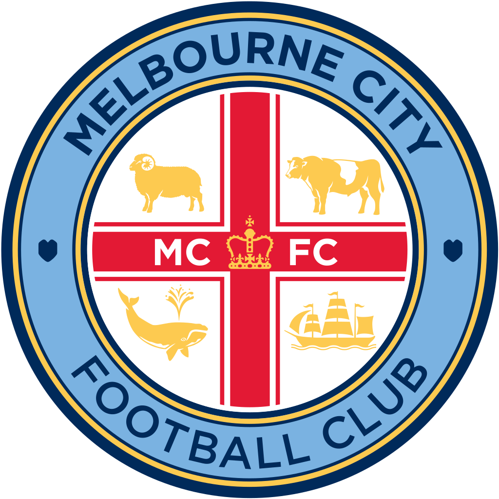
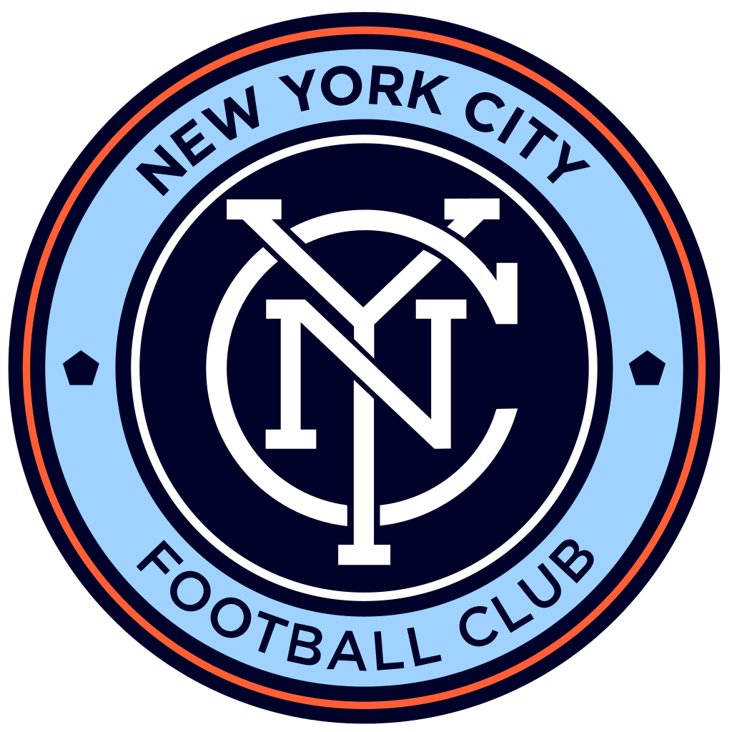
Like this old one but with more modern lines, colours and font: (big one not the small one)


These two are great:
1024px-Melbourne_City_FC.svg.png


1024px-New_York_City_FC.svg.png
 
Last edited by a moderator:
This has been an ongoing thing for quite some time now, I hope I'm wrong, but it isn't the type of thing the club would do out of the blue. The entire brand is hinged on our badge/logo, multi million pound deals have been made for the use of a badge that has seen us compete in Europe and win the league twice - it could negatively affect our global awareness which would be detrimental to the work our board have put in over the past couple of years. Why would they change the badge now, after they've forged all these new partnerships rather than before?

The idea of changing it now screams of inexperience in global marketing and brand awareness, which doesn't sound like City to me!
Not if we made a huge deal about it. Loads of fanfare; "¡LOOK AT MANCHESTER CITY FC, WE HAVE A NEW CLUB CREST!". The world would get used to it in less than weeks.
 
Hi Jon,
If your man at the club has put you up to this, please send him this design that Geek in Gav did, I think it's pretty much the perfect City badge! He did one with the Manchester bee instead of the Maltese cross, but I can't find it online. (Oh and while you're at it, will you tell them to bring back the navy blue socks as well please :-)

B-Fb7A8IUAE7PJ9.png:large


ByJ4nK-CUAA_ous.jpg
Yes, THIS. It is perfection!
 
I only wear my old 70's round badge anyway no matter what the club come up with.


I never wear scarves or kits...............they hate fans like me even though I'm a top blue
 
Don't mind the Lancashire rose, it is what it is, but I'm not one for red in the crest where it can be avoided. If I had my way the shield in this potential new crest wouldn't be red.
 
Found another couple of @GeekinGav excellent designs. Be interested in what other blues think.

1.

image7a064.jpg


2.
image980bc.jpg


3.
imagea54f6.jpg

4.
B-Fb7A8IUAE7PJ9.png:large

5.
BwnlFOsIEAAhoxS.jpg:large
It's funny I was looking for geekin gavs designs a few days ago and couldn't find them. Now just my conspiracy theory but he did these quite a while ago so if the club had any sense they would have approached GG , surprised he hasn't posted in this thread, just saying. :)
 
It's funny I was looking for geekin gavs designs a few days ago and couldn't find them. Now just my conspiracy theory but he did these quite a while ago so if the club had any sense they would have approached GG , surprised he hasn't posted in this thread, just saying. :)

It's an interesting theory mate. I'd searched for Gav's designs as well, after doing a bit of digging I found out they were all hosted on his Twitter account which has now been deleted.

I know from some of his old posts that he'd had some health problems, so maybe that explains him not currently being active on the site. Either way, obviously hope he's healthy, and thanks for all the designs he did. I really hope the club take his ideas on board.
 
The red shield with 3 gold stripes is part of the history of Manchester through roger de grelley. Oh and the 3 stripes have nothing to do with the rivers, apparently that's just a myth according to the council- just like the 3 stars on our badge I suppose :-)
 
Aahhh, this old chestnut. Has everyone agreed, once again, that the old badge is best?
 

Don't have an account? Register now and see fewer ads!

SIGN UP
Back
Top