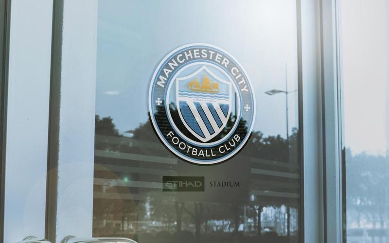
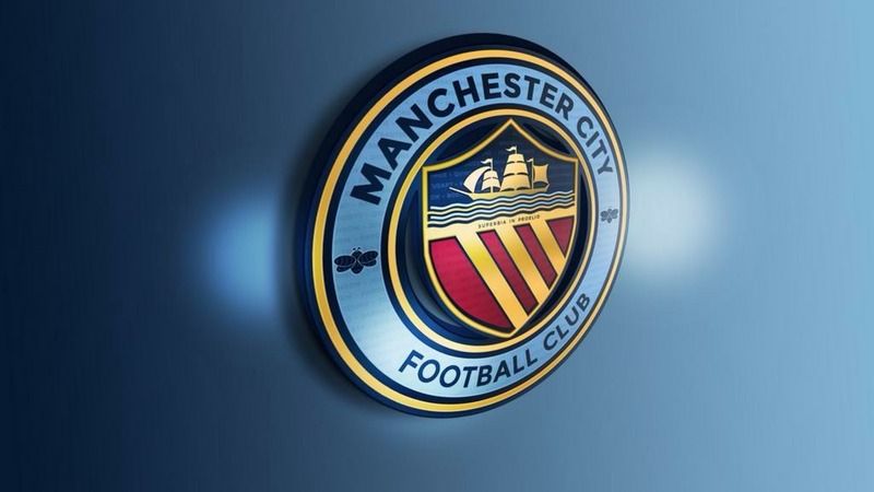
Club Badge (merged)

As much as I like 'the middle one', I don't think it's a good idea to change the current badge.
Our fan base has grown a lot over the past few years as has the club as an international brand. To change the badge now would stall some of that growth. It is a period of great success for the club and to lose a major symbol of that would for me be a mistake.
 
Really glad they're changing it. The current one is a complete embarrassment. I think the previous round one looks a bit dated and would like a more modern twist to it

Instead of the rose we could have a hologram of Miley Cyrus twerking.
 
Agree. Ditch the rose and go with rivers, bees and st marks, or 2 of the 3 if putting all in is too much

It's a great opportunity this. Did anyone really like our current badge? Total embarrassment considering what european teams have stars for. And what's the eagle about? Chuffed to see the club are ditching the monstrosity
 
Here you go Kev ;)

0129203_PE283223_S5.JPG


:D
Are you flirting with me?
 
So do we now all have to start labelling our posts in every thread with #teamcircle and #teameagle?
 
Brilliant. Blues, i may never have to answer the most difficult question my daughter could possibly ask me. Dad, what are the three stars for? Would be perfect to go back to the old one.

Someone told me the stars represent the three rivers ie medlock, mersey & irwell. Anyway the middle badge every time for me.
 
This is near perfect IMO.

image.jpg


My personal fave of @GeekinGav

2D4AB4E9-5AE2-4E1D-9C26-B96EBD2361C1_zpsm0z3rg3t.jpg

I agree, these are pretty close to perfect.

For me it has to be a roundel with that Manchester CoA in the middle.

I loved our badge in the 80s and early 90s, but the red Lancashire rose has got nothing to do with City or Manchester anymore. If we brought it back now it wouldn't make any sense.

I'm not dead set on those colours, be good to see a few different options on a sky blue shirt, but the main design is close to perfect.

I like the Manchester bees as well, but think the design of these could be tweaked to look more like the ones you see around town.

Personally, the latin writing and writing in the background could go for me as well.

I know most City fans won't really care, but I think this design also sits perfectly alongside the NYCFC and Melbourne badges.

So this design has elements of our past, present and future.
 

Don't have an account? Register now and see fewer ads!

SIGN UP
Back
Top