steviemc
Well-Known Member
With Fuck Man Utd in the middle
6 - 1 on the outsides
gets my vote :)
With Fuck Man Utd in the middle
6 - 1 on the outsides
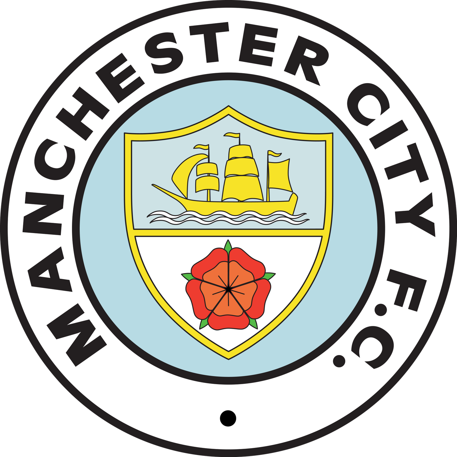
Often wondered about the significance of the 3rd flag facing the opposite direction. Is there any historical/trade reason for this that you know of?Manchester grew into a major city out of the industrian revolution and the cotton trade the boat is a reference to the world wide trade in goods from that trade and commerce, also the 3rd (right) flag should always face opposite the left and middle flag, the bees on a globe represent the industrial and busy labour force and the shield is a reference to the first duchy of Manchester, but also now used to represent the rivers in more modern times
You've got it 100% bang on there.round badge
city blue, white, black, maroon
shield, rivers
ship
bee
in comments box Manchester City not mcfc
no eagle or latin
It's a reminder of 'If you keep pulling your face like that, when the wind changes, it will stay that way'.Often wondered about the significance of the 3rd flag facing the opposite direction. Is there any historical/trade reason for this that you know of?
1 - 6 it was at the swamp, typingly speaking. soz. got a problem with premiership not premier league also. as you were.With Fuck Man Utd in the middle
6 - 1 on the outsides
Often wondered about the significance of the 3rd flag facing the opposite direction. Is there any historical/trade reason for this that you know of?
Good effort

Only a quick attempt, it would obviously need tweaking by a pro. I tried to modernise the old one. Keeping it clean and simple, partly inspired by Club Brugge badge. Which I have always admired.
I'm not a fan of the ship, if Manchester wants to shout about the ship canal, then united can carry on doing it on their shit badge.
I like the 3 river idea, I always have. It can be represented in such a simple way, with 3 stripes.
The two stars added are for the Premier League titles we have won. The badge should be modern and represent the club right now, stars should be added for every Premier Title we win. Up to 5 stars in total. Then it could like a very dominant badge.
Never really understood the eagle - Didn't think it was necessary
I do like the idea of the bee, but I'd hate it if we began to be known as the 'bees' - Its too 'rugby'
Anyway, It's only a quick idea, with work, I'd like something clean and simple like this
Another one of Gav's [emoji106][emoji106][emoji106]
deffo chaff your nipple though, is it 3d printed?If this becomes our badge I will break my promise and get this tattooed!
Fantastic!
What the actual fuck are you serious?
Surely you can't be.
To disregard our first league titles would be criminally disrespectful!
I am genuinely shocked at your idea. Should we change our foundation year to 1992 too while we are at it
The badge i grew up with,the one i identify us with and the one i will vote for.This and only ever this:
Change the roses with St Marks and its perfect
The crosses aren't an option so I'd be happy with roses in that badge.Change the roses with St Marks and its perfect


