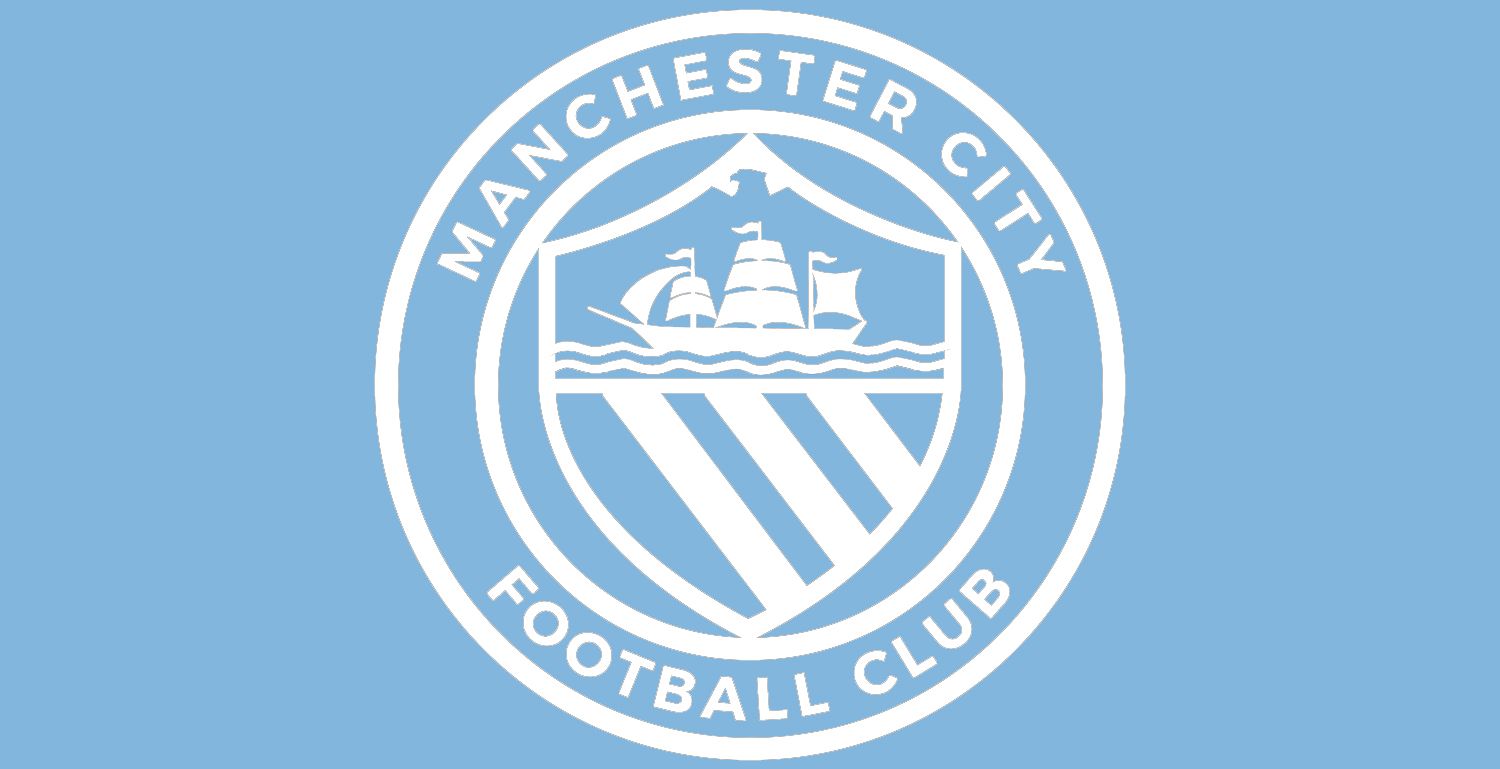
Club Badge (merged)

bg8k6a.jpg


Put this in the round badge, it would look fuckin awesome
 
Badge%20Mono%20White%20Golden%20Eagle.jpg


Do we need colour?

Other than the eagles head ;-) that looks absolutely fucking sensational! In fact I'll go as far as to say if the club don't use something very close to this design they'll have dropped an absolute bollock.

That to me feels more like the City badge than the one we've had for the last 18 years. In fact, it feels more like the real City badge than the rose one from the 80s.

I'd prefer it in full colour on the shirts, but on t-shirts, posters, websites, even windows, this design minus the eagle's head is the one.
 
Personally mate I like the "Football Club" bit written out like the NYCFC and Melbourne badges, gives it a bit of consistency.

If the 1894 was included, I'd have 18 at 9 o'clock and the 94 at 3 o'clock on the circle. I was never bothered about including the date, but I actually think it would open a lot of people's mind's around the world who have been force fed mass media garbage that we're a "petro club" that didn't exist before 2008.

Even in Germany when I went away to Dortmund we were chatting to some of their fans who thought we were a new club that had only been around for a few years.

Incuding the date might be a good and simple way of educating people that we're a club with a long history and encourage people to look in to it a bit more.
I think those Dortmund fans may have been winding you up. I went to Stuttgart for the pre-season friendly and their fans definitely knew who we were and even started the "Yaya/Kolo" chant after the game when we were coming out of the stadium!
 
Other than the eagles head ;-) that looks absolutely fucking sensational! In fact I'll go as far as to say if the club don't use something very close to this design they'll have dropped an absolute bollock.

That to me feels more like the City badge than the one we've had for the last 18 years. In fact, it feels more like the real City badge than the rose one from the 80s.

I'd prefer it in full colour on the shirts, but on t-shirts, posters, websites, even windows, this design minus the eagle's head is the one.


With a flat top shield id take that. What is that thing at the top? Its not an eagle.
 
bg8k6a.jpg


Put this in the round badge, it would look fuckin awesome
If you had attended the Gary James talk on the Club Badges you would know that this is what the current badge is based on. It was an image produced by Manchester CC for sports clubs to use at a cheaper rate than if they used the Coat of Arms.

As pointed out "The Evil Empire" used it on their 1958 Cup Final shirts, so no thank you it is tarnished.
 
Last edited:
I think basically the eagle is dead now. Its from Utd's 1958 Wembley shirt (as well as the M/C coat of arms). The rose/sheild and ship are as well but haven't been used by Rags FC. Enjoy the eagle wake...RIP eagle.
If you read Grays post you will see that it is nothing to do with the coat of arms of Manchester but was a council design for use by sports clubs within the city.
 
What about having the eagle where the three stripes are? A smaller, less detailed design. Similar to how the rags have the devil.

The eagle would represent the support of the club through the dark times, the Wembley comeback and the rise to the top of English football.
 
I´m sorry if I come across as a bit of a stickler about the eagle but I feel I have to point out that it has NEVER had anything to do with
the city`s coat of arms. There are many posters on here that seem to think it has. It IS, however, most definitely connected to united.
I suspect the person in the commercial dept. back in 1997 who designed the present badge was a red. Unfortunately there were several
of them working in the club back in the days of Swales and they hung on into the following era. The eagle itself came about as a result of the
council creating a blanket crest for sporting institutions in the city(see recent posts on this).
 
What about having the eagle where the three stripes are? A smaller, less detailed design. Similar to how the rags have the devil.

The eagle would represent the support of the club through the dark times, the Wembley comeback and the rise to the top of English football.
Please read Grays post from earlier today or any of the other posts that explain the eagle is a rag badge symbol and therefore unacceptable.
 
'for sport in this City'...belter that innit, with them lot not starting or finishing in this city...and the ground extending and campus being in Sports City...it's on signs on the M60 isn't it, Sports City? Anyone flick that pic up please of the eagle casting a shadow over Old Scaffold...something about it i like.

Eagle's got be stylised to work on a badge....having it sky blue would be hilarious.
 
If you had attended the Gary James talk on the Club Badges you would know that this is what the current badge is based on. It was an image produced by Manchester CC for sports clubs to use at a cheaper rate than if they used the Coat of Arms.

As pointed out "The Evil Empire" used it on their 1958 Cup Final shirts, so no thank you it is tarnished.

I did attend the lectures and Gary said pretty much every symbol has a utd link our current badge is based on thus image and the coat of arms that utd also used in their badge and fc utd do now
 

Don't have an account? Register now and see fewer ads!

SIGN UP
Back
Top