Club Badge (merged)

Yep the official City Twitter account has tweeted the "Eighteen Ninety Four" poster.

Hope it's at 9 and 3 o'clock on the outer circle. I like the dots in Gav's design, but the 1894 helps to make the badge more uniquely City, so easiser to trademark, and also helps educate ignorant foreign fans who think we were founded in 2008.

Not long to go now, just got to hope no posters appear talking about stars or eagles in the next day or two!


Absolutely . . . Please please please no eagles no stars simply give us the old badge back
 
I actually quite like it without the shield, looks classy! I agree with a previous poster that the 3 strips almost looks 'adidasy' Could the 3 squiggly lines under the ship represent the rivers and then replace the lines with 'Est. 1894'

Just a thought ?!

I thinks its going to be like a i said in the above post, following on from Gav's design without a shied in the middle? Any chance of a mock up gav? Page 367 if you dont know which one i mean
 
The only badge I can think of where the date is split is Everton's. I just think it looks odd. I didn't want the year on, it reminds me of when someone tells an audience their age and then waits a sec to milk some applause as if being born x amount of years ago was an achievement.
 
so a circle, a ship, rivers and now 1894 ..... we may swell just have our old badge please

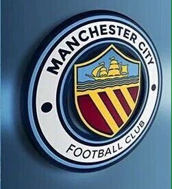
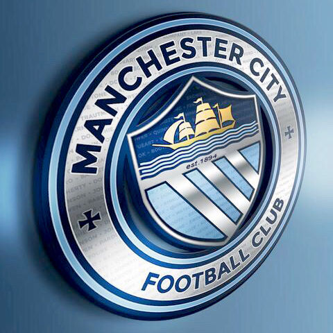
We know it's round, we know it's got the ship, we know it's got the 3 rivers. The only thing we don't know is if it's got the inner shield. So it's either going to be like:

A (with 1894 where the MCFC is)
h0TdAIv.png


Or,

B Gav's core design with 1894 at 9 and 3 o'clock

0Rdf3F1.png


Sincerely hope it's something more like B. The design is more balanced, much better design, looks more "City" to me. I'm delighted with everything the club has released so far, just sincerely hope they don't fudge it and go for something like A.

B looks brilliant, it is basically our old badge pre rose one.
 
B looks brilliant, it is basically our old badge pre rose one.


0Rdf3F1.png


Yep totally agree, but it's been modernised. Fits in with the other CFG badges, represents Manchester, represents City. I'm encouraged by everything the club has said so far, my only fear now is that we could end up with A.
 
0Rdf3F1.png


Yep totally agree, but it's been modernised. Fits in with the other CFG badges, represents Manchester, represents City. I'm encouraged by everything the club has said so far, my only fear now is that we could end up with A.

I really like A.

I don't dislike B but the gaps between the circle and the shield looks bad IMO. At least needs a different colour.
 

Don't have an account? Register now and see fewer ads!

SIGN UP
Back
Top
  AdBlock Detected
Bluemoon relies on advertising to pay our hosting fees. Please support the site by disabling your ad blocking software to help keep the forum sustainable. Thanks.