And why is man kind emitting so much carbon? Because of exponential population growth.
Absolutely correct.
Could not agree more in fact.
And why is man kind emitting so much carbon? Because of exponential population growth.
I wonder whether humanity will eventually be able to devise technology to remove huge quantities of CO2 from the air.
Only it isn't exponential.Absolutely correct.
Could not agree more in fact.
Only it isn't exponential.
World population is predicted to flatline at around 11 billion. Challenging enough to sustain that number of course, but to imagine it's just going to inexorably rise, let alone inexorably rise at an exponential rate, is not correct.
Of course we will. It's impossible to imagine the sorts of technologies we'll have available in 50 or 100 years time. For a start, we'll probably have nuclear fusion cracked by then, so (a) we won't need to produce any CO2 in order to generate energy, and (b) we'll have essentially limitless "free" energy to power all sorts of carbon sequestration technology which isn't conceivable right now.
Jumping through ever more ludicrous hoops now, in order to fix a problem which is 100 years away, would not be such a silly idea if there were no adverse consequences. But there are enormous adverse consequences. The numbers of people who die in the developing world each year is astronomically high and to seek to constrain economic development in those countries (which is the effect of imposing strict carbon emissions targets) condemns literally millions of people to a premature death. And then there's the rather silly idea of trying to fix a future problem with old technology. A bit like deciding to fight world war 3 with bi-planes.
There's nothing wrong with prudence, but the climate change challenge is WAY over hyped and politicised.

Took me two years to think about it ;-)Odd to reply two years later, I can’t even remember posting the above.
Do you have any content to back that up?
i would suggest it's foolish to expect that technology that's not yet been invented could be used to solve a problem that is likely to have significant adverse consequences to the whole planet, especially when we can do something about it at the moment.
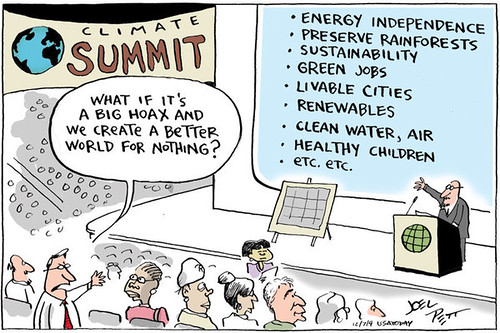
i work in an environment and sustainability management role in an engineering company and use this image a lot when delivering presentations.
We (as a developed nation) should be doing everything we can to reduce our impacts. You mention people dying but they're dying now thanks to air pollution, especially in our cites (not on the same scale granted).
We could do something about it if we wanted, but we wont as it'll cost money
Nonsense, what on earth gives you that idea?We are centuries away from nuclear fusion as a viable power source.
If ever.
Have the public been invited to consider these possibilities, or have they simply been fed propaganda about how calamitous it will all be and that we MUST act NOW?
"We'll probably have nuclear fusion cracked"? That's quite the mixed metaphor, especially when you prefaced it with "It's impossible to imagine..." and then you start, well, imagining. I'm not saying I don't hope and believe we won't get Fusion "cracked" but we just can't rely on what might happen with technology, when we know that we are having a detrimental impact on our own environment.Of course we will. It's impossible to imagine the sorts of technologies we'll have available in 50 or 100 years time. For a start, we'll probably have nuclear fusion cracked by then, so (a) we won't need to produce any CO2 in order to generate energy, and (b) we'll have essentially limitless "free" energy to power all sorts of carbon sequestration technology which isn't conceivable right now.
Jumping through ever more ludicrous hoops now, in order to fix a problem which is 100 years away, would not be such a silly idea if there were no adverse consequences. But there are enormous adverse consequences. The numbers of people who die in the developing world each year is astronomically high and to seek to constrain economic development in those countries (which is the effect of imposing strict carbon emissions targets) condemns literally millions of people to a premature death. And then there's the rather silly idea of trying to fix a future problem with old technology. A bit like deciding to fight world war 3 with bi-planes.
There's nothing wrong with prudence, but the climate change challenge is WAY over hyped and politicised.
I don't think we'll ever invent tree's gdm ;-)I wonder whether humanity will eventually be able to devise technology to remove huge quantities of CO2 from the air. It’s an eye-watering undertaking, but never say never.
I watched it, but my biggest takeaway wasn't climate change, it was just good, old-fashioned water pollution.I don't think we'll ever invent tree's gdm ;-)
Did anyone watch that Stacey Dooley documentary tonight on how fashion is polluting the earth, its as big an issue as fossil fuel for me, I had no idea how bad it was, and it contributes to the use of fossil fuel/climate change and plastic problem.
