I respect your view mate, and I agree we are a forward thinking club.
My personal view is that there was no demand for change from the fans in 1997. We were all very happy with what we had at the time, and the 1930s badge that had come before. Sure, at some point it could have done with a bit of an update in design to remain relevant.
Other than City, I'd say The Shite, Arsenal, Chelsea, Aston Villa, Liverpool, Spurs, and Everton are probably the 7 biggest clubs in England. They've all had updated designs of their badge in the last 15 years. But all of them are completely recognisable as the same core design that those clubs had as far back as the 1970s.
Only City's has drastically changed and incorporated a load of new symbols that previously had no relevance to the club - eagle, stars, latin etc.
In my view the eagle and the stars were foisted upon us with no consultation and no demand for them from the fans.
I understand the reason we had to change (copyright), but if those reasons are no longer an issue, why shouldn't we have an updated version of the previous badges that were so popular? Is City's history and identity not as important as those other 7 clubs? It certainly is to me.
I appreciate we are a forward thinking club, but one of the reasons the Premier League and it's clubs are so popular is because of the 100 plus year history.The badge should respect and represent that history.
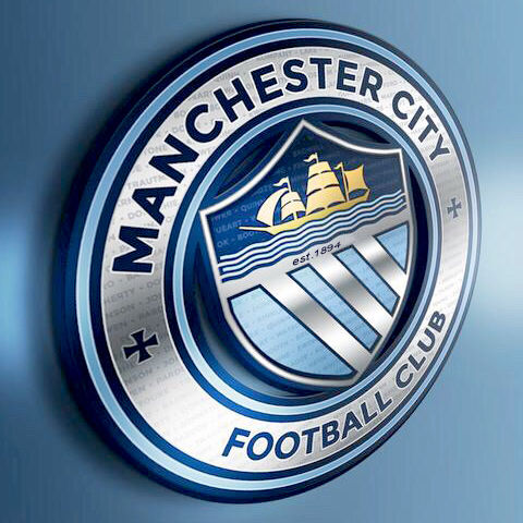
It's possible to be modern, forward thinking, but still respect and represent the history of the club. The best representation I have seen of that is
@GeekinGav 's designs below.
I strongly believe that if we had updated to this design in 1997, there would be absolutely no appetite to change the badge now.


