ALL OUR LIVES
Well-Known Member
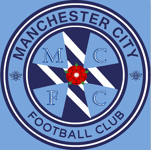
Sorry pal - that is awfulSomething a bit different??

Sorry pal - that is awfulSomething a bit different??

HAHAHAHAHAHA!!!!Sorry pal - that is awful
I don't like the CFG trim on the circle at all for our badge - it looks like a crap imitation of NYCFC - whereas the old badge is still a circle obviously but looks unique to NYCFC. Should just be a black trim, not black and sky blue or whatever. White circle, black trim.

Nice to see so much enthusiasm on here for the badge debate but please don't forget to do the official mcfc consultation stuff as well. Remember that colours, shapes and every aspect is worth thinking about - never forget that mufc dropped football club, arsenals cannon turned around and Everton, well Everton messed everything up as far as fans were concerned. This is a great opportunity. Also, don't forget I'm doing some lectures on the badge over the next few weeks. Book on and I'll go through the history of the badges and their elements. There'll also be an opportunity for questions about the badges histories, do if you've wondered about the significance of any element, ownership of rights or whatever then come along and I'll do my best to explain or answer the questions. Cheers
I like that but it'd look better and unique from the NYCFC/Melbourne designs if you did away with the blue outer circle (and maybe the gold inner too). I do think the 3 rivers are a given for the badge as well but I really like the rose design.did try to comprimise ...

Can the faded words in the background read "Fuck off, UEFA"?did try to comprimise ...

Something a bit different??


I like that but it'd look better and unique from the NYCFC/Melbourne designs if you did away with the blue outer circle (and maybe the gold inner too). I do think the 3 rivers are a given for the badge as well but I really like the rose design.
